Wednesday, May 31, 2017

Hudson Medi-Centre Gallery

It's been six years since the new medical centre opened in our little town. Since then, I've been managing a small showcase of local art in their waiting room, rotating the display every two months. That's almost forty different presentations! We've had fibre, photography, molded paper, sculpture, and of course many different painting media.

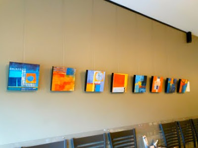
This time it's my turn, and I've hung eight of my abstract acrylic collages, each measuring 10" x 10". Not the most inspiring photo, but you get the idea....  To get a better look at the individual pieces, check out my previous post.


Please get in touch with me by e-mail if you'd like to have your work considered for this space: hdubreuil[AT]sympatico.ca

The medical centre is located at 465 Main Road in Hudson, Quebec.

Monday, May 29, 2017

Fabric Tales

In our little town of Hudson, Quebec, there is an innovative group of artists called "Hudson Fine Crafts", most of whom work with fibre. They are putting together a collaborative project, "Fabric Tales", to celebrate the town, asking participants to make a simple collage in cloth and stitch that depicts a local scene. All items submitted will be displayed on a clothesline as part of an upcoming spring fair.


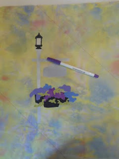
I began with a photo of an arrangement I have at the foot of my driveway, and printed it out to the required size in black and white.


Below you can see the photo taped to my "light table" so that I can trace its shapes onto some heat-away stabilizer. This product is a clear film, and it acts as a placement guide for appliqué shapes and then later as a stitching guide. 


At this point I also trace the major appliqué shapes onto a fusible web. I work from the back of the photo so that the shapes are "flipped horizontal".


I auditioned a few different fabrics to serve as the background, looking for something light enough to provide contrast for the black stitching that was to follow. This one screamed "garden" to me, so here it is, with the clear film drawing pinned into place.


Next, I chose some hand-dyed and printed cottons to represent the different elements in the composition.


Here's the clear film placement guide, pinned at the top, with the appliqué shapes positioned into place. At this point the film is temporarily removed and a hot iron is used to adhere the appliqué shapes to the background.


As I wanted to have some closely-spaced quilting to hold this top layer to the batting and backing underneath, I used a disappearing-ink marker to lay down a couple of guidelines for diagonal stitching. These stitching lines were broken so that they did not stitch over the appliquéd shapes.


Time to pin the clear film into place so that the black line can serve as a guide for machine stitching with a heavy black thread. I like to offset the stitching line and the shapes by about 1/4 inch.


Once stitched, the clear film is removed by tearing and then with a hot iron. I used a product called TAP to transfer the word "Hudson" to the signpost, and then bound the edge of the project with a green printed cotton. After signing my name on the back with a marker, I considered my contribution to be complete.

Here are some of the specialty products that I have used so often over the past few years to transform my own photo images into fibre landscapes.


And now this mini-quilt (measuring the requisite 14" x 10.5") is ready to take its place on a clothesline display celebrating the charms of our little burg.


Sunday, May 21, 2017

ArtDaily.org


Billing itself as The First Art Newspaper on the Web, ArtDaily.org is available as a daily bulletin that you can subscribe to, for free.

It's been around since 1996, and offers a wide selection of news about exhibitions, auctions, publications, and more.

And if you're planning to travel, you can use this site to do a search for art events that coincide with your trip.

Wednesday, May 17, 2017

Mirka Knaster on Playfulness

For several years I have subscribed to the blog of Mirka Knaster, a textile artist with a decades-long career as a writer. This month, she posts a thoughtful piece on the value of play, and its role in creativity.

Paul Klee, Castle and Sun

As always, Knaster draws on a wide range of sources to explore her subject, this time referencing artists Paul Klee, Henri Matisse and Richard Diebenkorn as well as Dale Carnegie, Jean Piaget and other psychologists. She reflects on a recent exhibition staged at SF MOMA and on her own experience of rust-dyeing.


Knaster ends her posts with thought-provoking questions and invites responses from her readers.

Couldn't we all use a little more playfulness in our lives?

Sunday, May 14, 2017

The Art Assignment

A recent discovery is the website "The Art Assignment", a treasure trove of inspiration, instruction and ideas.

You can learn more about it here.

Warning: This could become addictive. Here's a sample:


Wednesday, May 10, 2017

Latest Acrylic Collages

In late April I attended "Acrylic Painting for Textile Artists", taught by Jane Davies at the Helen Day Art Center in Stowe, Vermont. I had a great time, and learned a lot from Jane and from the other participants.

This was made of some bits from a previous exercise.
I like the "brushiness" of the orange background, with a previous layer
of blue background still visible, holding the central shape together.
I think that the extreme value contrast adds to the piece.

It also shows a contrast between "busy" and "quiet" areas.

Something that Jane recommends is to set a few parameters and develop a series from them. For example, you could require yourself to make several pieces with an "open grid" using all squares and rectangles, or you could set a particular colour scheme, or you could work with three shapes, two lines and a pattern.


More brushiness. I'm beginning to understand
that paint is crucial to achieve this effect.
Cloth alone won't get me there.

Working with multiples makes each single piece less "precious" and easier to modify. This approach is less suitable to work in cloth, though, as the medium is so much more labour-intensive.


I found that generally the piece is more successful
when the shapes of each colour coalesce into a single mass,
rather than being scattered throughout.

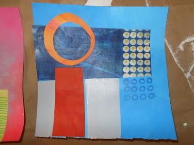
The ten pieces shown here all measure 10" x 10", and all share a complementary colour scheme of blue and orange. Most of them use a rectilinear grid, but also include some rounded shapes for contrast.


Having one colour predominate seemed to work best.

As I explained in the previous post, some of these began as a painted background, with collaged shapes on top. Further painting and collage often ensued. Others started as a collage with paint applied as a second layer.


A piece of cotton with black and white polka dots was stiffened
with Golden's GAC 400  so that it would cut like paper and not fray. 


Some of these were begun before the workshop, others were started at the workshop, and a few were begun and finished in the days following the workshop. It was important to me to have a cohesive set of ten new pieces for our local show, and I was able to complete these just in time.


These four shapes include a good range of size.
The large orange-red shape began as painted tissue paper
and offers an interesting, wrinkly texture.

As I worked on these, I tried to use contrast of scale, hue, value, hard and soft edges, etc. Using blue and orange automatically ensures the contrast of warm and cool.


Multiple layers of paint contribute a sense of depth.


This one was much improved when blue paint was added to the central blue area,
 making a large blue shape.

I think this one would be improved with more value contrast.
I was seduced by the soft, limited range of mid-tone values in the background.


I still intend to translate some of this abstract imagery into cloth, but I am more and more persuaded that paint will also be needed to achieve the "lost edges" that I find so appealing. Meanwhile, I am having great fun exploring what paint can do.

Sunday, May 7, 2017

Another Jane Davies Workshop

A few weeks ago I posted some almost-finished work that was inspired by a suggestion on Jane Davies' blog. She proposed that we choose complementary colours to make small compositions in paint and collage, and gave some examples of her recent demo pieces on this topic.

Soon after, I attended a four-day workshop in Stowe, VT with Jane. The class was titled "Abstract Painting for Textile Artists", and Jane has posted a few photos from the workshop on her blog . The photos below are some of my "starts", not one of them finished at the time of the photo.


There were twelve of us in the class. One participant was an established watercolour painter, and most of the others were textile artists with little experience using paint.

Jane was able to cover some basics that are essential to those new to the acrylic medium: how to mix paint, how to use products like gel medium and glazing medium, how to dry brush, how to achieve smooth transitions by working wet-on-wet, painting on tissue paper, and much more. Of special interest to the textile artists was the use of a Golden product, GAC 400, which is designed to stiffen fabric so that it behaves more like paper, making it suitable for collage.


It is fascinating to watch Jane demo her own approach to making painted collage. She is absolutely fearless in her quest to "move the composition along", obliterating some beautiful passages in service to the success of the whole, seemingly ever-confident about her own ability to make good decisions in seconds.


One of our first in-class assignments was to make collage papers in a variety of techniques and a full spectral range of colour. We were then asked to assemble collages, and to add paint to them. Later, we were shown how to make interesting backgrounds and to build collages on them. So in effect we alternated from painting to collage to painting to more collage, until we were satisfied with the piece.

Throughout, Jane emphasized the value of using contrast in our compositions: contrast of value, hue, scale, texture, pattern, of hard edges and soft edges, of curving shapes and rectilinear shapes, of matte and gloss, of opaque and transparent, and so on.


Jane encouraged us to produce a number of "starts", and to rotate through them, adding or modifying each in turn. This prevents one from "getting stuck" on any one piece, and makes each little project less precious. My best guess is that none of the participants felt they had actually produced a finished piece, but that each left with a bundle of "works in progress" that they were excited to complete.

This was my second in-person workshop with Jane and, as before, what I found most valuable was her personal feedback. Just as in the previous workshop, Jane suggested that while my imagery was strong, my compositions needed more "breathing room", more quiet areas to complement the busier bits, giving the eye somewhere to rest. In fact, I did cut up some of my earlier efforts, isolating interesting parts and adding them to quieter backgrounds.

All this to say that when I returned home, I continued to work on what I had begun, and also tried to apply some of what I had learned to the blue-and-orange exercises I began last month.

And so I now have in hand ten small mixed-media works to hang at this weekend's show of the Hudson Artists. I will be sure to post some images in the next few days.

To find out more about Jane Davies, her art and the many workshops she offers, both on-line and in-classroom, please visit her website.
Wednesday, May 3, 2017

Another course from Coursera


Six weeks ago I posted here about an on-line course designed by the Museum of Modern Art and offered through Coursera. The 8-week course, titled In the Studio: Post-War Abstract Painting, focused on the technical approaches of eight individual artists, what made their work distinctive, the trajectory of their careers and their place in that period of art history.

Initially I had no intention of pursuing the course. "Far too busy," I told myself.  But since it was available at no cost, I decided to give it a try and was soon completely engaged. Each of the eight units required certain readings and viewing of videos, followed by a quiz, and I'm a sucker for that kind of structured learning. I found the material interesting, and it was presented in an effective variety of formats.

With the course nearing its end, I have now signed on to another of Coursera's free on-line offerings, though I haven't yet begun it. This one is called Modern Art & Ideas. It's a five week course, again designed by MOMA. The course proposes to explore modern art, not chronologically, but through four different themes:
  • Places & Spaces
  • Art & Identity
  • Transforming Everyday Objects
  • Art & Society
No prior knowledge of art history is required. Enrolment ends May 20. More information is available here.