Wednesday, July 29, 2020

Sketchbook Explorations, Part 6

Continuing on with Week 5 of Jane Davies' packaged instruction, I pulled out the small gestural compositions that I made in the previous lesson, using black paint and black wash.

We were asked to add one piece of collage to each of these little studies, and then to add "something else", which could be a mark with a drawing tool, another piece of collage, some paint or some pattern. We were to note the relationship between the original marks and the collage piece, and then use the next addition to strengthen the relationship between them.

red, textured collage pieces added, then opaque black paint

deli paper scribble collage added, then quin gold wash and
white marker scribble.
I found the quin gold wash acted to unify the parts.

I found myself using positive/negative, black/white contrast for some of these.


The next exercise had us go back to the thumbnail compositions made in a previous lesson. We were to choose one design, and express its shapes using paint / collage / line in various media.

my initial design:
I like the small, somewhat rectangular shapes contrasted with
enormous rounded shapes, so big they exceed the margins of the frame.

paint and collage, with white marker defining the lines


paint and collage, using a narrow range of hue and value,
uniform black marker

contrast of highly textural areas with flat and patterned areas,
smudgy line

more variety in small shapes, less definition between large shapes,
brushy margins


variety in small shapes, some texture in large shapes,
hard edges define large shapes

lots of texture in background areas, red collage defines large shape

I may well go back to this exercise and choose another thumbnail design to work from.

Finally, the lesson ended with self-portraits, using blind contour. I allowed myself to look at the drawing when I needed to lift the pencil and reposition it. Otherwise, my eyes were on the mirror at all times.

without glasses

with glasses

I am struck by how the distortions evident in these blind contour drawings express the tenor of our times.

Monday, July 20, 2020

Sketchbook Explorations, Part 5

Continuing with the downloaded instruction from Jane Davies, I embarked on Lesson 4 of Sketchbook Practice.

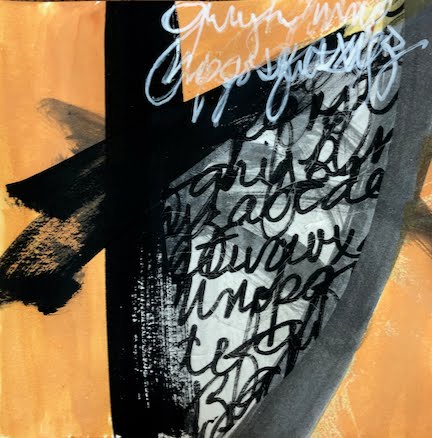
We began by making large gestural paintings, on cheap 18" x 24" paper, using only black and white materials: paint, ink, crayon, marker, pencil, charcoal, etc. I spattered paint with a toothbrush, improvised paintbrushes from combs and sticks, dripped and drizzled. The idea was to ignore composition. Later, we would be selecting "interesting areas" to cut out and develop.


Somehow, when I am told to do this kind of thing, I begin to work very fast. The result was six large, indistinguishable messes: minestrone soup.

I am so glad that I tossed these six and began again, slowing down and becoming more deliberate, more thoughtful, just as the instructor was in her demo video, creating "areas of interest."


The 8 successful candidates

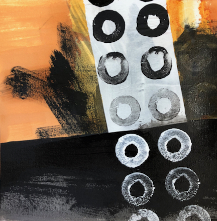
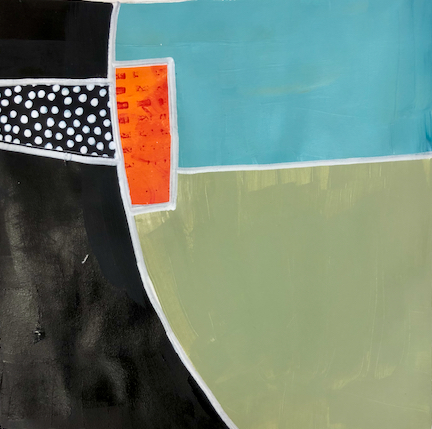
This time, I had no trouble isolating eight mini-compositions to develop further, from four large sheets. One of the key things was to keep distinct areas of dark and light. After gluing them down on larger,  better-quality paper, I began to develop each one in turn, extending shapes, adding shape and line. And I have another eight mini's that are also candidates as "starts".

The 8 runners-up

Here are some of the results. I don't see any of these as finished pieces, but rather exercises in composition, creating variety and interesting shapes and lines.


To prepare for Lesson 5, we were asked to paint a random shape/line with black paint on small (7" x 7") squares, and then to augment that with a "wash" of black paint. These will be developed later.


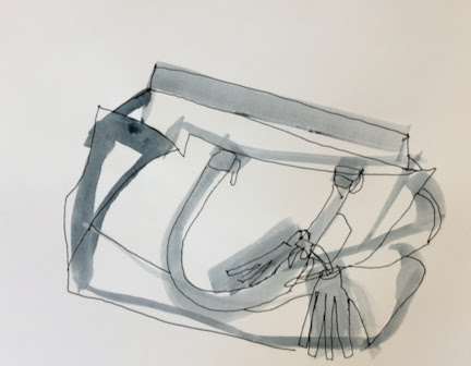
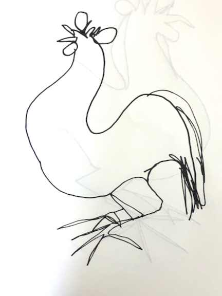
The final part of Lesson 4 was to make a rough contour drawing of an object, using a black wash and a big brush. As a second layer, we were to do a quick contour drawing of the same object on top of the wash study, either aligning the two studies or offsetting them.

I was unhappy with my first efforts. There was no energy to them. They were more like drawings that had been filled in with wash, like a child's colouring within the lines.


Blah

So I took a looser approach and repeated the exercise, disregarding the matching of the two sketches and going for something of an offset effect.


more lively, more interesting

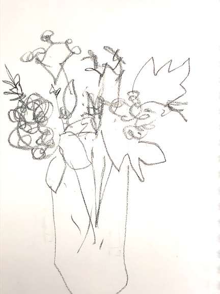
Could still stand to loosen up a bit more. Perhaps a floral arrangement, a more organic subject?

I'm beginning to see how having a regular sketchbook practice would be a good way to generate ideas for further development.

Wednesday, July 15, 2020

Sketchbook Explorations, Part 4


The opening exercises in Lesson 3 of Jane Davies' on-line workshop focus on shape and line together.


We began by applying water to paper, and then adding drops of ink to create random shapes. We could manipulate these shapes by tilting the paper, allowing the ink to run amok. We could lighten the results by applying a paper towel to areas where the ink had pooled, lifting some of the ink. I also spritzed water onto the paper, to encourage more randomness in the results.


Once these papers had dried, we added line, using a variety of materials (graphite pencil, charcoal, paint marker, conté crayon). Sometimes the line might outline the shape; at other times it might ignore the shape. It could be a languid line or one full of energy, scribbled or precise, confident or hesitant. The lines could be separate from each other, or echo each other, or intersect.


I think the whole exercise is about honing our observational skills (how does this line relate to this shape?) as well as encouraging a variety of line.


Our next assignment began by laying down a wash of colour to make some backgrounds.  (We had the option of using an unpainted background.) Then, we used paint to make a solid shape of any size. Next, we added a collage shape, and finally we added a third shape, using only its outline.


Some of the shapes could extend beyond the edge of the paper. Shapes could touch each other, or overlap each other, or remain separate.


We were to notice the edges of the shapes: were they soft, or brushy, or hard? Cut or torn?


Also to be noticed: rectilinear shapes vs. curving shapes...


... relative size of the shapes...


... alignment of shapes...


... busy areas vs. quieter areas...


... shapes inside shapes.


Again, these are exercises in observation, and noting all the ways of achieving variety. Even with the constraints, I'm beginning to think about composition. What do I find interesting? Why?

Continuing along with the line/shape dynamic, we made mini-compositions that conformed to our own parameters. For example, I chose to work with two shapes and one line.


It's not always clear to me whether a line functions as a line or as the outline of a shape.

Next, we were to return to some timed contour drawing that we had made in a previous exercise, and add "something" to them. Shown below are the original 60-second drawings, and the "something extra" added to them.


The teapot was painted white and a multi-coloured wash
was added to the background. (Paper wrinkled.)


Collage and watercolour were added.


This drawing has the same subject as
the one above, but was done with conté crayon,
and was left "unimproved."


The still-life sketch above was transformed
with the addition of oil pastel.


Collage and paint were added to the sketch.


Watercolour was added.

The final exercise of this Lesson 3 was to use black paint to draw the negative space in a still-life arrangement. In other words, don't outline your subject, but just go in there with your brush and paint what you discern to be the spaces between the shapes.


I like the fresh effect I can get by doing a 60-second drawing. There is often a charming, naive, and lively quality to a timed drawing.