Showing posts with label reflections. Show all posts

Wednesday, June 3, 2020

An artist for the COVID-19 era?

Cape Cod Morning, Edward Hopper, 1950
In the June 8 issue of The New Yorker, Peter Schjeldahl writes about a show currently running at the Beyeler Foundation, Switzerland's premier museum of modern art, outside Basel. The show is called "Edward Hopper: A Fresh Look at Landscape".

Schjeldahl's article is titled "Apart: Edward Hopper's Solitude". The writer suggests that Hopper, "the visual bard of American solitude ...  speaks to our isolated states these days with fortuitous poignance."

After making comparisons between Hopper's paintings and Hitchcock's cinematography, and after discussing the dynamic of Hopper's marriage to artist Josephine Nivison, Schjeldahl concludes that Hopper explores "a condition in which, by being separate, we belong together."

A similarly perceptive article on the subject by Jonathon Keats, "Life Under Lockdown Resembled an Edward Hopper Painting – and a New Hopper Retrospective Offers a Picture of Our Future" appears in this month's Forbes magazine.

Keats begins his piece by quoting a tweet from the writer Michael Tisserand, dating back to the middle of March: "We're all Edward Hopper paintings now." Writes Keats,
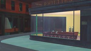
Tisserand's words struck a chord. Within a couple of weeks, his tweet had garnered more than two hundred thousand likes. People responded by posting coronavirus-inspired parodies of Nighthawks, showing the diner completely vacant. There were even articles in The Guardian and ArtNews debating whether Tisserand was right."
What do you think? Could it be that Edward Hopper (1882-1967) is in fact the artist for our time?

Parody of Hopper's Nighthawks, artist unknown

Wednesday, January 22, 2020

Why the Art World is Embracing Craft: Artsy

Thank you to Michele for bringing this recent Artsy post to my attention. Readers should be able to access it here.

The author, Glenn Adamson, celebrates a renewed interest in craft as art, evidenced by several major museum shows and by rising sale prices for craft-based art.

Anni Albers, Black White Yellow, 1926
included in her retrospective show at Tate Modern, 2018-19

He proposes that bringing craft "into the circle" is a way of ensuring the inclusion of women and non-Western artists.
"Craft is also a rich tapestry of ethnic diversity, having been practiced expertly by people of all nations and regions for millennia. You can make a strong case that the long-standing marginalization of the crafts—and the self-evidently crazy idea that painting isn’t one—was just the art world’s way of practicing sexism and racism, barely disguised as a policing of disciplines rather than people."

an installation photo from "Taking a Thread for a Walk",
a show organized for the re-opening of MOMA, and continuing until April 19, 2020

He also suggests that the embrace of handwork reflects our hunger for "materiality" in an increasingly virtual world.
"At a time when our collective attention is dangerously adrift, trapped in the freefall of our social-media feeds and snared in a pit of fake facts, handwork provides a firm anchor. It cannot be spun. It gives us something to believe in."
I expect to visit the MOMA show before it closes, and will share the experience by posting here.

Sunday, September 22, 2019

New work

Many deadlines and calls for entry are crowding my calendar. The time has come to pull out the "starts" and massage them into something I can be happy with.


untitled 1, 16 x 16, collage/paint

A workshop in August with Jane Davies gave me some insight into process. Jane warned the participants not to expect to go home with finished work. We were to consider everything we did to be a "start". Jane counselled us to work with multiple pieces at once, to do one or two things to each piece in rotation, and then to move on. In this way, we could perhaps avoid getting "stuck".

When you think about it, you don't want to practice "getting stuck". Rather like spinning your wheels when your tires are deep in the mud, perseverating in the stuck position just reinforces those pathways in the brain, and leads to frustration / avoidance / grief in the studio.

I've heard similar advice given to writers who are struggling to complete a particular piece of writing:  put aside the task that is not flowing and tackle something else. If the novel isn't going anywhere, write a magazine article or a book review. Then return to the problematic project with a renewed perspective.


untitled 2, 16 x 16, collage/paint

Having come to art through fibre, I am very much a "planner". With my cityscapes, I begin with my photo, which becomes a drawing. I choose a palette of colour to work with and proceed from there. Perhaps a few tweaks with dark/light relationships, elimination of some detail, and the outcome is very much determined from the start. Not much opportunity for "happy accidents".

Painting and collage is, for me, a very different process. Obliteration is a tool available to the painter that is not readily at hand to the textile artist.

Two shows coming up next month, and these two recent pieces will be submitted to one of them. 

Wednesday, April 17, 2019

The Way We Talk About Art Shouldn't Be Impossible to Understand

Are you often stymied by Art-Speak, the gobbledygook that purports to explain a particular work of art?

Here's a great article on the subject, written by Jackson Arne and published last year on artsy.net:

https://www.artsy.net/article/artsy-editorial-way-talk-art-impossible-understand?fbclid=IwAR1WwlDxeuMvnSL5GJOweWkJNRxbDrrm-QDf8lGnY1p28RxG7OgAiC2nQok

Sunday, March 17, 2019

The Artificial Divide between Fine Art and Textiles is a Gendered Issue

Thank you to Dianne, who sent along this link to an article from Frieze, a contemporary art magazine published eight times a year from London.

Bayeux tapestry

The article was published as a response to the recent Anni Albers exhibition at Tate Modern, which ended in January.

Written by Amber Butchart, it notes the resurgence of interest in textile art, and explores the artificial divide between fine art and textiles. Medieval embroidery was prized around the world, but it was during the Renaissance that "fine art", with its masculine associations, became more valued, and this separation was accelerated by the academies.

Well worth reading, the article explores the marginalization of needlework while referencing the Bayeux tapestry, the non-European tradition of stitching, and Judy Chicago's The Dinner Party.

Wednesday, September 12, 2018

"Why I Did Not See the Picasso Exhibit at the Tate Modern"

Thought-provoking article at Hyperallergic, written by Ksenia Soboleva. Thank you, Colleen, for sharing it.


For a more conventional (5-star) review of the show, titled "Picasso 1932: Love, Fame, Tragedy", visit The Guardian here.  Having read this review, I am convinced I would have jumped at the chance to see the show at Tate Modern, political correctness cast aside. Alas, the exhibition has ended.

Sunday, June 3, 2018

Saying yes to something new

Green Bowl, Deborah Boschert

Deborah Boschert is a quilt artist whose work I admire. She is also the producer of a series of web conversations on the topic of Visual Design, as part of SAQA Seminar 2018.

She has asked me to engage in a 20-minute video chat about the Principles of Design, and of course I said yes to her proposal, though not without some trepidation.


An Unlikely Confluence of Events,
one of a series of 13, hand-dyed linen, 24 x 24, 2017

But saying yes to new experiences is part of what keeps us growing as artists, isn't it?

one of a small series In Blue and Orange,
cloth and paint, 24 x 24, 2017

Ironically, much of the conversation will probably refer to my Cityscapes. Even though I haven't made one for a couple of years now, and have been dabbling with other series and other media, it seems they are still well-received, and still opening doors to new opportunities.


Dix / Ten,
one in a series of 30, acrylic collage,  20 x 20, 2016

I will be sure to post here about the experience later this summer.

Wednesday, May 16, 2018

Mother's Day Reflections

Mother's Day was just a few days ago, and I was reminded of a small art quilt I once made as my contribution to a group challenge. 12 by the Dozen, a group I belonged to at the time, had chosen "Connections" as the theme for that quarter.

Knitted. Together. 2010, 12" x 12"

I thought about how knitted stitches are "connections", and how knitting has connected at least four generations of women in my family. My grandmother taught me to knit, and she and my mother made me many knitted items: sweaters, slippers, and a spectacular (now long-gone) poncho. I've taught my daughter to knit too, and she makes the most remarkable things, like baby blankets made of tiny stuffed hexagons, stitched together.

I began the piece by knitting a 14" square with big needles and string. I stretched it out onto a stiff cardboard, dabbed it with paint, and made a monoprint of the texture onto hand-dyed cotton.  This became the background for the composition. Also included was a Beehive pattern for a child's sweater, and the accompanying illustration. The little sweaters were originally printed in black and white, so I tinted them with paint. Buttons and a corded yarn edging finished the piece.

Four generations, knitted together. And lots of tiny baby sweaters, lovingly tucked away in tissue paper.

Sunday, April 8, 2018

Guns: A Loaded Conversation

I am a juried artist member of Studio Art Quilt Associates (SAQA), a group of more than 3000 that promotes the art quilt worldwide.

SAQA has recently put together a curated show of 33 art quilts on the subject of guns. This timely and powerful exhibition opens in San José, California on April 22, 2018.

A slideshow of the 33 works is available here. Click on any one of the works to see it more closely. A written artist statement and an audio clip narrated by the artist are also available.

137 Bullets,  Diane K. Bird, 41 x 43 inches
"Timothy Russell and Malissa Williams lost their lives on November 29, 2012. Russell sped away from a Cleveland police officer who had attempted to pull him over for a traffic violation. The ensuing chase ended in a school parking lot, where police officers shot 137 bullets at the pair trapped in the car. They claimed gunfire emanated from the car, but no gun was ever found. Malissa was shot 24 times and Timothy was shot 23 times. Their humanity was erased with the shooting. My quilt tabulates the bullet count that took their lives."

Sunday, February 4, 2018

Don't Tell Ken Burns Quilts are Quaint


A recent article in The New York Times is part of an ongoing series in their Art & Design section, called Show Us Your Wall.

The article coincides with a newly-opened show at the International Quilt Study Center & Museum in Lincoln, Nebraska, titled Uncovered: The Ken Burns Collection.


The International Quilt Study Center & Museum is located on the University of Nebraska - Lincoln's East Campus and houses the largest publicly held quilt collection in the world.

Here's a powerful quote from Burns about his relationship with the antique American quilt:
"As a collector, I'm looking for something that reflects my country back at me. Quilts rearrange my molecules when I look at them. There's an enormous satisfaction in having them close by. I'm not a materialist. There are too many things in the world, and we know that the best things in life aren't things. Yet there are a few things that remind me of the bigger picture.
"We live in a rational world. One and one always equals two. That's okay, but we actually want—in our faith, in our families, in our friendships, in our love, in our art—for one and one to equal three.
"And quilts do that for me."
—Ken Burns

Sunday, December 24, 2017

Happy Christmas!

To express the pleasures of the season, I look back and reflect on the wonderful exhibition of John Little paintings, held at Montreal's Galérie Eric Klinkhoff this fall.


Rue Scott, Quebec, John Little, 1967

John Little had a way of making our mundane and slushy winter streets lyrical.

And so I wish you contentment in the small and ordinary things at Christmas, and throughout the year.


Wednesday, October 18, 2017

600 posts!


Quite amazes me to realize that this marks my 600th blog post!

My blog serves as a journal for me. Sometimes writing a post about an experience requires me to dig a little deeper into a subject. And the blog allows me to connect with friends near and far. I also enjoy reading your comments, and appreciate your taking the time to respond.

What's in the future? Travel experiences, new work, art shows, museums, local events, books, films: in other words, more of the same. Please join me on the journey!

Sunday, March 19, 2017

Five years of blogging!


Wow! Last week marked the fifth anniversary of this blog. It has been rewarding to have conversations with my readers, often in person. Writing these posts helps to clarify my thinking, set goals, and share news of resources and art events, near and far.  And, of course, to share my own work and inspiration.

Almost without fail, I have been in the habit of posting twice a week. (This is post # 539. Can you believe it?) I may cut back on that a bit to allow more time for, um, making art.

Meanwhile, thank you for reading. And here is a little treat that will, I hope, brighten the day of any art-lover. Thank you, Jane, for passing this on.


Sunday, February 5, 2017

"The Painted Word", by Tom Wolfe

The Connoisseur, Norman Rockwell, 1962

"If you have ever stared uncomprehendingly at an abstract painting that admired critics have said you ought to dig, take heart. Tom Wolfe...is on your side. [The Painted Word] may enrage you. It may confirm your darkest suspicions about Modern Art. In any case, it will amuse you."  - The New York Sunday News
"The Painted Word may well be Tom Wolfe's most successful piece of social criticism to date.   - The New York Times
"The Painted Word is a masterpiece. No one in the art world... could fail to recognize its essential truth. I read it four times, each of them with mounting envy for Wolfe's eye, ear, and surgical skill."  -The Washington Post
One of my favourite books of all time is Tom Wolfe's Bonfire of the Vanities (1987) so when this book was recommended to me, it was hard to resist. Published in 1975, it was written just a year after I graduated in Fine Arts. Forty-two years ago. (sigh) It speaks to the state of art at that time, and helps me better understand some of the confusion and conflicts I experienced as a young art graduate.

The focus of The Painted Word is the New York art scene, familiar territory for the author, but his analysis holds for the entire network of North American / European art hubs. Wolfe begins by explaining how the art of the early 1900's was a reaction to "literary art". Think of the iconic paintings of the 19th century, for example, so many of which allow the viewer to read them as a story.


The Raft of the Medusa, Géricault, 1819
(Romanticism)

The Hay Wain, Constable, 1821
(Romanticism)

The Stone Breakers, Gustave Courbet, 1849
(Realist School)

Luncheon of the Boating Party, Renoir, 1881
(Impressionism)

With the beginning of the Modern movement, around 1900, Wolfe explains,
"Literary became a code word for all that seemed hopelessly retrograde about realistic art.... The idea was that half the power of a realistic painting comes not from the artist but from the sentiments the viewer hauls along to it, like so much mental baggage."
What was the opposite of literary painting?
"Why, l'art pour l'art, form for the sake of form, colour for the sake of colour. In Europe before 1914, artists invented Modern styles with fanatic energy – Fauvism, Futurism, Cubism, Expressionism, Orphism, Suprematism, Vorticism – but everybody shared the same premise: henceforth, one doesn't paint 'about anything, my dear aunt,' to borrow a line from a famous Punch cartoon. One just paints. Art should no longer be a mirror held up to man or nature. A painting should compel the viewer to see it for what it is: a certain arrangement of colours and forms on a canvas."
Allow for a decade or two for the culturati to adopt and champion abstraction. Watch how their tastes evolve in an endless search to distinguish themselves from the bourgeoisie. Factor in a decade or so of strongly leftist politics, which resulted in the 1930's era of Social Realism in art, and make allowances for two world wars. Add in the influence of art theorists like Clement Greenberg and Harold Rosenberg and observe the dance between them, the bohemian artists and le monde.


Lavender Mist, Jackson Pollack, 1950

What do you get? Abstract Expressionism. Whereas with the realistic art of earlier eras, it was a case of "seeing is believing", the new experience is one of "believing is seeing". Viewers of art could only hope to understand abstract expressionism by having it explained to them by art theory, the theory of "the integral plane", of "flatness". And few were buying it. Writes Wolfe,
"First you do everything possible to make sure your world is antibourgeois, that it defies bourgeois tastes, that it mystifies the mob, the public, that it outdistances the insensible middle-class multitudes by light years of subtlety and intellect – and then, having succeeded admirably, you ask with a sense of See-what-I-mean? outrage: look, they don't even buy our products!"
So what direction could the art scene possibly take after Abstract Expressionism? Pop Art was the next Big Thing, rejuvenating the New York art scene. The flatness that was so sought after in abstract expressionism came naturally to the flags of Jasper Johns, the comic strips of Roy Lichtenstein, and the silkscreen posters of Andy Warhol. The art theorists agreed that these were not literary, that they were symbols; not representations, but "sign systems".

Flag, Jasper Johns, 1955
(Pop Art)

In the Car, Roy Lichtenstein, 1963
(Pop Art)

Campbell's Soup Cans, Andy Warhol, 1962
(Pop Art)

The culturati quickly cycled through Op Art, Colour Field, Minimalism, and Conceptualism.
"How religiously we've cut away the fat! In the beginning we got rid of nineteenth-century storybook realism. Then we got rid of representational objects. Then we got rid of the third dimension altogether and got really flat (Abstract Expressionism). Then we got rid of airiness, brushstrokes, most of the paint, and the last viruses of drawing and complicated designs (Hard Edge, Colour Field, Washington School).
"Enough? Hardly, said the Minimalists, who began to come into their own about 1965."
Further reductions ensued. Frames? Canvas? The wall? The gallery or museum? The idea of a permanent work of art? Even a visible work of art?
"So it was that in April of 1970 an artist named Lawrence Weiner typed up a work of art that appeared in Arts Magazine – as a work of art – with no visual experience before or after whatsoever, and to wit:
1. The artist may construct the piece
2. The piece may be fabricated
3. The piece need not be built
Each being equal and consistent with the intent of the artist the decision as to condition rests with the receiver upon the occasion of receivership."
And here Tom Wolfe sums up the whole business in his inimitable style:
"And there, at last, it was! No more realism, no more representational objects, no more lines, colours, forms, and contours, no more pigments, no more brushstrokes, no more evocations, no more frames, walls, galleries, museums, no more gnawing at the tortured face of the god Flatness, no more audience required, just a "receiver" that may or may not be a person or may or may not be there at all, no more ego projected, just "the artist", in the third person, who may be anyone or no one at all, for nothing is demanded of him, nothing at all, not even existence, for that got lost in the subjunctive mode – and in that moment of absolutely dispassionate abdication, of insouciant withering away, Art made its final flight, climbed higher and higher in an ever-decreasing tighter-turning spiral until, with one last erg of freedom, one last dendritic synapse, it disappeared up its own fundamental aperture... and came out the other side as Art Theory!... Art Theory pure and simple, words on a page, literature undefiled by vision, flat, flatter, Flattest, a vision invisible, even ineffable, as ineffable as the Angels and the Universal Souls." 

Telephone Booths, Richard Estes, 1968
(Photo-Realism)

In the book's epilogue, Wolfe discusses the return to realism, including Photo-Realism, which became a hot seller in the 70's as a reaction to all that had preceded it. (The art-buying class must have its meat.) Photo-Realism gives me vertigo.


Orange and Yellow, Mark Rothko, 1956
(Colour Field)

As for me, I'm an old-fashioned sort. Colour and form do it for me. Give me a brushy Rothko or the push-and-pull of a Hans Hofmann any day.


Yellow Burst, Hans Hofmann, 1956
(Abstract Expressionism)

Sunday, December 25, 2016

Happy Christmas!

John Henry Twachtman, (1853 - 1902), Winter, oil on canvas, undated,
from The Phillips Collection, Washington DC

Best wishes of the season to everyone.

May the year to come bring peace, love and joy to us all.

Sunday, November 20, 2016

Judith Scott @ World of Threads

Judith Scott show at Oakville Galleries, Centennial Square

Recently I had the good fortune to visit the World of Threads, a biennial celebration of fibre art staged in the Oakville area, just west of Toronto. Imagine: 315 artworks by 134 artists from 24 countries, all available for viewing until November 27, 2016.


One of the shows organized as part of the festival is dedicated to the work of Judith Scott, whose fibre sculptures form an interesting counterpoint to the Sheila Hicks exhibition that I posted about earlier this week.


Judith Scott (1943-2005) was deaf and born with Down syndrome. She was institutionalized for 35 years, until her twin sister became her guardian and introduced her to the Creative Growth Art Center in Oakland, California. There, Scott went on to produce a complex, far-reaching and masterful body of work in the 18 years that followed until her death. Four films have been produced about her life, and her sister has recently published a biography of her twin.


The curator's notes read, in part,
"Developing a broad spectrum of forms from the sparest of materials, late American artist Judith Scott ... is best known for her dynamic, strikingly original mixed media works. Enveloping found objects - from wood, jewelry and magazines to bicycle wheels and plastic tubing - in yarn, thread and knotted cloth, Scott's works take shape as dense, often cocoon-like structures notable for their canny approach to colour, texture and form."


Of the 30 or 40 pieces on display, no two are alike. The show itself is comparable to others I have seen in the medium, given the complexity, innovation and intentionality of the works.  Fascinating questions are raised by this exhibit about the creative capacity of the intellectually disabled, and about the whole concept of "outsider art".

Wednesday, July 13, 2016

Art? Or Craft?

Angela Teng, Jump Start, 2016. Crocheted acrylic paint on aluminum panel, 24 x 18 in.
Angela Teng is one of fifteen finalists in the RBC Canadian Painting Competition. Her work explores the relationship between art and craft, which I always find interesting. Prize winners will be announced September 20, 2016.

To quote from the magazine Canadian Art, 

"Angela Teng has gained attention in the Canadian art realm—and should garner yet more—for her unique approach to the materials and practices of painting. Most notably, Teng crochets “canvases” out of strings of dried paint, inverting expectations around fine art and fine craft. Based in Vancouver, Teng was born in Victoria in 1979 and studied art at Camosun College and Emily Carr University, graduating from the latter in 2011. She is due to have a solo show at Vancouver’s Equinox Gallery later this year, and she has also exhibited at Mixed Greens in New York and Wil Aballe Art Projects in Vancouver, among other venues."
Now, if Teng had used yarn in the same way, and applied it to an aluminum panel, would it still be considered fine art? Is there something inherently superior about using paint for the crocheted rectangle? Intriguing questions are raised by this "painting", don't you think?

Sunday, May 29, 2016

"Through the Prism of Gender"

A thought-provoking piece in the New York Times about women in art caught my attention last month. You can read the whole article on-line. Written by Hilarie M. Sheets, it begins,
"At the peak of her career in 1976, Georgia O'Keeffe refused to lend her work to a pivotal exhibition in Los Angeles, 'Women Artists: 1550 to 1950'. It was one of a wave of all-female shows - some 150 - that decade to spotlight artists largely ignored by major museums and galleries. But O'Keeffe, the most famous female artist of her day, saw herself in a different category - 'one of the best painters,' period.

Georgia O'Keeffe

"The feminist art historian Linda Nochlin borrowed an O'Keeffe painting elsewhere and put her in the show anyway. Yet despite these exhibitions, neither O'Keeffe nor any other woman would break into "Janson's History of Art," the leading textbook, until 1987, and equality remained elusive. 
"While some artists are ambivalent about being viewed through the lens of gender, the all-women's group show, which fell out of favor in the '80s and '90s, is flourishing again...." 

The article goes on to list a number of current shows focusing on the work of women, which are seen by some as a corrective measure, making up for centuries of being overlooked by the mainstream. Also discussed is the price gap: good art by women is relatively under-priced, and so considered to be a buying opportunity.

Currently, the Montreal Museum of Fine Art is running "Her Story Today", focusing on the work of six contemporary painters, all women, from Quebec and Canada.

The issue of ghettoization is raised in the article, and parallels are drawn to shows that focus on African-American art. Washington DC is home to both the National Museum of Women in the Arts and the National Museum of African American History and Culture, part of the Smithsonian.

I think that the public financing of these gender- or minority-specific museums is justified by the lack of representation in the mainstream. If women taxpayers are required to fund institutions which allow them less than ten percent of the floorspace, why should there not be a remedial "catching-up"? Those who argue that the quality of the art on display should trump issues of equal representation might reflect on the degree to which cultural bias determines our ideas of "quality".  The article in the New York Times quotes Janice Sands, the executive director of Pen and Brush, a 122-year-old nonprofit New York gallery that showcases only work by emerging female artists and writers:
"Our conclusion is that showing work by women exclusively is a way to get right at the heart of the stereotype that there's just not enough good work by women. People come into our gallery where there is no obvious indication that all the work is by women. They read the information cards. They're surprised. They buy."
It is to be hoped that with curators more conscious than ever about inclusion of minorities in their shows and collections, corrective measures will some day not be necessary. Parallels can be drawn to "affirmative action", a similarly controversial topic.

Tendency, Lorraine Pritchard

One woman painter who has recently caught my eye is Montrealer Lorraine Pritchard.  I want to learn more about her, not because she's a woman but because I really like her take on abstract expressionism.

Wednesday, May 25, 2016

More colour studies

colour study, 10 x 10

On April 30, I posted images of small "colour field paintings", from the final assignment in my on-line colour class. I've become quite addicted to making these little studies, and have decided to show some of them at the upcoming spring show for the Hudson Artists. I think twelve will make an interesting display when grouped together.


colour study, 10 x 10

Each one is acrylic paint on paper. The paint, both transparent and opaque, is applied in layers until some depth and interest is achieved. The paper is then mounted to a birch board, the edge of which is painted black. This is an inexpensive mounting that gives the work a "presence" on the wall, and helps flatten the paper.


colour studies, mounted

When I met with my group of text'art friends a couple of weeks ago, we all had fun putting together little swatches of colour to make three-colour collages. We looked for colours and proportions that had some "zing". In my childhood, people would have said that the colours "clashed". Does anyone say that anymore?


mini-collages, about 3" x 2.5"

I can still clearly remember being told by my home economics teacher in grade 7 that "Blue and green should never be seen together except in the washing machine." And I also recall people lamenting the choice of green shingles on a roof, as it would "clash" with the blue sky. Oddly, no one ever seemed to consider how green trees looked against the sky. I guess they weren't fans of the Fauves.

So, what am I learning from these little studies?

I realize I can use hand-dyed cloth to achieve this depth of colour. But working with cloth, piecing it together or collaging it into place, would create hard edges, and I much prefer the soft, modulated edges one can achieve with paint. So, do I just paint on cloth to get those soft edges? To be resolved.... 

Wednesday, February 10, 2016

Self-Portraits with Alzheimer's

When he was diagnosed with Alzheimer's at the age of 62, the American painter William Utermohlen (1933-2007) began a haunting series of self-portraits that documented his experience with the disease. “From that moment on, he began to try to understand it by painting himself,” said his wife, Patricia Utermohlen, a professor of art history. She noted with some poignancy that he became better known for this series than for any other work he had done, even at the height of his career.


Utermohlen painted realistically when everyone else was doing Abstract Expressionism. Yet, as his disease progressed, his images became distorted until his features melted into an indistinguishable mass.

There is some debate as to whether the change was a result of Utermohlen's cognitive decline, or whether he chose to paint in a more expressionistic style to convey the sense of disintegration he experienced. In his final years, he no longer painted at all. 

Dr. Bruce Miller, a neurologist at the University of California, San Francisco, who studies artistic creativity in people with brain diseases, believes that some patients can still produce powerful work. "Alzheimer's affects the right parietal lobe in particular, which is important for visualizing something internally and putting it onto a canvas," Dr. Miller said. "The art becomes more abstract, the images are blurrier and vague, more surrealistic. Sometimes there's use of beautiful, subtle colour." 

Utermohlen's moving portraits continue to be exhibited, most recently at Wesleyan University in Bloomington, Illinois; Loyola University in Chicago; and Trinity College Dublin.


(This post is based on an article from The New York Times. Thank you to James Gurney for bringing it to my attention.)