You can read about my experience with this class by doing a search for "100 Drawings" on this blog (see search box on the right-->).
The final assignment, Lesson 10, was unique. We were required to devise our own "parameters", with Jane's advice and input.
Out of that experience, Jane came up with a brilliant idea. She offered graduates of the class the option of doing Lesson 10 eight more times. In other words, devise your own parameters for an exploration, submit it for approval, and then post ten paintings created using your own guidelines. Do this eight times, once every two weeks. And be prepared to comment on the work of the other participants. Of course Jane comments too, and offers suggestions and resources.
 |
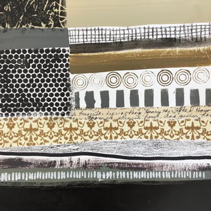
| #1 has the lightest values |
Because I had missed Lesson 7 the first time around, I decided that it would make a good re-entry plan. The assignment was to use horizontal stripes in a monochromatic colour scheme, and to demonstrate "unity" more than "variety". Many techniques and materials were permitted: collage, paint, and crayon. Pattern could be introduced with stamping, stencilling, and scribbling.
 |
| #2 has the darkest values. It began as a black background |
So I embarked on this lesson, changing only one thing. Rather than working with a monochromatic colour scheme, I chose to use neutral colours (black, white, grey, buff, taupe, brown, etc.)
 |
| #3 has very darks and very lights, but not much in the mid-range of value. |
 |
| #4 has a full range of values, and hints of muted colours like celadon, olive, raw umber, burnt sienna |
 |
| #5 has a full range of values, and touches of raw umber |
 |
| #6 has mostly lights and mediums, but suggests some colour: celadon, burnt sienna, and violet |
 |
| #7 began with a bright yellow background. My intention was to allow a tiny bit of yellow to peek through the stripes, but somehow it got away from me. |
 |
| Likewise #8 began as a red background, and would have benefited from more stripe, less red |
 |
| #9 relies on dry-brushing for texture, rather than patterning, as does #10. It began as a background of burnt umber. |
 |
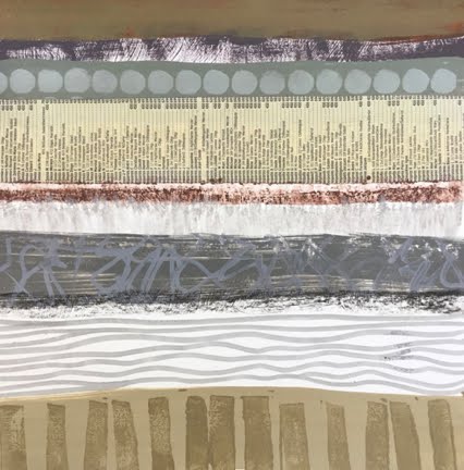
| #10, like #9, has a landscape quality. They seem to have more depth than the first eight, which were flattened by the patterning. It began as a background of neutral grey. |
The original assignment described the patterning as "tone on tone", more subtle than the patterns I employed here. As I worked on these, I thought about range of value, range of "chroma", unity and variety. I would say that the unity suffered from excess variety, but otherwise neutral stripes could have been deadly boring. I also noticed how a colour that looks neutral on the palette can appear to be quite colourful next to duller hues. For example, the yellow in #9 and #10 looked like putty on the white palette.
All these measure 9" x 9", or 10" x 10".
Do you have a favourite? Can you guess which one the instructor preferred? And what parameters should I set for myself next week? If you scroll wa-a-a-ay down, you can find out which one Jane Davies liked best.
The first one! And my daughter has already claimed it.
The first one! And my daughter has already claimed it.
2 comments:
I confess I like the last two the best. Probably comes from living over a decade on the prairies (out of the city). The one looks like a storm rolling in, with canola in the foreground; the other, power lines over a stretch of field or roadway...just very prairie-like!
I agree, Margaret, that these last two can be seen as "landscapey". They seem to have a bit of depth and mystery, especially compared to the more patterned ones.
Post a Comment