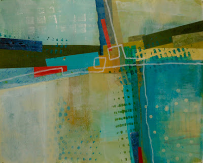
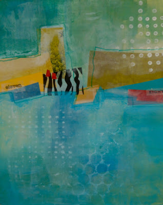
For our sixth and final week in Keys to Dynamic Composition, Jane Davies had us experiment with different ways to create transparency, and encouraged us to contrast it with opacity, to create depth. Because I don't usually work with paint, this was all new to me. Our assignment was to choose a format from an earlier lesson (grid, landscape, cruciform, floating grid) and bring together all that we had learned, including the use of texture, pattern, line and depth. All the pieces shown here are about 9" x 11".
My new favourite is the cruciform shape. Each quadrant is supposed to have a different shape and colour / value. It's not supposed to look like a "cross on a background": there should be ambiguity where positive space meets negative space. I hope to work with this format again, perhaps in cloth.
In the piece at left, I chose to work in a landscape format, adding texture and line to a collage. To create transparency, I blotted off paint with copy paper, dry-brushed, and used glazing medium mixed with paint. Most of the opacity comes from the collage elements.

Here's another landscape format. In the upper left corner, you may be able to see the scribble I scratched into gel medium, and then overlaid with paint. This piece was "worked" again and again. (Jane says we shouldn't use the term "re-worked", because it suggests correction. Layering, obliterating, layering again: all part of the process.)
Veiling with transparent white was also suggested by Jane as a way to create depth.
This one on the left, with the "floating grid" format, felt a bit scattered to me, but it was Jane's favourite. She liked the depth created in the central area and the strong focal point provided by the red and dark blue on the right. Not as "safe" or "balanced" as the others, she said.
This last one didn't use collage, only paint. I've always wanted to master an "illegible script" and this was my chance to invent one. It served as a good finishing touch.
All the paint colours in these four pieces were made from white, Phthalo Blue and Yellow Ochre.
How to create transparency/depth when working with cloth? Organza and tulle overlays? Painting onto cloth?
The class was a challenging but valuable introduction to a new medium. I'm enjoying this flirtation with abstraction, and I have enrolled in another Jane Davies course later in July, on the topic of colour.
Meanwhile, I plan to matte some of these up and offer them in the unframed bin at the upcoming Hudson Artists show, June 5 - 7.


6 comments:
I love what you've done Heather. The floating grid one is bit of an acknowledgement of your building theme.
Thank you, Dianne. I find the cruciform format resonates with me too. All that structure, intersection. Love it and want to take it home with me!
Thanks for sharing your experience in the Jane Davies class. I've learned a lot from following these posts. The work you've done for the class is beautiful - and so interesting!!
Thanks Kay! Jane is a good teacher, though I wish she would respond more promptly to the student posts. Her own work is very exciting, and it is all too easy to slip into mimicry mode. If you check out her website, you will see that she offers lots of intriguing workshops, most of which fill up very quickly.
Love these pieces and I can see how they would translate into cloth.
Thanks, Maggi. I've enjoyed my cityscapes series but this little fling with abstraction has been lots of fun.
Post a Comment