Part 1: Value scales with Transparent Paint
Our first project was to create value scales with transparent paints. For each colour, we made a scale of tints, first by thinning the paint with transparent glazing medium, and then by thinning it with opaque white paint.
I much preferred doing these colour studies with the white paint. The opacity made it easier for me to judge the value of the tints, and I didn't have to fuss with streaky brushstrokes.
Part 2: Monochrome Collage
Our next assignment was to make a simple collage using 5 or 6 shades of grey. Uncannily, this turned out to look like my finger placing bits of paper into a collage!
Then, I used five shades/tints of manganese blue to translate the design into a monochromatic colour scheme. By scanning the coloured collage and de-saturating the colour using photo software, I could determine how accurate my values were.
Similarly, I used five shades/tints of yellow-orange azo. When you darken yellows with black, they become greenish, and that's why some of these shades look like olive or brown.
I can see that the eye goes directly to the areas of highest value contrast. I prefer the third collage, perhaps because the vibrant orange adds an element missing from the blue and grey versions: warm - cool contrast?
Part 3: Collage Paintings
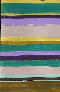
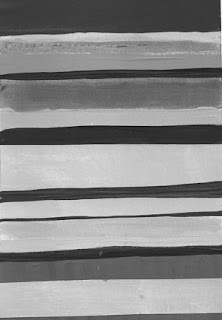
Our third assignment was to take 4 or 5 colours and use them, along with their tints and shades, to make some simple compositions in a stripe format. I used Dioxazine Purple, Cobalt Turquoise, Green-Gold and Raw Umber.
We were to evaluate them in their full-colour version and also in a de-saturated version, stripped of colour and down to value alone. Were they interesting in their original state? In their grey-scale version? How important is value contrast in making the composition work? Colours that are quite distinct in "hue" can be indistinct when de-saturated, because they are of equal value.
I understand that high value contrast adds drama and power to the image. But sometimes I want to enjoy the juxtaposition of two hues of similar value, say chartreuse and turquoise. There can be a lovely subtlety in those combinations. Still, checking the value contrast of any composition can be illuminating, and answer the question: "Why is this not working? How can I make it more exciting?"


No comments:
Post a Comment