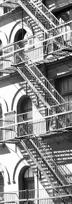
 I have signed up for a class at the Montreal Museum of Fine Arts, titled "Methods and Materials in Acrylic Painting". The instructor is Melanie Matthews, who is well-known in Montreal as a rep for Golden products. Her specialty is mixed-media: collage and painting.
 For the six weeks of the class, we will be working on three 12 x 12 panels. Our homework this week is to select a single black-and-white image that measures 37 x 13 in vertical or horizontal orientation. These dimensions require severe cropping of a standard-sized photo.
The idea is that the three panels will ultimately be hung together to display the full image. The extra inch in both directions is required for a half-inch overhang on the panel sides.
The photo is be printed out in mirror-image, full-size, at a specialty copy shop. As well, the image is to be 70% light and 30% dark. It should be "simple". And it will be the only image we work with for the full six weeks of the course, so it's important to like it!
Each successive week will be devoted to adding more layers to our panels. We have begun by sealing them and applying gesso. Next comes collage to add texture. Later it will be glazes of paint.
Above are the five images I am considering. I have tried to crop so that each panel is interesting in itself, and taken into account the negative spaces. I'm completely undecided at this point, and hope to get advice from the instructor about their suitability before going to the print shop. Any thoughts?


3 comments:
I much prefer the upper photo: I find it a much cleaner image, with the chimney pots more visible. The lower photo seems too cluttered, with windows, balconies, roof lines and antennae. Looking forward to sfollowing your posts and seeing what emerges!
I think # 4 is most interesting.
Melanie is a great teacher, I took her workshops some years back. I like the negative space in nr 4, It could be interesting in combination with the texture treatement on the panels. Looking forward to the finished tryptic!
Post a Comment