I took my cue from a recent blog post by Jane Davies, and tried to make interesting compositions in the complementary colours of blue and orange.

These all measure 10" x 10".
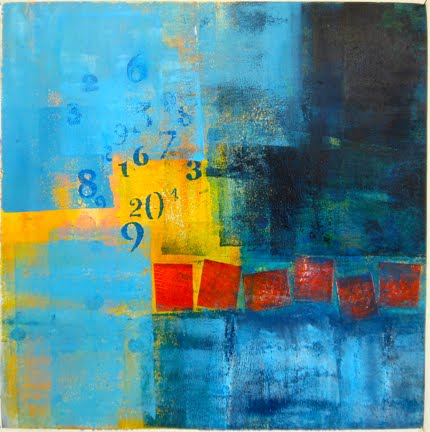
I used a variety of techniques for visual texture: stamping, stencilling, scratching, brayering and blotting with paint, as well as torn and cut collaged shapes. And I used several variations of the two main colours. Transparent paints (blue over orange or orange over blue) often produced a green hue, so I favoured opaque pigments. There's a little scribbling with oil pastel too.

I tried to use shapes in a variety of size: small, medium and large. Sometimes I employed hard edges, and at other times smudged edges. I tried to have some boring areas, and others more complicated. I also wanted to have some ambiguity about what was advancing and what was receding, that "push and pull" that Hans Hoffman achieved. If I could create a sense of depth, all the better.

I found the piece was more successful when one of the colours predominated over the other, rather than having a 50/50 distribution of the orange and blue hues. I also think it was useful to have each colour coalesce into an interesting shape, giving the composition some unity.

This assignment was challenging to me, but I persisted with it because I feel I have so much to learn. Instructors like Jane can make an exercise like this seem easy, but in fact it was quite a struggle. I'm still thinking of these as "works in progress". When I look at them again in a week or so, I may well make further adjustments.
No comments:
Post a Comment