The final part of Lesson 3 was quite structured and a bit intimidating. We were asked to begin by painting in a background of neutral colours, with very little range of value: either all lights or all darks. I decided to work with six 6" x 6" squares of paper, taped to a board. (I know, I know.... What kind of colour class is this? Where's the colour?)

We were then to choose a limited palette of analogous colours, and work with these colours in muted form. There was to be little value contrast. I chose yellow-orange, orange and orange-red, dulled down by adding neutrals, green, blue, and/or white. We were to use these colours to paint in a loose cruciform structure.
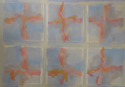

The next step was to add more collaged shapes, but now using the brightest versions of the colours.

Finally, we were to add a tiny accent of either a complementary colour (in this case turquoise or blue) or a dark. I had some printed deli papers on hand that I had prepared some time ago, stamped with black and white paint, and they proved to be just what I needed to add a bit of excitement. You can see the results below.
This exercise is a way of creating depth in your design. In nature, objects in the distance lose their colour saturation, becoming greyed. They also lose their detail. This activity capitalizes on this phenomenon, with softly blended neutral colours in the background, more defined but dull colours in the middle ground, bright colours in the foreground, and high contrast added as a top layer. Ingenious! This approach also creates quiet areas of subtly blended neutrals set off by vibrant areas of saturation and high value contrast. Yum!
The final results, below, were scanned rather than photographed to give a better idea of their true colours.
The final results, below, were scanned rather than photographed to give a better idea of their true colours.


I plan to mount these onto 6 x 6 canvases and hang them as a group of at least four.
4 comments:
You are going to have so much fun doing this sort of thing in fabric!
I can see this kind of composition in fabric and on a larger scale. I'm excited to be sampling this new direction.
I took a class from Jane in Vermont and really enjoyed it. This online class looks like a good learning experience. Thanks for sharing the lessons - I'll look into doing it in the future.
I'd love to take a live class with Jane. On the other hand, doing it on-line allows me more time to consider the assignment, and I find that helpful.
Post a Comment