Thursday, January 31, 2013

Montmartre #3

Montmartre #3

Here is my third Montmartre cityscape, based on a photo taken this fall. I have limited my palette to warm and cool neutrals, using the warm beiges for the sunny facades of the buildings, and the blue-greys for the shaded sides.

This is a new approach for me. I was inspired by a suggestion made in the on-line course I am currently taking, that shadow can be achieved by changing the colour, instead of simply darkening the colour chosen for the sunlit areas. It's another way to define the solid forms of the buildings. I was lucky to have a full range of hand-dyed neutrals on hand to work with.

Monday, January 28, 2013

Colour Finds

July in Vermont, Wolf Kahn, 2012


For the second week of my on-line course, we are asked to find artists who push the boundaries of colour. My first find is Vermont painter Wolf Kahn. If you just do a Google search for his images, you will be rewarded with bold and vibrant examples of unusual colour combinations. His work is carried in Montreal by Galerie de Bellefeuille, so I have been able to see his oils and pastels "eyes-on", and they are breathtaking.


Tropical Morning, Joen Wolfrom, 2006


My second find is Joen Wolfrom, quilt artist, teacher and author of several wonderful books on colour. Her website links to her colour blog with its in-depth discussions on the topic. Wolfrom's career has been built on the subject of colour, and she is recommended reading.


Spontaneous Combustion,
Helena Scheffer


My third find is my friend Helena Scheffer, whose work can be found at the Canadian Guild of Crafts in Montreal. Helena's abstracts are "colour explosions", made with small bits of brilliantly-coloured fabric, held in place under a layer of tulle and heavily stitched. She is a true colourist, and her work is well worth a look.


Does this mean I will be using bold hues for my class assignment this week? Probably not. In keeping with my recent cityscapes, I hope to explore the complementary qualities of warm and cool neutrals. While I love to see bold hues used skillfully, my preferred palette these days is more subdued. Let's see what I can do with the complexities of beige and grey!


Thursday, January 24, 2013

Quebec City: Monochrome

Here is an art quilt I have just completed, based on one of my photos taken in the Old Town of Quebec City. The Chateau Frontenac is seen in the background.

The piece was made as an assignment for a class I am currently taking. As part of our study of value (darks and lights), we made a range of hand-dyed cotton in "8 shades of grey" and then used them to make a  composition in cloth and stitch.

At 18" x 24", it fits in well with my Cityscapes series.


Sunday, January 20, 2013

Value: Black, White and Grey

I am taking an on-line course in dyeing with Elizabeth Barton, and our first lesson is on value: darks, lights and everything in between. We were asked to choose ten pieces of art that are mostly black, white and grey, and to analyze them in terms of structure. Where is the focal point? How is it created? How are the darks and lights organized to make an effective composition? Here are my choices:


1. "The Boulevard of Montmartre on a Winter Morning", Camille Pissarro, 1897
I love the way the rhythmic strokes of dark paint are used to depict the windows, carriages and trees lined along the boulevard, almost echoing the "clop, clop, clop" of the horses on the pavement. Large, dark masses on either side guide the viewer's eye down the lighter pavement of the road, towards a pale sky. Not strictly without colour, but a very minimal palette.


2. "Self-Portrait", Camille Pissarro, 1903

A very simple organization of two dark shapes that frame his face, set against a soft background much like his many paintings of the city.


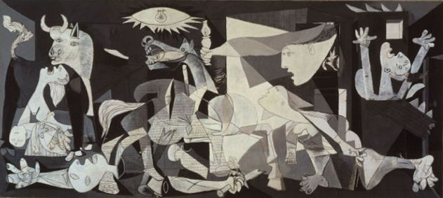
3. "Guernica", Pablo Picasso, 1937

It has no single focal point, and the eye jumps all over the canvas. Its visual disorganization conveys the chaos of war. A roughly triangular mountain of lighter values in the center stops the composition from spinning completely out of control.

I was lucky enough to see the current exhibition at the Guggenheim, Picasso: Black and White, which runs until January 23 and features about 100 of his works. If you go to the website
http://web.guggenheim.org/exhibitions/picasso/artworks you can see some of the pieces on display. Here is an excerpt from the website:

"Claiming that color weakens, Pablo Picasso purged it from his work in order to highlight the formal structure and autonomy of form inherent in his art. His repeated minimal palette correlates to his obsessive interest in line and form, drawing, and monochromatic and tonal values, while developing a complex language of pictorial and sculptural signs."

4. "Woman Ironing", Pablo Picasso, 1904

shows how areas of greater contrast are organized with vertical lines to convey the pressure the woman is applying as she irons. 


5. "Woman in White", Pablo Picasso, 1923

A much softer portrait, it was also featured in the show. The focal point is supported by using the greatest contrast of values, and the darkest values, around the subject's face. The softness of her rounded body is reinforced by the use of muted greys.


6. "Rainy Day Boston", Childe Hassam, 1885

The zigzag of dark shapes across the horizontal conveys the reflections of figures and buildings on wet pavement and organizes the composition.


7. "Across the Common on a Winter Evening", Childe Hassam, 1885-86

The canvas is bisected horizontally, with intrusions of black shapes on the lower, white foreground and of light shapes on the upper, dark background.


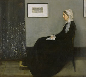
8. "Arrangement of Grey and Black No.1" (Whistler's Mother), James McNeill Whistler,  1871

Interesting that the area of highest contrast is a framed print on the wall, and not the subject itself. Other areas of high contrast are the subject's hands on her lap, and the lace around her collar against the black dress. The pattern on the curtains adds subtle texture, and the modulated warm grey background is very beautiful.


9. As a Quebecer, I have to include the paintings of Jean-Paul Lemieux. If you do a Google search for his images you will find many portraits of alienated figures set in the landscape, evoking memory and dream. He was influenced by French-Canadian folk art. One such example is "Evening Visitor", 1956.


10. Louise Lemieux Berubé is a Quebec artist who uses digital technology to make jacquard tapestries based on her photographs. At left is one of her works, "Un orteil dans le vide no2", 2011.

Because of the nature of jacquard weaving, she can produce many shades of grey by using only black and white thread, and changing the stitch on the loom. The backs of the pieces look like the negatives of the fronts. 

Sorry, but I just have to add one more, Gustave Caillebotte's "Rooftops in the Snow", 1878. Isn't it lovely? Strongest value contrasts in foreground and middle ground, softer contrasts in background, fading to a grey sky.  Love those spikey chimneys and mansard roofs.

Now to use some of these insights in my own work. I've started work on a Quebec City perspective with architecture in a similar style to this. 

Wednesday, January 16, 2013

Houses

There's something primal about the image of a house. Think of all those houses painted by children, with their crooked chimneys, their skewed windows and brightly-coloured walls. Think of gingerbread houses, dollhouses, and Lego houses, in all their infinite variety.


These houses were made by my children, many years ago, from scraps of wood. They look something like the boathouses from my last post. Every Christmas, we set them out on the mantel, and somehow they always add their warmth to the season.

Monday, January 14, 2013

Boathouses


My current preoccupation with architecture extends to boathouses. Last summer, while a guest at Dianne's cottage in the Eastern Townships, I stumbled upon a "village" of boathouses, surrounding a sheltered inlet and built on low-lying, inhospitable land.


What I enjoy about these structures is that they are both architectural and organic at the same time: architectural in the sense that they have been constructed, and organic in that they were improvised with leftovers, and placed to take advantage of any scrap of existing space, and that they show signs of weathering and disrepair.


They remind me of ancient cliffside dwellings, or shantytowns. Their bright colours give them a jaunty, whimsical look, like maritime buildings in Atlantic Canada.


Their skewed horizontals and verticals lend themselves to comical exaggeration.


Clearly they're all about function, not aesthetics. Yet you can also see pride in ownership.


Perhaps when the ice on our lake is more solid, I will take another look at the fishing shacks that populate our bay. They, or the boathouses, may well find a place in my Cityscapes series.

Thursday, January 10, 2013

Montmartre #2

Montmartre #2, 18" x 24"

I have made a companion piece to Montmartre #1, using a similar subdued palette. Again, this was based on a photo I took while travelling this fall. All the fabrics are hand-dyed. I am especially pleased with the sky fabric, made with low immersion dyeing. I posted about this process a couple of weeks ago. I find it interesting that when working with a subdued palette like this, the hints of hue in the neutrals become so evident. What would have been dismissed as "grey" becomes a very subtle blue-green, and what first looks like "beige" is now seen as a green-gold.

Original photo, Montmartre, October 2012

Saturday, January 5, 2013

Bernat Klein


One of the great things about holiday get-togethers with kith and kin is learning more about your family. This week my cousin mentioned a very distant family relationship with Bernat Klein, a top British textile designer, now aged 90. I have done a little on-line research and I am intrigued by what I have discovered.


Klein with his wife, Margaret Soper


Klein was born in Yugoslavia to an orthodox Jewish family in the textile trade, and studied in Jerusalem and Leeds. Based in Scotland, he supplied textiles to haute couture designers (Chanel, Cardin, Dior, Balenciaga, Saint Laurent) in the 1960s and 1970s, and later sold his own clothing collections. At one time, he ran a cottage industry of 250 hand-knitters. In 1964, Vogue praised Klein as having "revolutionized traditional English fabrics to win them new recognition abroad." He credits the business acumen of his late wife, Margaret Soper, for much of his success. Eventually his enterprise grew to employ over 600 internationally.


a recent painting


Bernat Klein Studio, near his home in Selkirk

Also a painter, he was appointed CBE in 1973. About 1800 items documenting his career are archived at National Museums Scotland. It is said that his distinctive approach to colour has been hugely influential on both fashion and interior design.  Klein continues to paint every day.


In 1964, Klein had a studio built to house his enterprise, near Selkirk, in southern Scotland. It has won several architectural awards, and has been voted 5th best building in Scotland built in the last 50 years. Its new owner is currently renovating the building.


Bernat Klein at home, aged 90


I have ordered a copy of Klein's book, An Eye for Colour, and look forward to adding it to my collection of books on the subject.

I have always known that my mother's family worked in the textile industry, as did so many in the Leeds region at that time, but this is at a whole other level. Very exciting!