Showing posts with label work in progress. Show all posts

Wednesday, February 17, 2021

Dabbling in figurative imagery

I have signed up for an online class with the Winslow Art Center. The class is called "Paint Fast, Loose and Bold in Acrylics and Oils", and will be given on-line by instructor Patti Mollica, for four consecutive Wednesdays. 

I never took a painting class while pursuing my BFA. For one thing, paint was expensive! Another factor was that the style of painting being championed in my program did not appeal to me. "Les Plasticiens" painted in a style described as "rigorously hard-edged and abstract" and they held sway over the painting department at the university.


an exhibition of "les Plasticiens"

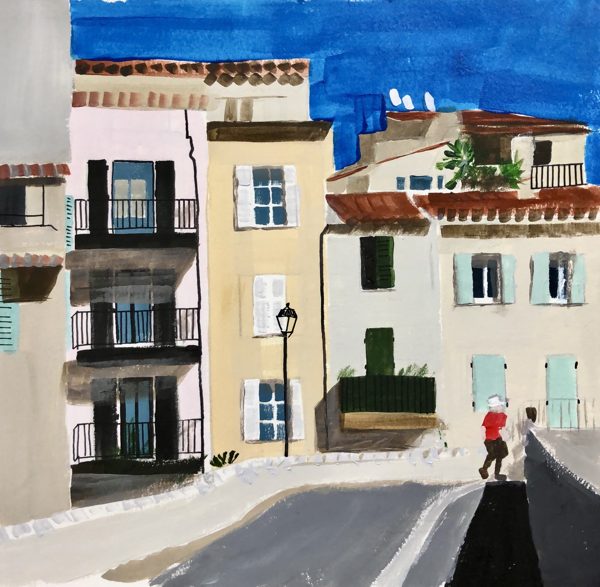
I've dabbled a bit in watercolour and explored abstract imagery in acrylic, but this will be my first experience with figurative painting in acrylic, and I thought I should do a little warm-up before the start of class.

I began with some travel photos and a still life, trying to match the colours in the photos. I found an app called Rapid Resizer that helped me to enlarge the image to the desired size. The app converts a photo into a line drawing and, using some antique carbon paper from the days when I had a portable typewriter, I was able to get the basic shapes and perspective in place.

sketch #1

sketch #2

I set up some still life tableaus and worked from those photos as well.

sketch #3

At this point, I realized that I wanted to do more than just reproduce photos. I wanted "the hand of the artist" to be evident in the sketches. More energy, more pizazz.

I thought back to my cityscapes in cloth, and how I had transformed my photo images by imposing my own colour scheme on them.

sketch #4

Then I noticed a Vlaminck post card that was pinned to my studio wall.

Le Restaurant de la Machine a Bougival, 1905

The bold palette appealed to me.

sketch #5

On further reflection, I decided that the success of Vlaminck's palette depended on many small areas of colour, rather than large blocks of colour. I've noticed the same phenomenon with patchwork quilts. I chose to work from a photo that had more small shapes.

sketch #6

I looked more closely at the Vlaminck street scene, and saw that his brushstrokes added to the vigour of the image. The brushstrokes were not visible on the buildings in the far distance, but became larger moving towards the foreground. I made an attempt to introduce some texture to the foreground of the scene.

Another Vlaminck postcard suggested a still life subject, using a similar palette.

Vase bleu avec fleurs, 1906

I set up a still life of flowers in a vase, and painted the subject.

sketch #7

How to proceed? Would it have been better to paint the background first? Perhaps I will learn some of these basic skills in my upcoming class. 

To complete the exercise, I took my cue from the Vlaminck and painted in a similar background.

sketch #8

Clearly I have a lot to learn, and I may decide that figurative work is not for me. But at least I am somewhat warmed up for the first class.

Wednesday, June 17, 2020

Another Baby Quilt: Preview

A couple of years ago, I posted a photo of a baby quilt I made for my first grandchild. I documented the making of it here.

My daughter really loves the quilt I made for little Nora, and now there is another grandchild on the way. Once again it is time to review the techniques of making a traditional quilt.

I turned to a favourite approach, as detailed in the book "Spectacular Scraps", by Judy Hooworth and Margaret Rolfe. I like to use up scraps of cloth: they provide lots of interesting variety and visual texture. And it's satisfying to use up what I have on hand.


The designs in this book are all based on the half-square triangle. The idea is to make many small squares, each of them composed of two triangles: in this case, one triangle is blue, and the other is gold or tan. The colours were chosen by my daughter. Blue and gold can be seen as complementary colours: certainly blue is considered to be cool, with gold being warm.


The blues range from very light to very dark, and the golds extend to tans.


Here are some of the triangles, ready to be assembled into squares...


... like so.


Here's the quilt top, up on the design wall.
By using a full range of blues, very light to very dark, the pattern
becomes less obvious: it almost shimmers. I like that effect.


The construction of this baby quilt did not go smoothly. At one point my sewing machine actually fell apart, and it was impossible to find a repair technician. I had to borrow a machine from a kind friend. 

As I write this, the quilt top is "batted up", layered with batting and backing, and ready to machine-quilt. I will be sure to post a photo when it's finished. Soon!

Sunday, June 30, 2019

Wild and crazy


Time to have some fun in the studio. This week I'm thinking of making my fabric postcards for Christmas. Maybe a wonky star motif?


commercial printed cotton, backed with fusible web


my own hand-dyed cotton

Wednesday, June 26, 2019

Explorations with Jane Davies, Lesson 8


#1


Yesterday I posted six pieces for the final assignment in my on-line class with Jane Davies. The class involved participants setting their own biweekly objectives, posting their work to the class blog by a set deadline, and commenting on their experience and on the work of the others. We got great feedback from each other, and from the instructor, incisive but also supportive.


#2

For my final assignment I wanted to return to the "minimal-hesitation" approach to painting. The idea is to set aside a specific amount of time to work continuously, with minimal hesitation, to muffle the inner critic and to work more instinctively. I found this a real stretch!


#3

I decided on a relatively small format (9 x 12) and a neutral colour scheme, using a wide range of materials. My idea was to start each of them with minimal hesitation, but then to go back repeatedly to reassess, to add  or remove a little of this or that. I don't consider any of these to be finished works, and I doubt that I will actually go back to them. For one thing, they were done on cheap paper.


#4

But I learned a lot in the process. 


#5

For one thing, I realized that I began each piece with broad gestural strokes of paint, even though this was new to me. Why did I assume that this was the way to go? Was I being overly influenced by what the other students were doing? Is there some stereotype in a dusty corner of my brain that says "a real painting begins with a big gesture"? Maybe there are other ways to begin that are more helpful to me?


#6


The comments I received from others reminded me to have faith in my efforts. Even work that appears to be misguided or unsatisfactory at the time contributes to one's growth, as long as we take the time to reflect on the experience.

What's next? At this point I am happy to take a break from assignments. I have a few ideas of how to spend my studio-time that might allow me to catch my breath and even have a little fun!

Sunday, June 9, 2019

Explorations with Jane Davies, Lesson 7

 Exhibit 1a

I had to skip Lesson 6 of my on-line class, as I was traveling at the time. Having been away from my studio for a few weeks, I thought a good strategy for re-entry and Lesson 7 would be to try something Jane Davies calls the "No-Hesitation-30-Minute-Mark-Marking" session. You can read the post on her blog here, where she uses a video to illustrate the idea.


Exhibit 2a

The basic idea is that you set yourself up with, say, three 24 x 18 sheets of paper, and lay out some basic materials (markers, brushes, paint, graphite stick, maybe some pastels and collage papers.) You set a timer for 30 minutes and then you proceed to make a variety of marks on the papers. You do not stand back and contemplate what you have done at any point, you just continue, without hesitation, to add marks to the papers. It's NOT speed painting, but you allow yourself no more than a few seconds of thought before making the next mark.


Exhibit 3a

Other participants in the on-line class had really good results with this, so I was inspired to give it a try. They used words like "joy" to describe how they felt during the experience. My feelings were closer to "pain", "panic" and "angst". I approached each of my five sessions with something akin to dread. It was like a bad dream. Honestly! You know that nightmare where you've entered a swim meet and you're in your lane and you realize all you have in your skill set is the dog paddle?

Exhibit 1b

As I had committed to doing five of these 30-minute sessions, the next day I took a deep breath and went back into the studio to "further develop" the pieces in the same fashion. The results are shown here, labelled Exhibits 1b, 2b and 3b.

Exhibit 2b

Exhibit 3b

For my third session, I found a large piece of paper, about 4' x 5', in a medium grey, and pinned that up on the wall. It's labelled below as Exhibit 4.

Exhibit 4

I was so displeased with that effort that I didn't return to it, but started fresh the next day. This time, I was a bit calmer. I reminded myself that it was not an exercise in speed, but an effort to eliminate hesitation. I began each of these pieces by making a meandering line, and I felt that having a "spine" as a beginning gave me something to build on. My mood was a bit better, less panicked, my hand more deliberate. See exhibits 5, 6 and 7 below.


Exhibit 5
Exhibit 6
Exhibit 7

It was Session 5 that was the real disaster. I spilled paint and stopped the session after 15 minutes, throwing in the proverbial towel. Photos of this are not available.

Well, I posted about the experience into the class blog and everyone was very positive, especially about the first ones (1 - 4). They noted that I seemed to have developed some new vocabulary in my mark-making.

And it seems that I was overly strict with the parameters of the exercise. The instructor clarified that you are allowed up to six seconds before deciding what comes next. (I allowed myself almost no time at all.) You can look at your work while you're pouring more paint or cutting out a shape of collage paper. (I turned my back to my work so I didn't give myself a chance to assess it.) And you keep the timer running if you have to pause to mix up more paint, etc. (I stopped the timer.)

I was so encouraged by the supportive comments that I have decided to give it at least one more try, using the slightly more relaxed parameters.

The thing is, that I have an in-person workshop scheduled with Jane Davies this summer. It is designed for those of us who want to work
  • larger
  • looser
  • more regularly
  • with more ease and less agony.
Perfect, right? It will either be my salvation or my downfall. Stay tuned.

Wednesday, May 15, 2019

Explorations with Jane Davies, Lesson 5

5.1

A few weeks ago I posted about the "City in Ruins" series I began as Lesson 4 of my on-line class with Jane Davies. For Lesson 5, I continued working on the first six pieces, and began another four. The approach was the same: four layers of collage, sanded, and then the application of paint, pattern and line. I chose to limit myself to a neutral palette, to use a wide variety of media, and to create quiet spaces that contrasted with busy areas.


5.2

The first step I took was to sand down more of each piece, especially the dark background, which I had created with Carbon Black. Jane Davies suggested I aim for a richer, more nuanced dark, so I was guided by her tutorial on laying down multiple coats of transparent colour. I settled on the complementary colours of ultramarine blue, quinachridone gold, and sepia.


5.3

Another suggestion was that I introduce some colour, and I chose to include some areas of quin gold.


5.4

I also made an effort to soften the margin between the building shapes and the background. I did this by applying a smudge of sepia or quin gold between the edge of the buildings and the background.


5.5

I did include a few pieces of red paper in the collage base for the latest four (5.7 - 5.10) but it didn't fit in well, and I persisted with the quin gold throughout.


5.6

Since I took these photos, I've made a few small adjustments, adding a touch more pattern here, a scrap of collage paper there, changing the value of a small area so that it is lighter or darker.


5.7

For example, in 5.7 above, I found the dark blotches on the lower right and upper left distracting, so I have moderated those bits with paint.


5.8

Can you see the clock face on the lower edge of 5.8? I partially concealed that with some Titan Buff paint. And the suggestion of red near the centre has been modified too. I find that looking at photos of the work can be helpful in suggesting small changes that might be needed to make a stronger composition.


5.9

I don't consider these works to be totally complete, and will no doubt return to them with fresh eyes at a later date.


5.10

Having spent so much time on this series in these last few weeks, I am somewhat weary of them and would like to put them aside for a while.

Wednesday, May 1, 2019

Explorations with Jane Davies, Lesson 4

Layer #1

I was curious about Jane Davies' "Radical Collage", as described on her blog. which involves the use of a sander to deconstruct multiple layers of collage. And I was intrigued by Peter Sacks' works, which are composed of many layers of collaged paper, text and cloth, and which I wrote about a few weeks ago.


Layer #2

So when it came time to lay out the parameters for Lesson 4, I decided that I would see what would happen if I took a sander to my collage. Otherwise, I wanted to continue with neutral colours, pattern, line, and the contrast of busy areas with quiet spaces.


Layer #3

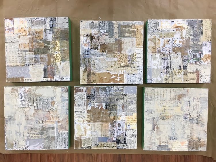
I pulled out piles of collage papers, including wallpaper and vintage text books. I reclaimed six birch cradle boards, 10 x 10, on which I had mounted earlier colour studies. I bought a product called Sandable Hard Gesso from Golden, mentioned on Jane's blog post. The manufacturer's website advised it was best used on a rigid surface, hence the birch cradleboards. As the sides had already been painted black, I protected them with green painter's tape.


Layer #4

And I got to work, cutting and tearing materials to collage into place with acrylic gloss medium. In the end, each board had four layers of collage. I worked in a rough grid format, using rectangles of various sizes, placed randomly. All had to be perfectly dry before applying the sander, a cute little hand-held number borrowed from my son-in-law.


hand-sized sander

Even using the coarse grade of sandpaper, I never got past the second or third layer. Papers that had wrinkled a bit when collaged looked striped when sanded. Others developed a kind of "blotchy rash". The edges in particular took a beating. The cloth bits were the most resistant to sanding. The result was completely unpredictable, which was fun. And challenging.


Top row, left to right, #1 - 3. Bottom row, left to right, #4 - 6.
Each 10 x 10 board has four layers of collage. At this point they've been sanded,
and #4 and #6 have a bit of paint on them.

The general appearance of the sanded pieces was "vintage", because of the papers I had used as collage material: mostly beige, with small print. If I had used white papers with large, modern typeface, the feeling would have been more contemporary. Because of this "antique" quality, I was tempted to finish these off with cut-out botanical prints (a rose, an apricot branch in bloom) or a butterfly, but decided that this was not the direction I wanted to pursue.

Instead, I reverted to my "cityscapes" theme. Carbon black paint established the sky background, sometimes further sanded down to create ambiguity. Masses of buildings emerged and were defined with patterning and line. Stencils, stamps, painters' tape, marker, paintbrush, water-soluble crayon and charcoal were all put to use. Further sanding and collage ensued. I wanted to retain the character of the "deconstructed" materials, not covering up too much. The impression is one of "A City in Ruins".

Here are the results:
#1

#2

#3

#4

#5
#6. This one has the least amount of paint and patterning added to the
deconstructed collage surface. Just a few lines to suggest shapes.

I consider these to be works in progress, and hope to have another go at them soon. Something about the black seems a bit harsh. Can I make it richer, somehow? Perhaps I can create some transitional areas between the busy patterning of the collage and the quiet space of the background. Might introduce a few touches of colour too. Stay tuned!