Showing posts with label Cityscape. Show all posts

Wednesday, March 11, 2020

Colour with a U: conference and exhibition

This promo card features a detail shot of a
gorgeous work by my friend Helena Scheffer

I had been looking forward to the annual conference of SAQA (Studio Art Quilt Associates), to be held in Toronto mid-March. It was to be the first time that the conference for this international organization was booked for a city outside the U.S.

Sadly, with concerns about COVID-19, the conference has been cancelled. Organizers are working hard to ensure that the presentations will be available in a virtual format.

And the exhibition organized to complement the conference will be staged as scheduled. And I am excited to have had a piece accepted. 

I chose this particular piece as one of my three entries, because I felt that the colour palette was indeed unique, and that the Quebec City architecture was distinctive and truly Canadian. 

The show continues until the end of May, and I hope to schedule a few days in the Toronto area to visit with friends and take in the exhibition.

Update: The Homer Watson Gallery is closed indefinitely due to concerns of viral transmission. Please check the gallery website for further information.


Rue de Buade #2

Sunday, February 23, 2020

"Griffintown" @ Montreal's McCord Museum

This weekend I had the pleasure of touring a newly-opened exhibition at the McCord Museum.

In this show, Montreal photographer Robert Walker shares twenty large-scale photos of Griffintown, a working-class Montreal neighbourhood, now undergoing radical gentrification. Another hundred or so of his photos are shown as projected images. Also on display are historic photos of the neighbourhood from the museum's archive.


Walker often juxtaposes the slick and glamorous "lifestyle" images used to promote the condos with the reality of their construction, and the consequent deconstruction of the neighbourhood. The viewer cannot help but ask:

  • what is lost?
  • what is gained?
  • what is promised?

You can find out more about the McCord's Griffintown photo exhibition here.

For those of you who appreciate the art of urban photography, have a look at this youtube video of Robert Walker on the job, in which he shares his approach and aesthetic considerations.


The show is the inauguration of an ongoing series at the McCord, Evolving Montreal.
"To document Montreal’s ongoing urban transformation, in the next few years the Museum will be commissioning well-known local photographers to explore the changes occurring in a neighbourhood of their choice."
The exhibition Griffintown continues until August 9, 2020.

Wednesday, August 7, 2019

Photos under consideration

Looking back over files of my photos, I am close to selecting a few more that will serve as inspiration for new cityscapes.

Yes, I know, I said I would never make any more cityscapes. And yet I find myself needing new material to add to some exhibition commitments for the coming season.

Exteriors? Interiors? Perhaps one or two of these images will serve nicely. All were taken last year in Copenhagen.


This photo and the two below were taken in a stairwell of an art museum.
I wish I could remember which museum it was.


As I responded to Jo, who commented on a similar post two weeks ago,
"We have to take our inspiration where we find it, yes? When something speaks to us, that makes it worth following up, I think. And it's also valuable to ask ourselves what it is about the image that has drawn us in. Contrasting scale, contrast of straight vs. curved, contrast of light and dark, the juxtaposition of the human figure against the architectural, rhythmic grids.... It's all there!"

Wednesday, June 19, 2019

So pleased...

Two of my Cityscapes were chosen in SAQA's
recent promotional campaign.
This is a full page ad in the most recent issue of SAQA Journal.

... to have my work featured in the latest fund-raising campaign by SAQA (Studio Art Quilt Associates).

SAQA has given me many opportunities since I joined them some ten years ago. Right now one of my works is being shown at the Grants Pass Museum of Art in Oregon, having been accepted into an international show, Tranquility, staged by SAQA. It has already traveled to five major Australian cities, and three American venues.

Just a day or two ago I received this envelope in the mail:


accompanied by this letter:


The graphic designer responsible for the campaign has done a fine job of using my compositions to enhance SAQA's communications, don't you think? And I appreciated the tagging of each image with my name and the title of the work (in very small print.) 

As well, 

Thank you to Joanna Olson, the talented graphic designer of
this promotional poster.

... another of my works has been the inspiration for a different promotional campaign. The local "Museum of Living History", Greenwood, is focusing on their textile collection this summer, and chose one of my pieces as their promotional image. Originally made as a 40 x 30 textile work to be used for a Town of Hudson banner project, Greenwood: Layers in Time is now on display year-round at the museum. 

I just may have to have more greeting cards printed up, featuring some of my Cityscape images....

Wednesday, May 15, 2019

Explorations with Jane Davies, Lesson 5

5.1

A few weeks ago I posted about the "City in Ruins" series I began as Lesson 4 of my on-line class with Jane Davies. For Lesson 5, I continued working on the first six pieces, and began another four. The approach was the same: four layers of collage, sanded, and then the application of paint, pattern and line. I chose to limit myself to a neutral palette, to use a wide variety of media, and to create quiet spaces that contrasted with busy areas.


5.2

The first step I took was to sand down more of each piece, especially the dark background, which I had created with Carbon Black. Jane Davies suggested I aim for a richer, more nuanced dark, so I was guided by her tutorial on laying down multiple coats of transparent colour. I settled on the complementary colours of ultramarine blue, quinachridone gold, and sepia.


5.3

Another suggestion was that I introduce some colour, and I chose to include some areas of quin gold.


5.4

I also made an effort to soften the margin between the building shapes and the background. I did this by applying a smudge of sepia or quin gold between the edge of the buildings and the background.


5.5

I did include a few pieces of red paper in the collage base for the latest four (5.7 - 5.10) but it didn't fit in well, and I persisted with the quin gold throughout.


5.6

Since I took these photos, I've made a few small adjustments, adding a touch more pattern here, a scrap of collage paper there, changing the value of a small area so that it is lighter or darker.


5.7

For example, in 5.7 above, I found the dark blotches on the lower right and upper left distracting, so I have moderated those bits with paint.


5.8

Can you see the clock face on the lower edge of 5.8? I partially concealed that with some Titan Buff paint. And the suggestion of red near the centre has been modified too. I find that looking at photos of the work can be helpful in suggesting small changes that might be needed to make a stronger composition.


5.9

I don't consider these works to be totally complete, and will no doubt return to them with fresh eyes at a later date.


5.10

Having spent so much time on this series in these last few weeks, I am somewhat weary of them and would like to put them aside for a while.

Sunday, May 5, 2019

City in Ruins

Thank you to Tess Hall, a participant in my current class with Jane Davies, for sending me a reference to the poem, Building with its Face Blown Off, by Billy Collins.


I am also reminded of this photo from Edward Burtynsky, which I saw recently at the Musée des beaux-arts de Montréal.

Edward Burtynsky, from Three Gorges dam project, China, 2002

This is the kind of devastation that is suggested by my recent imagery of "deconstructed" buildings in a mixed-media series, "City in Ruins", which I blogged about earlier this week.

Wednesday, May 1, 2019

Explorations with Jane Davies, Lesson 4

Layer #1

I was curious about Jane Davies' "Radical Collage", as described on her blog. which involves the use of a sander to deconstruct multiple layers of collage. And I was intrigued by Peter Sacks' works, which are composed of many layers of collaged paper, text and cloth, and which I wrote about a few weeks ago.


Layer #2

So when it came time to lay out the parameters for Lesson 4, I decided that I would see what would happen if I took a sander to my collage. Otherwise, I wanted to continue with neutral colours, pattern, line, and the contrast of busy areas with quiet spaces.


Layer #3

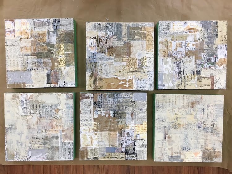
I pulled out piles of collage papers, including wallpaper and vintage text books. I reclaimed six birch cradle boards, 10 x 10, on which I had mounted earlier colour studies. I bought a product called Sandable Hard Gesso from Golden, mentioned on Jane's blog post. The manufacturer's website advised it was best used on a rigid surface, hence the birch cradleboards. As the sides had already been painted black, I protected them with green painter's tape.


Layer #4

And I got to work, cutting and tearing materials to collage into place with acrylic gloss medium. In the end, each board had four layers of collage. I worked in a rough grid format, using rectangles of various sizes, placed randomly. All had to be perfectly dry before applying the sander, a cute little hand-held number borrowed from my son-in-law.


hand-sized sander

Even using the coarse grade of sandpaper, I never got past the second or third layer. Papers that had wrinkled a bit when collaged looked striped when sanded. Others developed a kind of "blotchy rash". The edges in particular took a beating. The cloth bits were the most resistant to sanding. The result was completely unpredictable, which was fun. And challenging.


Top row, left to right, #1 - 3. Bottom row, left to right, #4 - 6.
Each 10 x 10 board has four layers of collage. At this point they've been sanded,
and #4 and #6 have a bit of paint on them.

The general appearance of the sanded pieces was "vintage", because of the papers I had used as collage material: mostly beige, with small print. If I had used white papers with large, modern typeface, the feeling would have been more contemporary. Because of this "antique" quality, I was tempted to finish these off with cut-out botanical prints (a rose, an apricot branch in bloom) or a butterfly, but decided that this was not the direction I wanted to pursue.

Instead, I reverted to my "cityscapes" theme. Carbon black paint established the sky background, sometimes further sanded down to create ambiguity. Masses of buildings emerged and were defined with patterning and line. Stencils, stamps, painters' tape, marker, paintbrush, water-soluble crayon and charcoal were all put to use. Further sanding and collage ensued. I wanted to retain the character of the "deconstructed" materials, not covering up too much. The impression is one of "A City in Ruins".

Here are the results:
#1

#2

#3

#4

#5
#6. This one has the least amount of paint and patterning added to the
deconstructed collage surface. Just a few lines to suggest shapes.

I consider these to be works in progress, and hope to have another go at them soon. Something about the black seems a bit harsh. Can I make it richer, somehow? Perhaps I can create some transitional areas between the busy patterning of the collage and the quiet space of the background. Might introduce a few touches of colour too. Stay tuned!


Wednesday, March 27, 2019

Cityscapes @ Galerie Plus, Hudson

Old Town Square, Riga, 18 x 24

I am delighted to invite you to a solo show of Cityscapes, opening April 3 at Galerie Plus, 448 Main Road in Hudson.

My cityscapes are made with hand-dyed cloth and stitch. They begin with everyday urban scenes, distilled into their essence of shape and line and then transformed by the expressive potential of colour.

Heather and Bert Markgraf opened their gallery/café a couple of years ago.  Bert's parents, Peter and Traudl Markgraf, were famous for their signature silkscreen prints of the Canadian landscape. Many of these prints are available for purchase. Also featured are paintings, sculpture, jewellery, and fine craft by local artists.


View from Riga Cathedral, 24 x 18

The vernissage is April 3, 5 - 8 pm. Consider coming! I would be happy to show you around.

Gallery hours are Wednesday to Sunday, 10 am - 5 pm

For more information, please call 450-458-1319.

Wednesday, February 6, 2019

My Cityscapes @ the MVTM

Here are some photos from the opening of "Stitched: a Homecoming", the two-person textile art show currently staged at the Mississippi Valley Textile Museum in Almonte, Ontario. I was excited to have my cityscapes included in this show along with the intricate, detailed work of British artist Anne Kelly, who grew up in Ontario and Quebec.

Much of my work was very effectively grouped by colour. 

The distressed stone walls of the old mill complemented
 the clean shapes of the cityscapes.

I was pleased with the way the work was hung.


Even though these smaller pieces were not originally part of the plan,
I was glad to have them included in the show.

Anne Kelly's work, on the left, and mine on the right,
contrasted nicely within similar colour ranges.

Here's another piece by Anne Kelly, "China Garden".
Her work often includes repurposed, vintage textiles.

Given the wintry weather forecast, I was pleased to see so many
visitors to the show.

Thank you to all those who came out for the official opening. Your support means a lot to me!

The show continues until March 23, 2019. Visitors might consider spending a few hours in picturesque Almonte, with its thriving commercial area, filled with independent shops and wonderful restaurants. And the MVTM itself has a well-organized display of artefacts that illustrate the history of the textile industry in eastern Ontario.

Museum hours are Tuesday - Friday, 10 am - 4 pm, and Saturday noon - 4 pm.

Sunday, January 6, 2019

Upcoming exhibition @ the MVTM

Brooklyn #6, hand-dyed cotton, 24 x 24

I am delighted to have been invited to participate in a two-woman show at the Mississippi Valley Textile Museum, in Almonte, ON. Some twenty of my cityscapes will be on display, along with the work of British textile artist Anne Kelly.

The show will open on Saturday, January 19, with a reception from 2 - 4 pm. Anne and I both plan to be on hand so please consider attending.

The museum is a national historic site, and its permanent exhibit showcases the history of the textile industry in Eastern Ontario.

The museum's second floor is filled with artefacts from
the area's history as a centre for textile manufacture.

Almonte itself is a charming example of small-town Ontario, so plan to spend a little time there, checking out its cafés and shops.

The museum's winter hours are Tuesday - Friday 10 am - 4 pm and Saturday noon - 4 pm, closed on Sunday and Monday.

The show continues until March 23, 2019.

Sunday, December 16, 2018

Old Town Square, Riga

Old Town Square, Riga, 18 x 24

Completed just a few days ago, this is #20 in the collection of larger cityscapes to be included in my upcoming museum show. In addition, I will deliver seven smaller urban landscapes, which may also be displayed as space allows. 

Fabrics used include a mottled hand-dye for the sky, a range of hand-dyes in neutral colours and, for the terra-cotta-coloured roofs, commercially printed cotton.

The work is inspired by a photo I took while visiting Riga this past summer.

Sunday, December 9, 2018

A New Cityscape

It's true. I declared to my art friends a year or two ago that I would never make another cityscape.

But now I find myself preparing for a show that requires twenty cityscapes, and I am currently in possession of only 18. (I've been very fortunate to have sold most of the hundred-or-so that I have made over the years.)


A visit to Latvia this past summer allowed me to take this photo from the top of the Riga cathedral, using a good zoom lens. Thank you, Lauma, for convincing me that I needed a new camera, and then for showing me the sights in this intriguing city.

I am pleased to introduce my most recent cityscape, made of hand-dyed and commercially-printed cotton.


View from Riga cathedral, 24 x 18

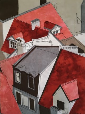
Love those rooflines, the variety of scale, the punch of the reds against the neutrals, the range of value. I think that what I have been learning in painting workshops is reflected in this most recent work in fibre, and I am happy to include it in my upcoming show.

Sunday, August 5, 2018

My favourite Baltic city...

Stockholms skärgård.png


... had to be Stockholm. A beautiful city, actually an archipelago of emerald islands.  The early morning approach by cruise ship was an unforgettable experience.  More distinctive than Copenhagen, more human-scaled than St. Petersburg. I hope to return there some day.

Meanwhile, here are some snippets of the architecture I found so pleasing. Something about the bold colours of the buildings, the brilliant blue of the sky, the high contrast of black rooftops.... Or perhaps simply because it was the last city we saw before returning home.


Though our time was limited, it was refreshing to observe the Scandinavian way of life, a society that supports extensive parental leave, higher education, a more reasonable work week, local food sourcing, community-owned wind farms, and free health care. There seems to be less need to over-consume, and less income disparity. With so much of their territory at low elevation, there is a keen awareness of climate change and global warming. I wish our North American model could shift to something closer to that seen in Denmark and Sweden.

Do hope to return some day for further explorations!