Wednesday, May 29, 2019

"Epic Abstraction" @ the Met


I enjoyed this ongoing exhibition at the Met when I visited New York recently. "Epic Abstraction" features large-scale abstract painting and sculpture from the 1940s through the early twenty-first century. I was impressed that fully half of the artists included in the show were women, a welcome trend I noticed here and elsewhere.

To quote from the introduction posted at the entrance to the show:
"Many of the artists represented here worked in large formats because they sought not only to have the scope to fully explore line, color, shape, and texture, but also to evoke expansive – "epic" – ideas and subjects, including time, history, the body, and existential concerns of the self."

Joan Mitchell, La Vie en Rose, 1979

Helen Frankenthaler, Western Dream, 1957

Louise Nevelson, Mrs. N's Palace, 1964-77

Louise Nevelson, Mrs. N's Palace, 1964-77 (interior)

Louise Nevelson, born in Ukraine, is one of my favourite sculptors.
"Nevelson loved New York, describing the city as 'my mirror'. This sculpture composed of more than one hundred seemingly disparate but interconnected objects absorbs and emanates her spirit and that of her adopted home. Her largest work, it took thirteen years to complete and was unveiled on her eightieth birthday. The charismatic Nevelson is the 'Mrs. N' of the title, the monarch of this massive structure that is both environment and monument, recalling grand memorials and tombs as well as intimate, private spaces. Nevelson was captivated by the beauty she found in discarded materials and urban detritus, tenderly composing, layering, and painting her 'found objects' until they shed their skin, reborn as art. Here, it is forgotten things found by chance that together make up the whole – perhaps a metaphor for the city, even for life."

Judit Reigl, Guano (Menhir), 1959-64

Judit Reigl, Guano (Menhir), 1959-64 (detail)

"Part of an ambitious series of process- and time-based paintings, Reigl's Guano (Menhir) confronts the viewer with an imposing and ambiguous mound centrally positioned against a dark backdrop. The forms' hard, stony appearance, evoking compressed natural strata, is a result of the painter's innovative technique, a radical departure from her earlier, Surrealist-inspired methods. To protect a new studio floor, she had covered it with several layers of rejected canvases, which became saturated with pictorial matter and were trampled underfoot. In her words, 'As time went by, these excremental rags slowly became stratified layers, like the guano [bird dung] that comes from the isles of Latin America'. She then performed an excavation of sorts, finding her composition by using a homemade tool to scrape through the years of serendipitous accumulation."

Franz Kline, Black, White, and Gray, 1959


Jackson Pollock, Pasiphaƫ, 1943
 "[Pollock titled this painting] after hearing the story of the Cretan princess PasiphaĆ«, who gave birth to the half-man, half-bull Minotaur. Throughout World War II, many artists mined classical mythology's vast repository of tragic tales of war, struggle, and loss."

Jackson Pollock, Number 28, 1950, 1950

"After Pollock's move to Springs, in the town of East Hampton on Long Island in 1945, he took up painting in a barn adjacent to the home he shared with his wife, fellow artist Lee Krasner. This larger space expanded his practice, allowing for painting on and around unstretched canvases on the floor, a process the artist likened to Native American sand painting. Pollock appears to have begun this composition by dripping and spilling great amounts of black and ochre-colored medium onto the canvas, but they became buried under subsequent layers of paint applied in acrobatic swirls and dribbles. With their expansive scale and decentered compositions, the 'drip' paintings exceed their own boundaries...."

"Epic Abstraction: Pollock to Herrera" continues indefinitely at the Met.

Sunday, May 26, 2019

Spilling Over @ the Whitney


While in New York recently, I visited a show at the Whitney, "Spilling Over: Painting Color in the 1960s". Quoting the posted text:
"Drawn entirely from the Whitney's collection, this exhibition gathers paintings from the 1960s and early 1970s that inventively use bold, saturated, and even hallucinatory color to activate perception. During this period, many artists adopted acrylic paint – a newly available, plastic-based medium  – and explored its expansive technical possibilities and wider range of hues."
Here are five of the paintings I most enjoyed:


Kenneth Noland,  New Day,  1967
Noland painted on raw canvas, allowing the paint to sink into the surface.

Josef Albers, Homage to the Square: Wait, 1967
This series, developed from 1950 to 1976, eventually encompassed more than one
thousand separate artworks.

Again, quoting from the text on the label:
"[Albers] would select one of four set layouts, all of which were symmetrical and oriented toward the bottom edge. He then applied each color ... from the center out, using a knife to spread paint straight from the tube. Albers' technique allowed him to use the same form to create vastly different experiences, and to explore the distinction between 'physical fact and psychic effect.' Across the series, color combinations affect not only how we see individual hues but also how we perceive space and form, with some squares seeming to leap forward while others recede."

Helen Frankenthaler, Orange Mood, 1966

"In Orange Mood Helen Frankenthaler thinned acrylic paint to the consistency of watercolor in order to create large, curving expanses of color through which the weave of the canvas remains visible. Like Jackson Pollock, she placed her canvas directly on the floor and poured paint from above, largely without the aid of a brush. Frankenthaler used color as her painterly language, but she never entirely abandoned representation. Although the references can be subtle, her paintings consistently evoke nature."

Miriam Schapiro, Jigsaw, 1969

"In paintings like Jigsaw, Miriam Schapiro explored how geometric abstraction could serve both formal and feminist concerns. Here, she experimented with the spatial effects of color....  [She] often adopted geometries that resembled apertures and passageways evocative of the female body. If a human figure is implied in this painting, however, it is hard to read as male or female – a rebuke of the idea that gender can be simply defined and categorized."

Richard Anuszkiewiez, The Fourth of the Three, 1963

Anuszkiewiecz "composed this painting with only three colors. But the visual impact – as the title implies – opens beyond that simple arithmetic. Although working with relatively straightforward combinations of line and color, he created complex visual effects, including optical illusions, movement, and the impression of colors mixing. Here, a simple shift in a line's width impacts the intensity of color and how depth and surface are read."
I like to visit the Whitney when I'm in New York because of its fine collection of modern American art, especially its Hoppers and Rothkos, as well as its location at the southern endpoint of the High Line linear park. The exhibition "Spilling Over: Painting Color in the 1960s" ends in August 2019. 

Wednesday, May 22, 2019

Wow! 200 books on Modern Art now available on line


The Guggenheim has published 200 books on Modern Art on line, available at no cost. You can access them here. And...

... did you know that you can explore every exhibit that MOMA has staged since 1929? You can access this material for free here.


Sunday, May 19, 2019

"Little Fires Everywhere" by Celeste Ng


Another art-related book I have recently enjoyed is Little Fires Everywhere, by Asian-American author Celeste Ng.  When I'm slogging away in my studio I sometimes want the diversion of an audiobook. This time I chose an author whose previous novel Everything I Never Told You impressed me. It was an Amazon Book of the Year in 2014.

Ng's parents emigrated from Hong Kong in the 60's, and Ng was born in the US in 1980. At the age of ten she moved to Shaker Heights, Ohio, a progressive, well-regulated suburban community that she has chosen as the setting for both her novels.

A winner of Goodreads Choice in 2017, Little Fires Everywhere is mostly about family and motherhood. One of the main characters is Mia Warren, a peripatetic artist who, with her teenaged daughter Pearl, moves from one American town to another. Once one project ends, they pack up their few belongings and move on to find another. There is a stark contrast between the bohemian lifestyle of this little family and the rigid conformity of Shaker Heights.  This is reinforced by the introduction of  the Richardsons, an affluent, conventional family who take Mia and Pearl Warren under their wing. The reader slowly learns about the mysterious background of the Warrens as another plot line involving cross-racial adoption evolves.

The life of Mia Warren as an artist is central to the story, and comes into focus as the novel ends. A good read, Little Fires Everywhere is being made into an 8-part mini-series for Hulu, starring Reese Witherspoon and Kerry Washington.

Wednesday, May 15, 2019

Explorations with Jane Davies, Lesson 5

5.1

A few weeks ago I posted about the "City in Ruins" series I began as Lesson 4 of my on-line class with Jane Davies. For Lesson 5, I continued working on the first six pieces, and began another four. The approach was the same: four layers of collage, sanded, and then the application of paint, pattern and line. I chose to limit myself to a neutral palette, to use a wide variety of media, and to create quiet spaces that contrasted with busy areas.


5.2

The first step I took was to sand down more of each piece, especially the dark background, which I had created with Carbon Black. Jane Davies suggested I aim for a richer, more nuanced dark, so I was guided by her tutorial on laying down multiple coats of transparent colour. I settled on the complementary colours of ultramarine blue, quinachridone gold, and sepia.


5.3

Another suggestion was that I introduce some colour, and I chose to include some areas of quin gold.


5.4

I also made an effort to soften the margin between the building shapes and the background. I did this by applying a smudge of sepia or quin gold between the edge of the buildings and the background.


5.5

I did include a few pieces of red paper in the collage base for the latest four (5.7 - 5.10) but it didn't fit in well, and I persisted with the quin gold throughout.


5.6

Since I took these photos, I've made a few small adjustments, adding a touch more pattern here, a scrap of collage paper there, changing the value of a small area so that it is lighter or darker.


5.7

For example, in 5.7 above, I found the dark blotches on the lower right and upper left distracting, so I have moderated those bits with paint.


5.8

Can you see the clock face on the lower edge of 5.8? I partially concealed that with some Titan Buff paint. And the suggestion of red near the centre has been modified too. I find that looking at photos of the work can be helpful in suggesting small changes that might be needed to make a stronger composition.


5.9

I don't consider these works to be totally complete, and will no doubt return to them with fresh eyes at a later date.


5.10

Having spent so much time on this series in these last few weeks, I am somewhat weary of them and would like to put them aside for a while.

Sunday, May 12, 2019

Another art-related audiobook

When I'm slogging away in the studio, especially when engaged in less mindful tasks, I often like to keep company with an audiobook. My latest find is The Muralist, by B.A. Shapiro (2015). Shapiro is best-known for The Art Forger (2012).


Like many novels of historical fiction, this one shifts between two different protagonists. One of them is a young woman artist, working in the 1930's in New York, employed by the Work Projects Administration. AlizƩe Benoit, born in France, is part of the Abstract Expressionist movement, friend of Lee Krasner, lover of Mark Rothko, protegƩe of Eleanor Roosevelt. She is preoccupied with the fate of her extended family, French Jews who are desperate to emigrate to America.

The second main character is her great-niece, Danielle Adams, also an artist, working as a researcher for an auction house in contemporary New York. Danielle wants to find out more about AlizƩe, about her impact on the development of Abstract Expressionism, and about the mystery of her disappearance. Nothing is known of AlizƩe's life after 1940, when she was still in her twenties.

So there is much in this book to interest me, including the American art scene of the 30's and 40's, the WPA, and the tragic indifference of so many governments to the plight of refugees from Nazi Germany.

As with Shapiro's "The Art Forger", I found the writing to be competent but not compelling. Much of the drama of the story is inherent in the historical turmoil of the era. The book never becomes more than the sum of its parts. Still, good company in the studio. I listened all the way to the end :-)

Wednesday, May 8, 2019

Art + Life Rules from a Nun

Almost five years ago, I wrote a post about Sister Mary Corita Kent, and her ten rules on Art + Life. Some things are meant to be savoured more than once.

These rules are no doubt posted in many a studio, serving as daily inspiration. Here's a youtube presentation of them:


Sunday, May 5, 2019

City in Ruins

Thank you to Tess Hall, a participant in my current class with Jane Davies, for sending me a reference to the poem, Building with its Face Blown Off, by Billy Collins.


I am also reminded of this photo from Edward Burtynsky, which I saw recently at the MusƩe des beaux-arts de MontrƩal.

Edward Burtynsky, from Three Gorges dam project, China, 2002

This is the kind of devastation that is suggested by my recent imagery of "deconstructed" buildings in a mixed-media series, "City in Ruins", which I blogged about earlier this week.

Wednesday, May 1, 2019

Explorations with Jane Davies, Lesson 4

Layer #1

I was curious about Jane Davies' "Radical Collage", as described on her blog. which involves the use of a sander to deconstruct multiple layers of collage. And I was intrigued by Peter Sacks' works, which are composed of many layers of collaged paper, text and cloth, and which I wrote about a few weeks ago.


Layer #2

So when it came time to lay out the parameters for Lesson 4, I decided that I would see what would happen if I took a sander to my collage. Otherwise, I wanted to continue with neutral colours, pattern, line, and the contrast of busy areas with quiet spaces.


Layer #3

I pulled out piles of collage papers, including wallpaper and vintage text books. I reclaimed six birch cradle boards, 10 x 10, on which I had mounted earlier colour studies. I bought a product called Sandable Hard Gesso from Golden, mentioned on Jane's blog post. The manufacturer's website advised it was best used on a rigid surface, hence the birch cradleboards. As the sides had already been painted black, I protected them with green painter's tape.


Layer #4

And I got to work, cutting and tearing materials to collage into place with acrylic gloss medium. In the end, each board had four layers of collage. I worked in a rough grid format, using rectangles of various sizes, placed randomly. All had to be perfectly dry before applying the sander, a cute little hand-held number borrowed from my son-in-law.


hand-sized sander

Even using the coarse grade of sandpaper, I never got past the second or third layer. Papers that had wrinkled a bit when collaged looked striped when sanded. Others developed a kind of "blotchy rash". The edges in particular took a beating. The cloth bits were the most resistant to sanding. The result was completely unpredictable, which was fun. And challenging.


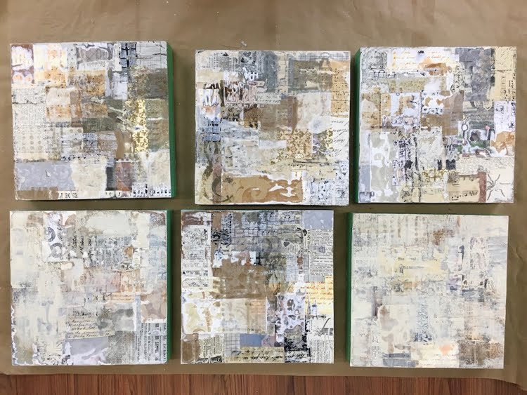
Top row, left to right, #1 - 3. Bottom row, left to right, #4 - 6.
Each 10 x 10 board has four layers of collage. At this point they've been sanded,
and #4 and #6 have a bit of paint on them.

The general appearance of the sanded pieces was "vintage", because of the papers I had used as collage material: mostly beige, with small print. If I had used white papers with large, modern typeface, the feeling would have been more contemporary. Because of this "antique" quality, I was tempted to finish these off with cut-out botanical prints (a rose, an apricot branch in bloom) or a butterfly, but decided that this was not the direction I wanted to pursue.

Instead, I reverted to my "cityscapes" theme. Carbon black paint established the sky background, sometimes further sanded down to create ambiguity. Masses of buildings emerged and were defined with patterning and line. Stencils, stamps, painters' tape, marker, paintbrush, water-soluble crayon and charcoal were all put to use. Further sanding and collage ensued. I wanted to retain the character of the "deconstructed" materials, not covering up too much. The impression is one of "A City in Ruins".

Here are the results:
#1

#2

#3

#4

#5
#6. This one has the least amount of paint and patterning added to the
deconstructed collage surface. Just a few lines to suggest shapes.

I consider these to be works in progress, and hope to have another go at them soon. Something about the black seems a bit harsh. Can I make it richer, somehow? Perhaps I can create some transitional areas between the busy patterning of the collage and the quiet space of the background. Might introduce a few touches of colour too. Stay tuned!