Showing posts with label inspiration. Show all posts

Wednesday, December 9, 2020

Artists Reinvent the Mask

 From The Guardian: 45 artists were asked to reinvent the mask. Here's the link.

Porcupine Fish, Liz Sexton

Beak, Elizabeth Morisette

Breathing Apparatus, Adrienne DeLoe

Sunday, December 6, 2020

Vogue Magazine celebrates patchwork

Recently published by Vogue, an amazing photo essay about patchwork on the runway. Catch it here.

Dolce & Gabbana,
spring 2020 ready-to-wear


Wednesday, June 24, 2020

Sketchbook Explorations, Part 1


I've recently signed up for a course designed by Jane Davies, with whom I've taken a number of workshops in the past. This is a downloadable course: it has no feedback from the instructor and no interaction with other students. It features a structured set of exercises, accompanied by a few video demonstrations.


Jane Davies offers a number of these classes, which can be found on her website, along with many video tutorials. I chose something very basic and fundamental: Sketchbook Practice. I hope that having the structure of a class like this will help me re-engage with my studio practice, as I have been so distracted these last months.


I am lucky to have two friends who have decided to join me in this venture, and I look forward to sharing the experience with them.


I begin the first lesson by gathering up all the mark-making materials I can find in my studio. I limit myself to the colour black. The idea is to make lines, just exploring the different qualities of each medium. Can you make a thick line, a thin line? What if you reduce the pressure? Can you smudge the line? Add water to the line? Use your non-dominant hand?


The next assignment in Lesson 1 is to use line to express an emotion. Here are my efforts:


Calm

Joy

Anxiety

Envy
(I like this design, though I'm not so sure
it expresses Envy.)

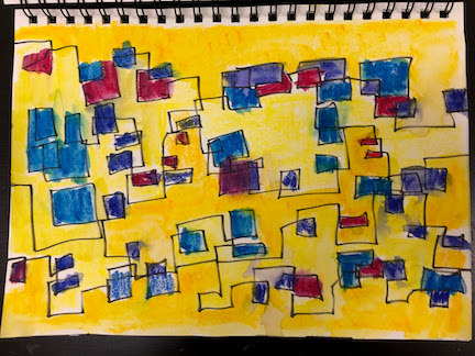
Continuing with Lesson 1, we are asked to do some "blind scribble" using various marking tools, and then, with eyes open, to apply some watercolour to the scribble.


If you look closely, you can see the white scribble,
created with a china marker, which resists the water colour paint.


I've never been one to use a sketchbook, but I can see the value in this kind of exercise, even if it's just to loosen up.  The final part of Lesson 1 will include blind contour and contour drawing. Looking forward to further explorations!

Wednesday, May 27, 2020

Finding Beauty...

... while biking through the woods today.


Wednesday, April 1, 2020

Finding beauty...

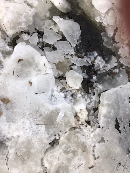
...while out for a walk yesterday morning. The snow and ice are melting here, the sap is running, and birdsong fills the air.


Wednesday, February 12, 2020

After the storm...

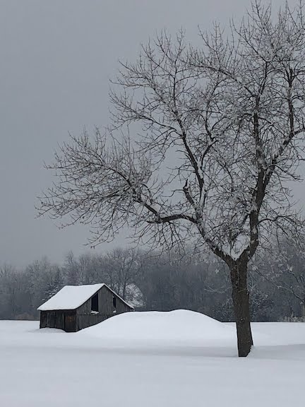
... I took these photos on my iPhone, driving home from Costco.

It was a moment to be reminded of the very special character of the winter landscape, and the singular appeal of familiar places.


Sunday, February 2, 2020

Those New Yorker covers

"Twilight Avenue", by Pascal Campion

Every now and then I am especially taken with the design of a New Yorker cover. The magazine is proud of its history of original illustrated covers, when so many magazines now rely on  photography.

I'm particularly fond of this recent illustration, and have spent some time analyzing its distribution of darks and lights, the sparks of red and pink amongst all those neutrals, the illusion of wet pavement, and the use of atmospheric perspective.

There are many ways of establishing a sense of depth in a landscape. For example, figures are larger in the foreground, smaller in the background. Overlapping of shapes contributes to the effect. Distant objects have fewer details. That decorative grate on the lower left helps to situate the viewer as apart from the scene. 

"Atmospheric perspective" is the use of lighter, duller colours to suggest items further away. The theory is that the further the distance, the more atmospheric particles separate the eye from the subject, lightening and dulling the distant objects. This effect is readily observed when looking at a series of distant hills.

Wednesday, August 7, 2019

Photos under consideration

Looking back over files of my photos, I am close to selecting a few more that will serve as inspiration for new cityscapes.

Yes, I know, I said I would never make any more cityscapes. And yet I find myself needing new material to add to some exhibition commitments for the coming season.

Exteriors? Interiors? Perhaps one or two of these images will serve nicely. All were taken last year in Copenhagen.


This photo and the two below were taken in a stairwell of an art museum.
I wish I could remember which museum it was.


As I responded to Jo, who commented on a similar post two weeks ago,
"We have to take our inspiration where we find it, yes? When something speaks to us, that makes it worth following up, I think. And it's also valuable to ask ourselves what it is about the image that has drawn us in. Contrasting scale, contrast of straight vs. curved, contrast of light and dark, the juxtaposition of the human figure against the architectural, rhythmic grids.... It's all there!"

Sunday, July 28, 2019

Architecture images

I've been entangled in domestic maintenance for the last few weeks, but have a few moments now to post some items to this blog.

These pix were taken almost three years ago, and I thought I would share them here. They could be interesting "starts" for a composition in fibre or paint/collage.

seen in the entrance to the Musée d'art contemporaine à Montréal

as above

plaza of Westmount Square, with reflected figure

Musée national des beaux-arts du Québec, interior
As above. Sometimes a figure is just what is needed
to make a photo interesting.

as above

as above

as above

as above

Wednesday, May 8, 2019

Art + Life Rules from a Nun

Almost five years ago, I wrote a post about Sister Mary Corita Kent, and her ten rules on Art + Life. Some things are meant to be savoured more than once.

These rules are no doubt posted in many a studio, serving as daily inspiration. Here's a youtube presentation of them:


Wednesday, April 10, 2019

"Daily Rituals: Women at Work," by Mason Currey


"What Women Artists Knew About Work" is the title of an article recently published in the Wall Street Journal. The piece was written by Mason Currey, the author of "Daily Rituals: How Artists Work", and more recently "Daily Rituals: Women at Work".

The article was so interesting that I decided to order his new book immediately.

Here is an excerpt from the newspaper piece that captured my interest:
"Don't be afraid of slumps. ... [I]t often turns out that these miserable slumps precede the most fertile periods of artistic or intellectual activity. The New Zealand writer Katherine Mansfield was very familiar with this cycle. Despite much self-castigation over her non-writing days, she eventually realized they were just as important as the more conventionally productive ones. 'What happens as a rule,' she wrote in her journal, "is if I go on long enough I break through." The Abstract Expressionist painter Helen Frankenthaler worked in periods of deep focus followed by stretches of labored, unsatisfactory painting, or nothing at all. 'I seem to start at day one again,' Frankenthaler said, adding that the feeling was 'agony'. But, gradually, these fallow periods would give way to a new phase of work.
"Never give up, no matter how long it takes. The Danish writer Isak Dinesen didn't start writing seriously until she was in her 40s, near the end of a failed venture at running a coffee plantation in Kenya. The sculptor Louise Nevelson exhibited her work for 25 years without making a sale; she got her big break shortly before turning 60. And the painter Alma Thomas didn't become a full-time artist until she retired from public-school teaching at age 68.
"These women were sustained by a belief in themselves and their gifts. But perhaps more important was the fact that they found real joy and satisfaction in the work itself, regardless of whether the outside world took notice. 'Nothing surpasses creative activity,' said the 19th-century pianist Clara Schumann, 'even if only for those hours of self-forgetfulness in which one breathes solely in the world of sound.'
"Even those who found their work quite trying would never seriously think of giving it up. The critic and novelist Susan Sontag is a good example: She wrote slowly and with painstaking effort, and yet at some level she found it all 'thrilling.' She liked to quote Noel Coward: 'Work is more fun than fun.'" 

Wednesday, April 3, 2019

Peter Sacks

I recently read a profile of the artist Peter Sacks in The New Yorker, March 25, 2019 issue. The caption under his full-page photo reads, "Late in life and seemingly overnight, Peter Sacks became a visual artist with a fully formed and dauntingly complex aesthetic."


The article is titled "What Lies Beneath", written by Joshua Rothman, and I would highly recommend it.

Sacks is a fascinating subject. He seems to have excelled at whatever he has put his hand to. Born in South Africa in 1950 of Lithuanian Jewish descent, he became active in the anti-apartheid movement at an early age, befriending Steve Biko. Sacks was at various times an Olympic-level swimmer, a Rhodes scholar, an English professor whose text on the English elegy form is without rival, an acclaimed poet, and now "one of the most exciting painters in America".

Necessity 7, 2007-09, "incorporates Rainer Maria Rilke's 'Duino Elegies'
in English and German. Like many of Sacks' triptychs, it is more than 12 feet long."

Sacks made his first painting twenty years ago, and hasn't written a single line of poetry since. Known to work 14-hour days, he has laboured over almost a thousand paintings, mounting ten solo shows in increasingly prestigious galleries. His paintings are large and "sedimentary". They consist of as many as seven or eight layers, and are painstakingly built over a period of years. The layers sometimes include linen, onto which he has laboriously typed entire texts. They might also include twisted cloth, sometimes singed, and corrugated cardboard. Writes Rothman,
"Sacks needed to invent a ritualized form of art-making – creating, burying, burning, uncovering."
“Township 17,” from 2017-18.
The painting combines fabrics from India, Europe, West Africa, and the Arab world.

Said Christopher Bedford, the director of the Baltimore Museum of Art,
"The paintings are deeply labor-intensive, almost painful in their execution. And the physical awareness that you're in the presence of something that was wrought over time, and that contains depth and layers that aren't visually perceivable, is very important. The feeling that the end point was reached through a process that you can sense but not perceive – that feels like history to me."

Farewell to an Idea 6, from 2010-12,
includes poems by Federico Garcia Lorca

Rothman creates a very compelling portrait of the artist, who currently works out of his studio on Martha's Vineyard. It makes me eager to find opportunities to see Sacks' work.

The article also prompted me to reflect on Rothman's classification of Peter Sacks' work. Not once was the term "collage", "textile art" or "fibre art" used in the New Yorker article. These are considered to be "paintings."