Showing posts with label techniques. Show all posts

Thursday, June 25, 2020

Sketchbook Explorations, Part 2

Creamer #1

Continuing on with Lesson 1 (see previous post), my next assignment was to do blind contour drawing. You are to look only at the subject of your drawing, and never at the paper before you. You allow your eyes to slowly follow the lines of your subject, at the same time guiding your pencil or pen without looking at the paper. 

Creamer #2

I was disappointed with my first efforts, as I used to be able to do this quite well.


Salt Shaker

But the point of the exercise is to put your observational skills and focused attention to work, to slow down your brain. It's really a form of meditation.


Flip Flops

I was pleased with my last effort, the Flip Flops. There is something charming about the imprecision.

The final assignment in Lesson 1 was "contour drawing". In this case, we are allowed to look at the paper while drawing. I've done very little drawing over the last few years, relying more on my camera, so this was challenging, but satisfying too.

Three examples are below:


Two Jugs

Flip Flops
Chair

Now looking forward to Lesson 2.


Sunday, February 2, 2020

Those New Yorker covers

"Twilight Avenue", by Pascal Campion

Every now and then I am especially taken with the design of a New Yorker cover. The magazine is proud of its history of original illustrated covers, when so many magazines now rely on  photography.

I'm particularly fond of this recent illustration, and have spent some time analyzing its distribution of darks and lights, the sparks of red and pink amongst all those neutrals, the illusion of wet pavement, and the use of atmospheric perspective.

There are many ways of establishing a sense of depth in a landscape. For example, figures are larger in the foreground, smaller in the background. Overlapping of shapes contributes to the effect. Distant objects have fewer details. That decorative grate on the lower left helps to situate the viewer as apart from the scene. 

"Atmospheric perspective" is the use of lighter, duller colours to suggest items further away. The theory is that the further the distance, the more atmospheric particles separate the eye from the subject, lightening and dulling the distant objects. This effect is readily observed when looking at a series of distant hills.

Sunday, September 22, 2019

New work

Many deadlines and calls for entry are crowding my calendar. The time has come to pull out the "starts" and massage them into something I can be happy with.


untitled 1, 16 x 16, collage/paint

A workshop in August with Jane Davies gave me some insight into process. Jane warned the participants not to expect to go home with finished work. We were to consider everything we did to be a "start". Jane counselled us to work with multiple pieces at once, to do one or two things to each piece in rotation, and then to move on. In this way, we could perhaps avoid getting "stuck".

When you think about it, you don't want to practice "getting stuck". Rather like spinning your wheels when your tires are deep in the mud, perseverating in the stuck position just reinforces those pathways in the brain, and leads to frustration / avoidance / grief in the studio.

I've heard similar advice given to writers who are struggling to complete a particular piece of writing:  put aside the task that is not flowing and tackle something else. If the novel isn't going anywhere, write a magazine article or a book review. Then return to the problematic project with a renewed perspective.


untitled 2, 16 x 16, collage/paint

Having come to art through fibre, I am very much a "planner". With my cityscapes, I begin with my photo, which becomes a drawing. I choose a palette of colour to work with and proceed from there. Perhaps a few tweaks with dark/light relationships, elimination of some detail, and the outcome is very much determined from the start. Not much opportunity for "happy accidents".

Painting and collage is, for me, a very different process. Obliteration is a tool available to the painter that is not readily at hand to the textile artist.

Two shows coming up next month, and these two recent pieces will be submitted to one of them. 

Sunday, June 23, 2019

Jean-Pierre Larocque @ La Poste

I stumbled upon the most remarkable exhibition yesterday. The ceramics and drawings of Jean-Pierre Larocque are showing at Galerie La Poste, 1700 rue Notre Dame in Montreal, until July 7. They occupy all three storeys of the space.

To quote from the artist's biography:
"Born in Montreal in 1953, Jean-Pierre Larocque studied drawing and printmaking at UQAM before pursuing studies in ceramics at Concordia University and the Alfred University of New York, from which he received an MFA in 1988. He is recognized as one of the foremost ceramicists-sculptors of Canada."

The additive and subtractive techniques define both shape and line.

On entering the gallery,  I was first struck by more than a dozen large-scale charcoal drawings of figures and faces, somewhat reminiscent of old photographic negatives. While the high value contrast is what first drew my eye, it was a closer inspection that allowed a multiplicity of faces to emerge.


What first appear to be random, textural drawings in ink...

... reveal, on closer inspection, a multitude of faces.


The large figurative "assemblages" of clay are also prominently displayed by the entrance to the show. The viewer is compelled to do a complete tour of these sculptures, to enjoy all their dimensions.

Four figures greet the visitor...


... and demand to be seen from all angles.

The artist...
"... works with clay that is rolled into slabs and laid out flat on a table, cutting the strips he will use to make his piece. The clay is deposited in sedimentary layers, akin to the way successive strata accumulate as a city develops over time.... Coils suggest snakes, entwined in Gorgon-like hair.... The applications of round, flat, pleated, hatched and coiled structures evoke hair, or ears adorned with pendants. The psyche inhabits the hollow chambers that give the piece its structure."


A close-up view of the ceramic construction

As with the charcoal application and erasure in the large-scale drawings, the building of the sculptures is both additive and subtractive.

On the mezzanine, the artist's sketchbooks are on display.


Also on the mezzanine:

nine portraits in gouache...
... and friezes of hooded faces, in partially glazed and enamelled stoneware.

In the basement, a video shows the artist at work.

Drawings in felt pen on paper, also in the basement.

Seeing how the artist was able to express his rich vision in so many media was a revelation. A show not to be missed!

Wednesday, June 12, 2019

"Chromaticity", by Ptolemy Mann


If you've ever wondered about the appeal of dyeing yarn and weaving on a loom, here is a wordless two-minute video that celebrates the rhythms and visual pleasures of this ancient craft.


Sunday, June 9, 2019

Explorations with Jane Davies, Lesson 7

 Exhibit 1a

I had to skip Lesson 6 of my on-line class, as I was traveling at the time. Having been away from my studio for a few weeks, I thought a good strategy for re-entry and Lesson 7 would be to try something Jane Davies calls the "No-Hesitation-30-Minute-Mark-Marking" session. You can read the post on her blog here, where she uses a video to illustrate the idea.


Exhibit 2a

The basic idea is that you set yourself up with, say, three 24 x 18 sheets of paper, and lay out some basic materials (markers, brushes, paint, graphite stick, maybe some pastels and collage papers.) You set a timer for 30 minutes and then you proceed to make a variety of marks on the papers. You do not stand back and contemplate what you have done at any point, you just continue, without hesitation, to add marks to the papers. It's NOT speed painting, but you allow yourself no more than a few seconds of thought before making the next mark.


Exhibit 3a

Other participants in the on-line class had really good results with this, so I was inspired to give it a try. They used words like "joy" to describe how they felt during the experience. My feelings were closer to "pain", "panic" and "angst". I approached each of my five sessions with something akin to dread. It was like a bad dream. Honestly! You know that nightmare where you've entered a swim meet and you're in your lane and you realize all you have in your skill set is the dog paddle?

Exhibit 1b

As I had committed to doing five of these 30-minute sessions, the next day I took a deep breath and went back into the studio to "further develop" the pieces in the same fashion. The results are shown here, labelled Exhibits 1b, 2b and 3b.

Exhibit 2b

Exhibit 3b

For my third session, I found a large piece of paper, about 4' x 5', in a medium grey, and pinned that up on the wall. It's labelled below as Exhibit 4.

Exhibit 4

I was so displeased with that effort that I didn't return to it, but started fresh the next day. This time, I was a bit calmer. I reminded myself that it was not an exercise in speed, but an effort to eliminate hesitation. I began each of these pieces by making a meandering line, and I felt that having a "spine" as a beginning gave me something to build on. My mood was a bit better, less panicked, my hand more deliberate. See exhibits 5, 6 and 7 below.


Exhibit 5
Exhibit 6
Exhibit 7

It was Session 5 that was the real disaster. I spilled paint and stopped the session after 15 minutes, throwing in the proverbial towel. Photos of this are not available.

Well, I posted about the experience into the class blog and everyone was very positive, especially about the first ones (1 - 4). They noted that I seemed to have developed some new vocabulary in my mark-making.

And it seems that I was overly strict with the parameters of the exercise. The instructor clarified that you are allowed up to six seconds before deciding what comes next. (I allowed myself almost no time at all.) You can look at your work while you're pouring more paint or cutting out a shape of collage paper. (I turned my back to my work so I didn't give myself a chance to assess it.) And you keep the timer running if you have to pause to mix up more paint, etc. (I stopped the timer.)

I was so encouraged by the supportive comments that I have decided to give it at least one more try, using the slightly more relaxed parameters.

The thing is, that I have an in-person workshop scheduled with Jane Davies this summer. It is designed for those of us who want to work
  • larger
  • looser
  • more regularly
  • with more ease and less agony.
Perfect, right? It will either be my salvation or my downfall. Stay tuned.

Wednesday, May 1, 2019

Explorations with Jane Davies, Lesson 4

Layer #1

I was curious about Jane Davies' "Radical Collage", as described on her blog. which involves the use of a sander to deconstruct multiple layers of collage. And I was intrigued by Peter Sacks' works, which are composed of many layers of collaged paper, text and cloth, and which I wrote about a few weeks ago.


Layer #2

So when it came time to lay out the parameters for Lesson 4, I decided that I would see what would happen if I took a sander to my collage. Otherwise, I wanted to continue with neutral colours, pattern, line, and the contrast of busy areas with quiet spaces.


Layer #3

I pulled out piles of collage papers, including wallpaper and vintage text books. I reclaimed six birch cradle boards, 10 x 10, on which I had mounted earlier colour studies. I bought a product called Sandable Hard Gesso from Golden, mentioned on Jane's blog post. The manufacturer's website advised it was best used on a rigid surface, hence the birch cradleboards. As the sides had already been painted black, I protected them with green painter's tape.


Layer #4

And I got to work, cutting and tearing materials to collage into place with acrylic gloss medium. In the end, each board had four layers of collage. I worked in a rough grid format, using rectangles of various sizes, placed randomly. All had to be perfectly dry before applying the sander, a cute little hand-held number borrowed from my son-in-law.


hand-sized sander

Even using the coarse grade of sandpaper, I never got past the second or third layer. Papers that had wrinkled a bit when collaged looked striped when sanded. Others developed a kind of "blotchy rash". The edges in particular took a beating. The cloth bits were the most resistant to sanding. The result was completely unpredictable, which was fun. And challenging.


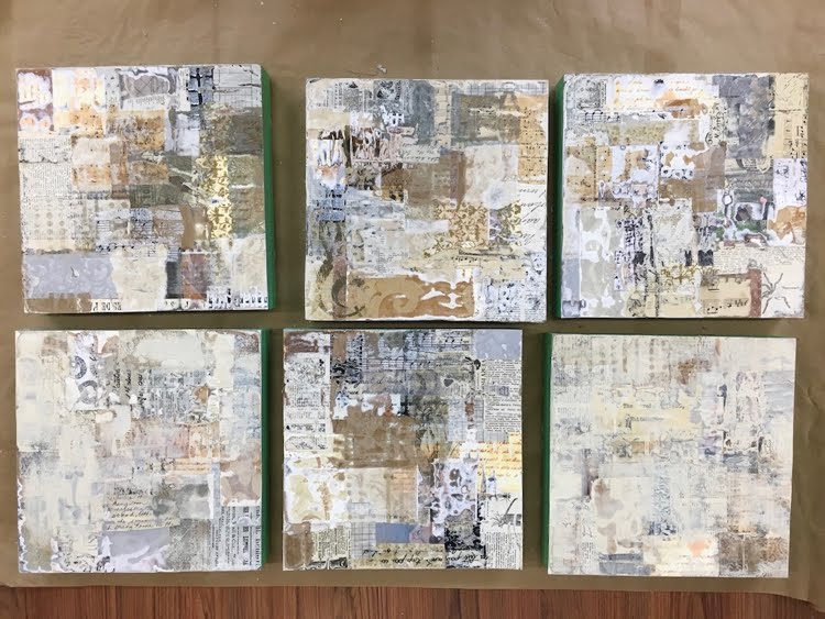
Top row, left to right, #1 - 3. Bottom row, left to right, #4 - 6.
Each 10 x 10 board has four layers of collage. At this point they've been sanded,
and #4 and #6 have a bit of paint on them.

The general appearance of the sanded pieces was "vintage", because of the papers I had used as collage material: mostly beige, with small print. If I had used white papers with large, modern typeface, the feeling would have been more contemporary. Because of this "antique" quality, I was tempted to finish these off with cut-out botanical prints (a rose, an apricot branch in bloom) or a butterfly, but decided that this was not the direction I wanted to pursue.

Instead, I reverted to my "cityscapes" theme. Carbon black paint established the sky background, sometimes further sanded down to create ambiguity. Masses of buildings emerged and were defined with patterning and line. Stencils, stamps, painters' tape, marker, paintbrush, water-soluble crayon and charcoal were all put to use. Further sanding and collage ensued. I wanted to retain the character of the "deconstructed" materials, not covering up too much. The impression is one of "A City in Ruins".
Here are the results:
#1

#2

#3

#4

#5
#6. This one has the least amount of paint and patterning added to the
deconstructed collage surface. Just a few lines to suggest shapes.

I consider these to be works in progress, and hope to have another go at them soon. Something about the black seems a bit harsh. Can I make it richer, somehow? Perhaps I can create some transitional areas between the busy patterning of the collage and the quiet space of the background. Might introduce a few touches of colour too. Stay tuned!


Sunday, March 3, 2019

Here we go again: Another Jane Davies workshop

Over the years I have been lucky enough to take several workshops with Jane Davies. Some of them have been in person, and some have been on-line. Most recently, I took an on-line class this fall titled "100 Drawings", which was wonderful, though intense. Each week, we were given some parameters and asked to produce ten (or at least six) small pieces that met the assignment. These were intended to be "explorations" not "finished work". I learned so much from this, not only from the teacher but from the other participants.

You can read about my experience with this class by doing a search for "100 Drawings" on this blog (see search box on the right-->).

The final assignment, Lesson 10, was unique. We were required to devise our own "parameters", with Jane's advice and input.

Out of that experience, Jane came up with a brilliant idea. She offered graduates of the class the option of doing Lesson 10 eight more times. In other words, devise your own parameters for an exploration, submit it for approval, and then post ten paintings created using your own guidelines. Do this eight times, once every two weeks. And be prepared to comment on the work of the other participants. Of course Jane comments too, and offers suggestions and resources.

#1 has the lightest values

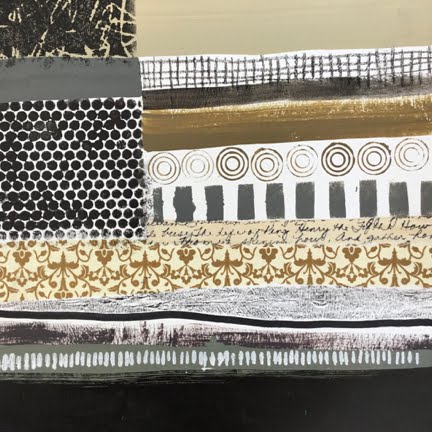
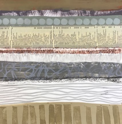
Because I had missed Lesson 7 the first time around, I decided that it would make a good re-entry plan. The assignment was to use horizontal stripes in a monochromatic colour scheme, and to demonstrate "unity" more than "variety". Many techniques and materials were permitted: collage, paint, and crayon. Pattern could be introduced with stamping, stencilling, and scribbling.


#2 has the darkest values. It began as a black background

So I embarked on this lesson, changing only one thing. Rather than working with a monochromatic colour scheme, I chose to use neutral colours (black, white, grey, buff, taupe, brown, etc.)


#3 has very darks and very lights, but not much in the mid-range of value.

#4 has a full range of values, and hints of muted colours like
celadon, olive, raw umber, burnt sienna

#5 has a full range of values, and touches of raw umber

#6 has mostly lights and mediums, but suggests some colour:
celadon, burnt sienna, and violet

#7 began with a bright yellow background. My intention was to allow a tiny bit
of yellow to peek through the stripes, but somehow it got away from me.

Likewise #8 began as a red background, and would have benefited from
more stripe, less red

#9 relies on dry-brushing for texture, rather than patterning, as does #10.
It began as a background of burnt umber.

#10, like #9, has a landscape quality. They seem to have more depth than
the first eight, which were flattened by the patterning.
It began as a background of neutral grey.

The original assignment described the patterning as "tone on tone", more subtle than the patterns I employed here. As I worked on these, I thought about range of value, range of "chroma", unity and variety. I would say that the unity suffered from excess variety, but otherwise neutral stripes could have been deadly boring. I also noticed how a colour that looks neutral on the palette can appear to be quite colourful next to duller hues. For example, the yellow in #9 and #10 looked like putty on the white palette.

All these measure 9" x 9", or 10" x 10".

Do you have a favourite? Can you guess which one the instructor preferred? And what parameters should I set for myself next week? If you scroll wa-a-a-ay down, you can find out which one Jane Davies liked best.


The first one! And my daughter has already claimed it.