Showing posts with label workshops. Show all posts

Wednesday, March 24, 2021

Painting class, progress report #3

Our fourth and final session concentrated on brushstrokes. We were encouraged to develop dexterity with big brushes, loaded with lots of paint. Big, juicy brushstrokes create a sense of energy. Beginning painters are often too timid with their brushstrokes, making many fussy adjustments that make the final painting look overworked, rather than fresh.

Patti Mollica, teacher for the Winslow Art Center's "Paint Fast, Loose and Bold in Acrylic and Oil", demonstrated by using a 2" brush on a 6" x 6" canvas. Very impressive brush-handling!

We were given a pdf with several awkward shapes (above), and tried to fill them in, without lifting the brush from the paper. In other words, with a single brushstroke.

To follow up, we tried to fill in awkward shapes in this line drawing of a rose. Again, single brushstrokes only. One approach I tried to put into practice was the under-mixing of colour on the palette, giving a kind of variegated quality to a single colour.

I see some value problems in this, but it was just an exercise,
and I'm not planning to rework it.

Our final in-class assignment was to create a value study of a photo, and then to paint over the value study using as few strokes as possible. We were challenged to make the image using no more than 15 separate brushstrokes.

the subject

my value study

I quickly realized that my brush needed to be fully-loaded with paint, and moved up to a 1" brush. It was also clear that I would have to put some thought into the sequence of strokes (dark over medium-value? medium-value over dark?) 

Maybe 20 strokes to cover 12"x9" panel

One non-essential stroke is the highlight down the side of the bottle. Also, I could have done with a single highlight on the bottle, rather than two. Five strokes were needed for the background alone. 

As instructed, I created the value study in charcoal directly on the panel, then painted over it. But the charcoal lifted from the surface and mixed in with the goopy paint, darkening it. Should I have applied fixative to the charcoal? Or used graphite instead of charcoal?

More importantly, was this just an exercise to teach the importance of loading the brush, making big, unfussy gestures, and planning a strategy? Or is this actually how we're supposed to paint?

Alas, these questions will not be answered, as the class has ended. Your comments welcomed.

Tuesday, March 9, 2021

Painting class, progress report #2

Having completed three sessions, I am learning a lot in Patti Mollica's class, "How to Paint Fast, Loose & Bold". I also ordered her book, and have found it to be instructive. 

One of the aspects of Mollica's paintings that appeals to me is that she imposes her own colour scheme on her subject, creating a mood with colour rather than faithfully reproducing reality. I often did this with my Cityscapes in cloth, so this approach interests me. 

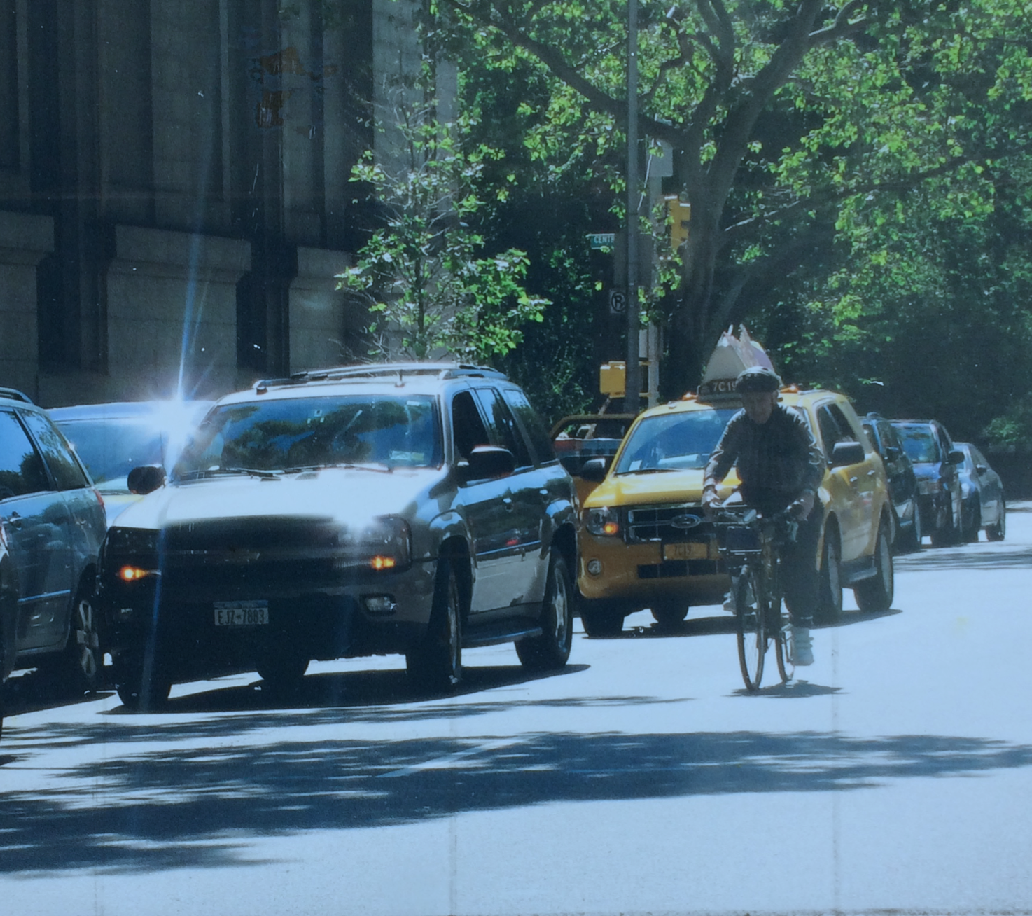
Here's the photo I started with. The instructor has given us ten photos to work with for the four classes. This limitation allows for easier comparison between the varying efforts of the participants.


 Here's how I cropped it into a 9 x 12 format, eliminating distractions that I felt were best removed.


Here's the value study. I used four values for this sketch, and three would have been easier. I eliminated the sun flares on the car to put the focus on the cyclist.


And here is my effort, using what I think might be called a triadic colour scheme (red-blue-yellow). I began this in the third class and finished it up a few days later. The idea is to work faithfully from the value sketch. If changes seem called for, they should be tried out first on the value sketch. (You may notice, if you squint, that I wasn't totally faithful to my value sketch.)

We were to pay attention to our brush strokes, and use them with freedom, introducing subtle variety in colour. Some of the students opted for a robust "mosaic" look, for a still life, for example. I felt an approach like that would undermine the focal point (the cyclist). But perhaps I could have been bolder with the brushstrokes.


More adventures await....

Sunday, February 28, 2021

Painting class, progress report #1

Patti Mollica, the author of "How to Paint Fast, Loose and Bold", offers an on-line class of the same name through the Winslow Art Centre. We are now half-way through the four classes, and I thought I would post an update here.

I am a real newbie when it comes to figurative acrylic painting, so I'm finding there's a lot to absorb.

Mollica's style is all about exuberant colour and energetic brushstrokes, but the basis of her approach to composition is quite technical. Whether she begins with a photo or from life, she translates her image into a value study, reducing the subject to three or four values of dark, medium and light. She transfers her value study to her support, using charcoal, and then mixes and applies paint, always keeping in mind the value of the chosen colours. Being able to rely on this structure allows her to be more expressive with colour and  application of paint.


Above is one of ten photos Mollica provided for our first efforts.


I cropped the image a bit and converted the colours of the photo into a value study, using black, white, and a neutral gray. At this point, the artist has the option of deviating from the original, to make a successful design. For one thing, it's important to have some imbalance. It would be rather boring to have equal amounts of the three values: one should dominate. Even more important is to have enough information to allow the viewer to decipher the subject. Above, the cylindrical nature of the solids are conveyed by means of highlights, credible shading and shadows, and small details that reinforce the perception of solid shapes. 

Another consideration is to establish a focal point, and use a dramatic contrast of value to establish that. Where is the eye drawn? (Often it's to a figure.) Can that focal point be strengthened by directional lines in the composition?

This value study is then transferred to a substrate, using charcoal to indicate areas of light, middle and dark values. Paint is then applied on top of the charcoal drawing.


Above is my first effort, 12" x 9". I decided the image needed to be cropped more closely, and used a 10" x 10" format for my second effort, below. 


I also applied green paint to the panel as a first coat. This "underpainting" peeks through and makes the painting more interesting, especially if its colour is the complement of the subject. 

I think the shadows need to be softened in the image above. Perhaps the instructor will offer some other advice, as she provides support on the class message board and during class time as well.

Here's another still life subject that I worked with:


Notice that in my value study I've transposed some of the values. The highlights are important details, giving information about the shapes of the solids as they are struck by the light.


I used an underpainting of turquoise for this one, though it's not as evident as I would like. Again, I think the shadows should have softer outlines.


When choosing our colours, it's important to be conscious of their values. If I need a dark, it's important that what I mix reads as a dark, to reinforce the composition. So by putting a dab of the paint on our "value checker", we can get a better sense of whether it suits our needs or not.

Mollica is an advocate of using as big a brush as we can handle, to allow for expressive brushstrokes. So far I'm being too careful with mine. Her palette often becomes tainted with colours transferred in the process of applying paint. This is all to the good, according to the instructor. Again, I'm not working loosely enough to accommodate this approach, but it's something I will try to put to use in my next assignments.

Below is a value study of a third photo provided by the instructor. Perhaps something more challenging for my next efforts?


Wednesday, February 17, 2021

Dabbling in figurative imagery

I have signed up for an online class with the Winslow Art Center. The class is called "Paint Fast, Loose and Bold in Acrylics and Oils", and will be given on-line by instructor Patti Mollica, for four consecutive Wednesdays. 

I never took a painting class while pursuing my BFA. For one thing, paint was expensive! Another factor was that the style of painting being championed in my program did not appeal to me. "Les Plasticiens" painted in a style described as "rigorously hard-edged and abstract" and they held sway over the painting department at the university.


an exhibition of "les Plasticiens"

I've dabbled a bit in watercolour and explored abstract imagery in acrylic, but this will be my first experience with figurative painting in acrylic, and I thought I should do a little warm-up before the start of class.

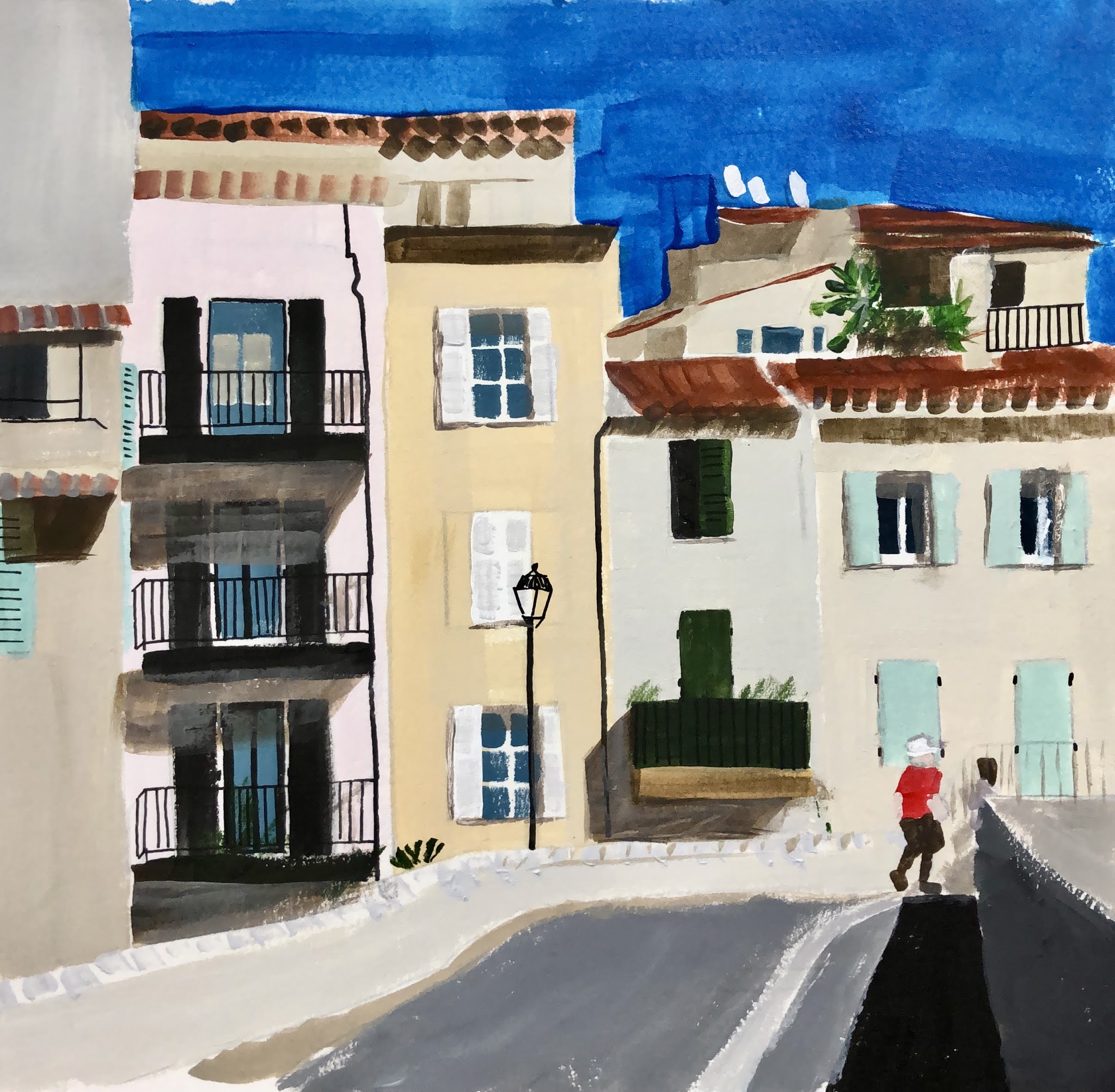
I began with some travel photos and a still life, trying to match the colours in the photos. I found an app called Rapid Resizer that helped me to enlarge the image to the desired size. The app converts a photo into a line drawing and, using some antique carbon paper from the days when I had a portable typewriter, I was able to get the basic shapes and perspective in place.

sketch #1

sketch #2

I set up some still life tableaus and worked from those photos as well.

sketch #3

At this point, I realized that I wanted to do more than just reproduce photos. I wanted "the hand of the artist" to be evident in the sketches. More energy, more pizazz.

I thought back to my cityscapes in cloth, and how I had transformed my photo images by imposing my own colour scheme on them.

sketch #4

Then I noticed a Vlaminck post card that was pinned to my studio wall.

Le Restaurant de la Machine a Bougival, 1905

The bold palette appealed to me.

sketch #5

On further reflection, I decided that the success of Vlaminck's palette depended on many small areas of colour, rather than large blocks of colour. I've noticed the same phenomenon with patchwork quilts. I chose to work from a photo that had more small shapes.

sketch #6

I looked more closely at the Vlaminck street scene, and saw that his brushstrokes added to the vigour of the image. The brushstrokes were not visible on the buildings in the far distance, but became larger moving towards the foreground. I made an attempt to introduce some texture to the foreground of the scene.

Another Vlaminck postcard suggested a still life subject, using a similar palette.

Vase bleu avec fleurs, 1906

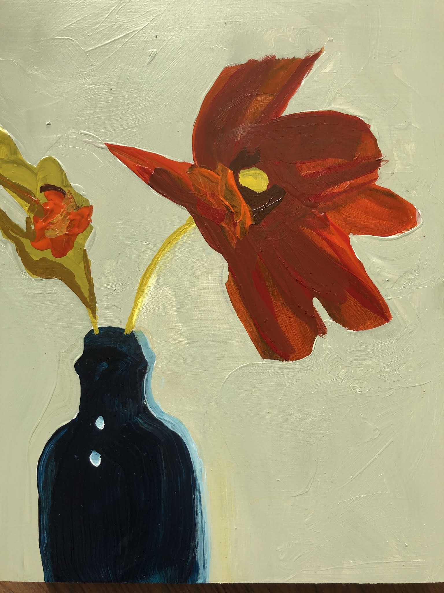
I set up a still life of flowers in a vase, and painted the subject.

sketch #7

How to proceed? Would it have been better to paint the background first? Perhaps I will learn some of these basic skills in my upcoming class. 

To complete the exercise, I took my cue from the Vlaminck and painted in a similar background.

sketch #8

Clearly I have a lot to learn, and I may decide that figurative work is not for me. But at least I am somewhat warmed up for the first class.

Sunday, August 2, 2020

Sketchbook Explorations, Part 7

I have found this downloaded package of instruction from Jane Davies to be helpful in getting me back into the studio. The point is to muck about in a guided and thoughtful way, to ask "what do I see? and "what if?" My hope is that these explorations will act as a springboard for further development.

The final lesson in the package focuses on the grid format, which relies on the use of squares and rectangles placed on vertical and horizontal axes.  We reviewed the distinction between the closed grid and open grid. The closed grid might be something like a checkerboard, where all the shapes are "locked in". An open grid would have some of the shapes overlapping, or floating freely on a background.

For my first attempts, I used collaged shapes exclusively.

closed grid


open grid

Next, I turned to paint:

closed grid

open grid


As I worked, I tried to notice whether I was using a full range of size, of value (dark/light), and of colour, or a more limited range. What made the grid more interesting? Transparency? Pattern?


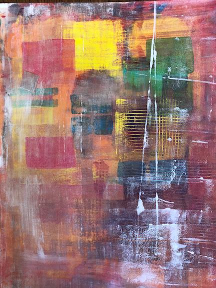
At one point, wanting to make the grid more ambiguous, I grabbed a small brayer, using horizontal and vertical swipes to distribute the wet paint. Then I took a comb to the piece, reinforcing the grid format.


more carnage ensued: hmmmm...

The next activity required me to make several "scribble paintings" on cheap paper, with no thought to composition but with a wide range of value, varied lines and varied patterns. The idea was that the scribble painting would then be cut up into squares of equal size (or rectangles of various sizes) and then rearranged into a closed or open grid.

I can see how this exercise requires an expanded "vocabulary", which is instructive. But I was not able to compose anything pleasing from the cut-out shapes. I suppose that not all approaches suit all students. Still, I'd like to think I learned something about the value of variety in composition.

Scribble painting #1

Scribble painting #1,
cut up and reassembled, but not glued


Scribble painting #2


Scribble painting #2,
cut up and reassembled, but not glued

Not thrilled with the results, but I thought some of the individual squares had some potential.  Pattern, texture and transparency helped make the squares interesting:


random square #1

random square #2

random square #3

random square #4

random square #5

Here's the third scribble painting, and how it was cut up and re-assembled:

Scribble painting #3


Scribble painting #3, cut up into squares and rectangles 
of various sizes and assembled into an open grid.
Perhaps I should have used fewer pieces, instead of
trying to fit them all on the page.


The final assignment in this final lesson is to use the grid format to make an actual composition, something that we find to be interesting and pleasing. Ambiguity and pattern are to be embraced. I look forward to taking on this final assignment, and will be sure to post here. Soon! Let's see if I can embrace the "sketchbook mentality" of experimentation to expand my visual vocabulary.

Wednesday, July 29, 2020

Sketchbook Explorations, Part 6

Continuing on with Week 5 of Jane Davies' packaged instruction, I pulled out the small gestural compositions that I made in the previous lesson, using black paint and black wash.

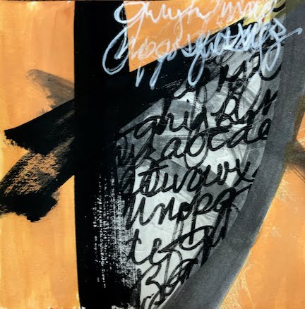
We were asked to add one piece of collage to each of these little studies, and then to add "something else", which could be a mark with a drawing tool, another piece of collage, some paint or some pattern. We were to note the relationship between the original marks and the collage piece, and then use the next addition to strengthen the relationship between them.

red, textured collage pieces added, then opaque black paint

deli paper scribble collage added, then quin gold wash and
white marker scribble.
I found the quin gold wash acted to unify the parts.

I found myself using positive/negative, black/white contrast for some of these.


The next exercise had us go back to the thumbnail compositions made in a previous lesson. We were to choose one design, and express its shapes using paint / collage / line in various media.

my initial design:
I like the small, somewhat rectangular shapes contrasted with
enormous rounded shapes, so big they exceed the margins of the frame.

paint and collage, with white marker defining the lines


paint and collage, using a narrow range of hue and value,
uniform black marker

contrast of highly textural areas with flat and patterned areas,
smudgy line

more variety in small shapes, less definition between large shapes,
brushy margins


variety in small shapes, some texture in large shapes,
hard edges define large shapes

lots of texture in background areas, red collage defines large shape

I may well go back to this exercise and choose another thumbnail design to work from.

Finally, the lesson ended with self-portraits, using blind contour. I allowed myself to look at the drawing when I needed to lift the pencil and reposition it. Otherwise, my eyes were on the mirror at all times.

without glasses

with glasses

I am struck by how the distortions evident in these blind contour drawings express the tenor of our times.