Sunday, October 30, 2016

Paper-clad mannequins at Berrington Hall

The grounds at Berrington Hall

While staying in Shropshire this summer, Hilary Gooding brought our little group to Berrington Hall, a National Trust property. It features an extravagantly furnished mansion, interesting gardens, and the final landscaping project of Capability Brown's long and illustrious career. This year marks the 300th anniversary of the birth of the famous landscape designer, and there was a special needlework exhibit on display that celebrated his life and times.

One of the many rooms, with its period furnishings

For me, one of the most intriguing aspects of the visit to Berrington Hall was the mannequins dressed in period costumes, all made of paper, not cloth. The artist is Denise Watson, and her beautifully costumed figures added a touch of life to the formidable formality of the house.


Don't stand too close to the fire!

Notice the hair, the lace and the "pearls", all created from paper.

Even the shoes were made of paper

I believe the central figure was meant to represent Capability Brown,
going over his landscape design with the architect (left), and the fellow on the right, described as a gardener.

Perhaps the whimsical treatment of the hair was meant
to signify his occupation.

This young miss's dress has a skirt with a sheer, polka dot overlay,
matching the lacy ruffle on her bonnet, all crafted from paper.

A family grouping adds warmth and scale to the elegant surroundings.
Notice the sheer layer on the dress of the little girl, to the left.

The docent explained that the paper clothing had been made especially for the venue, to celebrate the anniversary of Capability Brown. He also said that the artist wanted all the clothing destroyed when the exhibition ended. He said he hoped that something could be worked out that would allow the paper costumes to be on permanent exhibition there. I would like to think the staff at Berrington House had come to grow fond of their "paper dolls".

Wednesday, October 26, 2016

Stewart Hall Rental Collection 2017

Once again, I am delighted to have work accepted into the juried show for the Stewart Hall Rental Collection in Pointe-Claire.

Competition is always fierce, and typically there are over 500 entries from all over the region for the 130-or-so acceptances. This year I took a chance and entered three small acrylic collage pieces, rather than work in cloth.

One of them was accepted. And it has already been purchased. Every year the Gallery buys a single work and then awards it to someone randomly chosen from all those who purchase a piece of art during the show. This year the winner will go home with Touchstone #1.

Touchstone #1

The idea behind the Stewart Hall Rental Collection is that a wide range of work (different sizes, different media, different subjects, different colours, different price points) is accepted for the show at the beautiful Stewart Hall Gallery. When the show closes in late November, all the works become available for sale or rental, for one year. Last year I was lucky enough to sell a large cityscape in fibre.

Come and see what it's all about!

October 29 - November 27, 2016
Monday - Sunday 1 - 5 pm; Wednesday 1 - 9 pm
vernissage: Sunday, October 30, 2 pm

176 Lakeshore Road, Pointe Claire QC

514-630-1254

Sunday, October 23, 2016

It's Another Baby Quilt...

... and it's for another baby! Last month, my niece delivered her second child, a girl, and this 42"-square scrap quilt should do nicely to mark the event.


I dug deep into my fabric stash (so satisfying to use up what's on hand) and came up with an array of florals, checks, swirls and polka dots, all in greens and reds. The pattern was inspired by Spectacular Scraps: A Simple Approach to Stunning Quilts, written by Judy Hooworth and Margaret Rolfe (Martingale & Company, 1999). The book shows how half-square triangles can be combined in many different ways to create simple but effective patterns.


I chose to quilt it by machine in a pattern called "continuous curves", an easy approach that requires no marking.

The backing is a tiny pink-on-pink polka dot, and the binding is a green plaid. The wide variety of greens and soft pinks reminds me of pistachio and raspberry sorbet. Quite suitable to welcome Baby Karina!

Wednesday, October 19, 2016

Through Our Hands: new edition available on-line

They've done it again! With ninety-four pages of wonderful images, fascinating detail and a full range of fibre-based art, Laura Kemshall, Linda Kemshall and Annabel Rainbow have published Through our Hands magazine, Autumn 2016 edition.

It's available for free on-line, and well worth a look.


Sunday, October 16, 2016

Hockey & Fine Art: A Point of View

John Little, Hockey Rue d'Artillerie, Québec, 1960

The Alan Klinkhoff Gallery presents Fine Art & Hockey: A Point of View, an exhibition of fine Canadian paintings on the subject of hockey.

Some of the artists included are Bruno Bobak, Molly Lamb Bobak, Adrien Hébert, William Kurelek, John Little, Claude Simard, and Philip Surrey.
"Hockey has become synonymous with Canadian culture, and is often used as a metaphor for Canadian life....  The works of art, none of which are for sale, are on loan from private, corporate and institutional collections."
Philip Surrey, Detroit vs. Canadiens, 1960

October 15 - 29, 2016
1448 Sherbrooke St. W., Montreal
514-284-9339

Hours: Tuesday - Friday, 9 am - 5 pm; Saturday, 9:30 am - 5 pm.

The exhibition may also be viewed on-line.

Wednesday, October 12, 2016

Extreme cropping

I have signed up for a class at the Montreal Museum of Fine Arts, titled "Methods and Materials in Acrylic Painting". The instructor is Melanie Matthews, who is well-known in Montreal as a rep for Golden products. Her specialty is mixed-media: collage and painting.


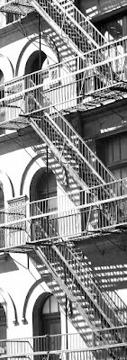
For the six weeks of the class, we will be working on three 12 x 12 panels. Our homework this week is to select a single black-and-white image that measures 37 x 13 in vertical or horizontal orientation. These dimensions require severe cropping of a standard-sized photo.


The idea is that the three panels will ultimately be hung together to display the full image. The extra inch in both directions is required for a half-inch overhang on the panel sides.


The photo is be printed out in mirror-image, full-size, at a specialty copy shop. As well, the image is to be 70% light and 30% dark. It should be "simple". And it will be the only image we work with for the full six weeks of the course, so it's important to like it!


Each successive week will be devoted to adding more layers to our panels. We have begun by sealing them and applying gesso. Next comes collage to add texture. Later it will be glazes of paint.


Above are the five images I am considering. I have tried to crop so that each panel is interesting in itself, and taken into account the negative spaces. I'm completely undecided at this point, and hope to get advice from the instructor about their suitability before going to the print shop. Any thoughts?

Sunday, October 9, 2016

In Print! x 3

Just delighted to have my work featured in three magazines this season.

An art quilt that I made specifically for SAQA's "Tranquility" call for entry was accepted to the show and also chosen as part of a two-page spread in the SAQA Journal, Volume 26 No. 3. I was pleased to be accepted as it was the first time I had entered an all-member SAQA show. I participated in a regional show a few years ago, "Synthesis 2".

Page 2 of 2-page spread on "Tranquility" show, SAQA Journal, Vol. 26 No. 3

SAQA (Studio Art Quilt Associates) is an American-based international group that promotes the medium and supports artists who work with fibre. Among their many initiatives, they regularly organize thematic exhibitions that travel worldwide to be shown in museums and at quilt shows. "Tranquility" will open at the upcoming International Quilt Festival in Houston, the IQF in Chicago (April 2017) and will likely be shown at other venues over the next couple of years.

The current October/November issue of Quilting Arts magazine also features an 8-page sampling from the "Tranquility" show, devoting a full page to my "Come Sit with Me, Patrick Caulfield". My artist statement reads,
"Patrick Caulfield (1936 - 2005) was a British artist known for his paintings of interiors, with their strong black lines and flat colours. This is my invitation to him, to join me in my cozy reading corner and have a cup of tea."


Page 4 of an 8-page spread in Quilting Arts magazine (Oct-Nov 2016) is given over to my work!


Even more exciting is the upcoming edition of Stampington's Art Quilting Studio, which will showcase ten of my cityscapes and include a beautifully-written article by Ricë Freeman-Zachary, based on her interview with me in August. I will post more details as they become available.

Wednesday, October 5, 2016

Café Mikko


A little over two years ago, Café Mikko opened its doors to the passing trade of Hudson, QC. It has become a favourite spot for coffee, lunch and snacks, and is also a great source for carefully curated housewares and accessories, all in keeping with its clean, minimalist aesthetic.


I was delighted to be approached by owner Elizabeth Glazier to show my work at Café Mikko for the next few months. I plan to switch it up every few weeks to keep the display fresh.


For more information about hours, menu and boutique items, please visit the Café Mikko website.

Sunday, October 2, 2016

Update on Hudson Artists Fall Show

Touchstone series, collage and acrylic, on display at show

For the first time ever, three judges were engaged at the Hudson Artists Fall Show. The intention was that the judges would choose a single work that was a real stand-out.

The judges were

Christian Gonzalez, cultural activist and publisher of "Talents d'ici", 
Madeleine Turgeon, President of the Autour de Nous art group and Vice-President of the Conseil des Arts et de la Culture de Vaudreuil-Soulanges, and 
Martine Therrien, professional artist and visual arts teacher,

and they were on the job when I arrived early to the 7 pm vernissage on the Friday evening.

When the judges addressed the assembled artists and visitors an hour later, they first announced the single work that had won Best of Show. It was a large collage on panel, about 30 x 40, by Francine Barrette-Labelle. 


Ville de Glace, by Francine Barrette-Labelle, won best of show


Then the judges announced that they had spontaneously decided to award two Honourable Mentions for "outstanding bodies of work".  I was thrilled to have my new Touchstone series recognized in this way. 


Madeleine Turgeon's favourite


Martine Therrien's favourite

Even better was a chance to talk to the judges about their response to my new work. Madeleine Turgeon, whose work I greatly admire, said that even though the abstract collage is a departure from my fibre-based Cityscapes, that it was immediately recognizable as my work because of its "meticulous attention to detail", and its "concern with balance and composition". She and Martine Therrien were able to identify their favourite of the 15 in the Touchstone series, but Christian Gonzalez wasn't able to name a single favourite. He liked the whole group.


Joanna Olson's small still life paintings

Joanna Olson's small still lifes were also acknowledged with an Honourable Mention. Again, Joanna's paintings can be immediately identified as hers. There is a soft warmth, a brightness and a delicate touch to her work that I find very feminine.

The judges' favourite of Joanna's small oil paintings

It was a delight to have validation from many of the other artists, who came up to me before the awards were announced to express their excitement about my new series. Because I am known to this group (mostly painters) almost exclusively for my work with fibre, I often feel a bit marginalized. So, it was very special to have new work in another style and medium recognized.