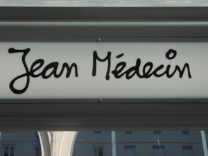
One of the first things I noticed when visiting Nice this September was the light-hearted font used to identify the tramway stops.
Very human.

I learned later that the script is that of Niçois artist
Ben Vautier, known as Ben and now 80 years old. His work is in the collection of the Musée d'Art Moderne et d'Art Contemporain in Nice. Among his many causes, Ben is a champion of the Occitan language.
The transit company has posted little phrases attributed to Ben on its tramway shelters. Some of them I could understand, but others may be in Occitan, a relative of Catalan.
 |
Raoul Dufy, La Jêtée-Promenade, Nice 1926
oil on canvas |
Then I saw an exhibition of paintings by
Raoul Dufy at Nice's
Musée des Beaux-Arts, specifically his paintings of the Promenade des Anglais which borders the coast of the Baie des Anges in Nice.
 |
Raoul Dufy, Le Casino 1950
oil on canvas |
What are these but line drawings superimposed on coloured shapes? And notice the quality of line: casual, approximate, playful.
 |
Henri Matisse, Still Life with Vase of Flowers
and Plate of Fruit, 1947 |
The
Musée Matisse in Nice has many of
Henri Matisse's very beautiful drawings, which show a similar quality of line: light, exuberant, expressive.
 |
| Henri Matisse, Female Portrait |
Even this poster advertising Nice, featuring
La Baie des Anges by Marc Chagall, uses a script with a similar flavour.
For about 150 years, Nice has marketed itself as an international playground. Whatever darker issues Nice must deal with (the legacy of colonialism, immigration, unemployment) its "brand" is effectively established as being "fun in the sun".
No doubt there is a synergy: the art is effervescent because of the setting, and the destination is seen as having a carefree
joie de vivre in part because of the art it has inspired.
And wouldn't it be fun to use a loose, sketchy line when working with my images from the Cote d'Azur?


