Sunday, February 28, 2016

La Grande Bibliothèque

Given that it is now more than ten years old, it's about time that I investigated La Grande Bibliothèque here in Montreal. Our text'art group is planning a visit, when I expect to learn more about what the library has to offer.

Audioguides are available to introduce the first-time visitor to the space and the collection. Membership is open to all residents of Quebec at no cost.

Wikipedia says it rivals all other North American libraries for attendance figures, and there may well have been more than 1500 people there on my last visit. The place is vast, with 33,000 square metres and many different configurations of reading spaces. One long hallway is lined with floor-to-ceiling windows and armchairs that overlook an urban landscape: aging low-rise buildings, complete with back balconies, clotheslines, alleys and garages. What a find!


Quick facts:

- 4 million items in the collection, 30% in English

- 80 kilometres of shelving
- 1300 reading armchairs, 850 study seats and carrels, and 350 computer stations
- 44 audio stations and 50 video stations, as well as multimedia computer terminals and two music rooms with facilities for composing electronic music
- a screening room that accommodates groups of up to 20
- a direct connection to the metro
- a coffee shop on the ground floor
- extensive e-book and audiobook collections


Until August, the library offers a virtual reality experience designed by Robert Lepage, The Library at NightIt explores ten of the world's most fascinating libraries, and "the philosophical, architectural and social foundations on which all libraries rest".  
"Visitors ... don headsets using 360°video immersion technology that take them from Sarajevo's National and University Library, magically risen from the ashes, to Mexico City's Megabibliotheca, the stunning digital-age Biblioteca Vasconcelos, and from the legendary city of Alexandria to the bottom of the sea aboard Captain Nemo's Nautilus. There are a total of 10 famous places, both real and imaginary, to be visited on a one-of-a-kind journey for which BanQ is your guide."
With fond childhood memories of a hometown library set in a re-purposed fire hall, I find it remarkable to see how the idea of the library has evolved in the last fifty years.

Wednesday, February 24, 2016

The Artist Project


Love museums? Fascinated by art? Then the Artist Project, an initiative of New York's Metropolitan Museum of Art, will delight you. 
"From March 2015 to June 2016, we will invite 120 artists—local, national, and global—to choose individual works of art or galleries that spark their imaginations. In this online series, artists reflect on what art is, what inspires them from across 5,000 years of art, and in so doing, they reveal the power of a museum and The Met. Their unique and passionate ways of seeing and experiencing art encourage all museum visitors to look in a personal way."
Seasons 1 - 4 are available by clicking on the MENU option on the website. Season 5 begins soon.


Sunday, February 21, 2016

1000 Barbies at Les Cours Mont-Royal

Les Cours Mont-Royal, a high-end shopping complex in the centre of Montreal's downtown, has set aside 5000 square feet for a permanent exhibit, "Barbie Expo". Admission is free, with donations suggested to the Make-a-Wish Foundation.

Zombie Bride


Put aside your reservations about Barbie and enjoy the creativity on display. Begin with the de rigeur bridal section, with many gowns by well-known designers. We have Grace Kelly, of course, but also Zombie Bride. (Sorry about the reflections in the photos: all that glitters... you know....)


We celebrate the various decades of style:
Nifty Fifties
Peace & Love 70's
Fabulous Forties

Bob Mackie has an entire showcase devoted to his over-the-top creations:

Lady Liberty
Le Papillon
Goddess of the Sun
Some designers were inspired by paintings:

Monet's Water Lilies
Klimt's Adele Bloch-Bauer I
Leonardo's Mona Lisa
Others by movies and TV:

Goddess of the Galaxy
The Munsters
Faraway Forest Elf


Inspiration comes from national costumes, birds, flowers, Coca-Cola and the Sydney Opera House, making for a remarkable display of technical skill and creative panache. Take care to scan the faces of the mannequins for some recognizable celebrities (Cher, Elizabeth Taylor, Penelope Cruz....) Consider how the extravagant footwear and hairstyles enhance the fashion. Of interest to all ages, though the very youngest might find some of the mannequins frightening.


Wednesday, February 17, 2016

Colour and value, Part 2

I've now completed the first of six lessons for Jane Davies' advanced colour class. For the fourth and final project in Lesson 1, our assignment was to make a colour wheel using primaries of equal value.


Because yellow is almost invariably lighter than either blue or red, the first job was to find my darkest yellow, which was in my set of gouache paint. Flame Red and Sky Blue came from the same set, but had to be lightened with white to match the yellow in value. Using the scanner and photo software helped me to mix the values of the red and blue to match the value of the yellow.

From that point, the task was to create secondary colours (green, orange and violet) that were at the mid-point between their components. The orange was to be midway between the red and the yellow, for example. Then, the same objective with the tertiary colours, so yellow-orange was to be midway between the yellow and the orange, and so on.

What you'll see here are some insipid violets. There are two reasons for this. The red and blue used to mix the violet were both "diluted" with white paint so there was less pigment than needed to make a vibrant violet. Also, the red I used is on the orange side of red. Orange and blue, being complementaries, make a neutral, hence the neutral chroma of those "violets".

No matter. The assignment was to have smooth transitions between the colours, and to use and create colours of the same value. You can see from the black-and-white version of the colour wheel, shown below, that the colours are relatively close in value. If I had used primaries of equal value straight out of the tube, I would bet that there would be more consistency in the values of the resulting colours. No doubt there were some little variations created when I had to re-mix the red and blue as I used up the paint. The theory is that if you start with primaries of equal value, you will get mixes of equal value.

Notice how dark the original red and blue are by comparison. A new way to look at colour.


Sunday, February 14, 2016

Colour and value

I've enrolled in an on-line Jane Davies class, "Beyond the Colour Wheel - Advanced Colour Studies", which will run for the next 12 weeks. This is my third on-line class with Jane, an abstract artist with a wonderful sense of colour and composition.


For Week #1, we are looking at colour and value. Value contrast can be useful in organizing a composition. We began by making our own grey scale, mixing black and white paint to make 9 swatches, gradating from light to dark. The goal was to make a smooth transition from one shade to the next.

Then we squeezed out paint and used our grey scale to assess just how light or dark each colour is. Evaluating the value of colours is deceptive, so this activity was designed to sharpen the eye. Look at these reds, for example.


You can probably pick out the lightest red and the darkest red, but could you assign each swatch of red a value number? Just how light is that scarlet? How dark is that alizarin crimson?


Besides a scanner, one of the tools we're using for this exercise is photo software that "de-saturates" the colour, changing a full-colour jpg to black-and-white. Now it's a bit easier to assign a value number to each of those reds. This is useful when pairing that red up with other colours. You could achieve the same thing by making a black and white photocopy of the colour swatches.

Another exercise was to choose a single colour of paint, and add to it white paint (to make tints) and black paint (to make shades). Then we took these paint chips and tried to match them to the closest value on the grey scale. Here is what I did with Phthalo blue (red shade):


After de-saturating the scanned image, it becomes clearer to see that I overestimated the strength of the blue tints (those paler colours) but was more accurate with the darker shades:


The final assignment for Lesson #1 is to use paint to make a colour wheel that uses only colours of equal value.  This will be a real challenge, and I will share my efforts in the next post.

Wednesday, February 10, 2016

Self-Portraits with Alzheimer's

When he was diagnosed with Alzheimer's at the age of 62, the American painter William Utermohlen (1933-2007) began a haunting series of self-portraits that documented his experience with the disease. “From that moment on, he began to try to understand it by painting himself,” said his wife, Patricia Utermohlen, a professor of art history. She noted with some poignancy that he became better known for this series than for any other work he had done, even at the height of his career.


Utermohlen painted realistically when everyone else was doing Abstract Expressionism. Yet, as his disease progressed, his images became distorted until his features melted into an indistinguishable mass.

There is some debate as to whether the change was a result of Utermohlen's cognitive decline, or whether he chose to paint in a more expressionistic style to convey the sense of disintegration he experienced. In his final years, he no longer painted at all. 

Dr. Bruce Miller, a neurologist at the University of California, San Francisco, who studies artistic creativity in people with brain diseases, believes that some patients can still produce powerful work. "Alzheimer's affects the right parietal lobe in particular, which is important for visualizing something internally and putting it onto a canvas," Dr. Miller said. "The art becomes more abstract, the images are blurrier and vague, more surrealistic. Sometimes there's use of beautiful, subtle colour." 

Utermohlen's moving portraits continue to be exhibited, most recently at Wesleyan University in Bloomington, Illinois; Loyola University in Chicago; and Trinity College Dublin.


(This post is based on an article from The New York Times. Thank you to James Gurney for bringing it to my attention.)


Sunday, February 7, 2016

Come Sit with Me, Georges Braque

Come Sit with Me, Georges Braque, 30" x 24"
I am happy to have finished this piece well ahead of deadline. I made it in response to a SAQA call for entry with the theme "Turmoil". This show is to be held in conjunction with the "Tranquility" show, for which I also created an entry.

It was exciting for me to set aside my Cityscapes series and techniques and try something different. This piece is inspired by a sketch I made while taking a class on Cubism in November. The teacher, Jessica Houston, explained that Cubism was the dismantling of the single-viewer perspective as devised in the early Renaissance. Instead, artists like Georges Braque used multiple, simultaneous viewpoints, to create an impression of reality as we actually experience it, moving through time and space. This breaking with convention created turmoil in the art world.

preliminary blind contour drawing of the stool:
made without looking at paper, without lifting pencil from paper
Our instructor placed a four-legged stool on a tabletop for us to draw. After a minute or two, she turned it upside down, and we continued to draw. She kept turning the stool, and we kept sketching.

another sketch with some lines erased and others emphasized
We were told to erase some of our lines, and emphasize others with a heavy line of charcoal.


We were then instructed to cut out an image of the stool from newspaper, without benefit of pencil, and incorporate the cut-out into another drawing. This third sketch was the one I worked from to make Come Sit with Me, Georges Braque.

A full-size maquette and various cut-outs, all part of the process
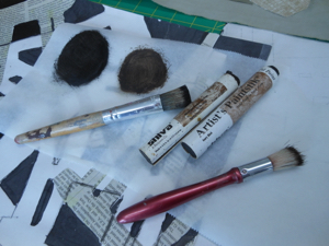
oil paint stick was applied to cloth shapes
Violin and Candlestick, Georges Braque
I continually referred to one of Braque's paintings, observing his use of colour, shape, line and brushstroke. The Cubists were innovators who collaged non-traditional materials like newspaper and wallpaper into their paintings. I referenced this by using some commercial cotton printed to resemble newsprint.

The dimensions of my piece are the minimum for this call for entry: 30 x 24". The announcement of which pieces have been accepted for both shows, "Tranquility" and "Turmoil", will be at the end of March. Fingers crossed! Meanwhile, Come Sit with Me, Georges Braque will hang with its companion piece Come Sit with Me, Patrick Caulfield at my upcoming solo show in Ottawa, both marked as NFS (not for sale).

Wednesday, February 3, 2016

Cityscapes: Solo show at Arts Ottawa East


I am pleased to announce the opening of my solo show,


Cityscapes: Collages in Cloth and Stitch

AOE Gallery, Shenkman Arts Centre
245 Centrum Blvd., Ottawa

February 11 - March 13, 2016

Monday - Friday, 9 - 5 

There will be a Meet the Artist event on Sunday, February 21, from 1 - 3 pm. Please consider dropping by!