Sunday, September 30, 2018

Lesson 3, "100 Drawings"


Lesson 1 was about line and veiling. Lesson 2 was about rapidly laying down paint, then going back in with line and veiling. Lesson 3 is an exploration of shape, incorporating the tools of line and veiling that we've already covered.


I'm three weeks into the ten-week on-line course with Jane Davies and the pace is challenging. There are close to 50 active participants, all posting their 6 to 10 "explorations" weekly. So I get to see everyone's responses to the assignments, and to exchange observations with all of them, and I get to read the teacher's comments on their posts, as well as on mine.


This week, we are to make ten drawings exploring shape as a primary element.
  • Line and pattern can be brought into play, but shape should be the focus. 
  • We are encouraged to use a variety of techniques to make our shapes, 
  • to make some compositions with minimal colour, 
  • to experiment with using just a few shapes, and
  • to try using a large number of shapes.


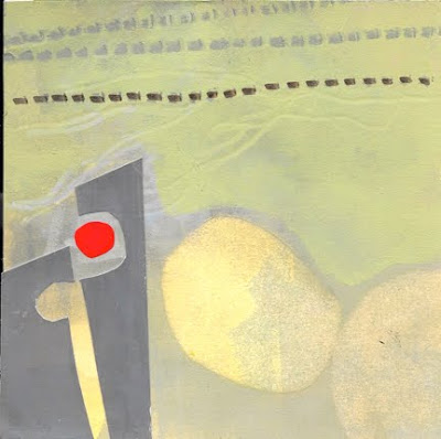
For this week's assignment, I made six pieces with a blue/orange colour scheme, and four with a neutral colour scheme (enlivened with a dash of red).


I should also mention that we get instruction every week, in the form of videos. Many of these videos are available on Jane Davies' website, so have a look at the "videos and tutorials" link if you'd like to see what that's all about.


In this week's videos, we looked at using hand-cut stencils to create shapes. A variation on this is to fill in the stencil with stamping or scribbling, or to spritz alcohol on the shape in the stencil, allowing you to "lift" some paint on the selected area.


We also looked at using "masks" to make shapes. Masks can preserve a background, allowing you to paint or splatter around it.


Shapes can be solid, or made with only an outline, whether that is created with paint, marker, charcoal, or watercolour crayon. Some media allow for smudged edges, others for clean or dry-brush edges. Shapes can be amorphous, like a cloud, or crisply defined. Then we have positive shapes (like the ring in the image below) or negative shapes (the hole in the middle of the ring.)


I tried to use a range of value, from dark to light, to combine shapes of varying size, and to use transparency and opacity. All these contrasts create interest in a composition.


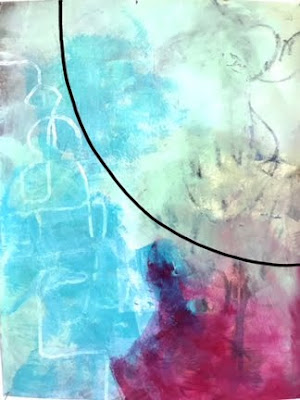
I thought this last one was the most interesting. I liked the way the mosaic of rectangular shapes contrasted with the ambiguous black line underneath it. The line was made with watercolour crayon, and then I dripped water onto it with a pipette, allowing the water to dribble down, forming vertical lines that faded towards the lower edge of the paper.

So many things to try out! 

Wednesday, September 26, 2018

Lesson 2, "100 Drawings"

my favourite

For Week 2 of the 10-week on-line Jane Davies class, our assignment is to work fast, with a 20-second limit for the first application of paint, in several colours, on our 9" x 12" paper. That's right: 20 seconds. With a timer!


We are allowed to spend a few more seconds, if need be, just to ensure that the whole paper is completely covered with paint. While this first layer of paint is still wet, we are to add drawn lines and shapes with graphite and then, with the paint still wet, to blot or "lift" excess paint, thereby creating some transparencies.


Once the paint has dried, we are to go back in with opaque paint (to cover up some of what we laid down on our first approach) and with transparent paint (to add interest and depth), adding more lines if we wish.


The objective of this exercise is to free us up, and to silence our inner critic. It also gives us experience with opacity and transparency.


Shown here is what I came up with, given the parameters of the assignment. I found that applying paint with my fingertips helped loosen me up.


Once again, we are to make ten of these paintings and post them onto the group blog.


my least favourite, and my husband's favourite:
go figure

Of course it's fascinating to see the variety in the student work, and then instructive to read the teacher's responses to each participant's post.


Jane was very positive in her response to my "explorations". She suggested, however, that to get the maximum effect from the assignment, I should aim for some areas that are absolutely flat and opaque, like "a paint chip". For example, in the image above, it's not enough that I used an opaque red paint. It should look opaque, without any suggestion of texture, so that there is a strong contrast between the red area and the other parts of the piece.

As a textile artist, I am most comfortable with defined shapes, so it is a bit of a breakthrough for me to use more amorphous shapes, transparent colour and brushy edges. I'm enjoying this!


Sunday, September 23, 2018

Lesson 1, "100 Drawings"


I have enrolled in an on-line class with Jane Davies, titled "100 Drawings". The class continues for ten weeks, and we are expected to create 6 - 10 drawings each week.


For our first week, we were

  • to work only with line (not shape or pattern or texture),
  • and only with black, grey and white. 
  • to aim for a variety of line (thin vs. thick, crisp vs. smudgy, jagged vs. sinuous vs. straight), 
  • that engaged with the edges of the paper,
  • that was intentional and thoughtful, and not just a scribble,
  • using a variety of media (charcoal, marker, ink, graphite, paint). 
We were then to apply white paint of varying opacity to create a sense of depth. The idea was for the lines to advance and recede from the surface of the paper, as they were "veiled" to varying degrees by the white paint. More lines and more layers of white paint were to follow as needed.


We are to post our work on a class blog every week, so we can learn from each other, and from the teacher's comments on each student's output. We are expected to choose one or two of our own pieces and explain exactly what we "see" happening in the piece. We are not to describe the process, just the result.


At first, I spent too much time experimenting with variety of line (actually kind of fun), but I then re-focused on creating a feeling of depth.


These are my resulting 9 pieces, all measuring 12" x 9".


The instructor's response to my drawings was that they were "beautiful" and fulfilled the requirements of having varied lines and variable use of veiling. Jane Davies suggested I would benefit from making a few that were more dense (more lines, more levels of obscuration) to expand my range. All the other participants had filled their papers with more lines, with exuberance winning out over restraint, and the instructor's own examples showed more density too. 

Something to keep in mind, but the class is fast-paced, and I've already moved on to Lesson 2. Part of taking a class is learning about your own inclinations, and whether to stretch them, break through them, or honour them.

Wednesday, September 19, 2018

Art film series at Cineplex


Great news! "In the Gallery", the series of art films screened at the Cineplex theatre chain, is expanding this season.

Salvador Dali: The Quest for Immortality, October 2018 (9 screenings)

Klimt and Schiele: Eros and Psyche, November - December 2018 (8 screenings)

Degas: Passion for Perfection, November 2018 - January 2019 (8 screenings)

Water Lilies by Monet: The Magic of Water and Light, December 2018 - January 2019 (8 screenings)

Young Picasso, February - March 2019 (8 screenings)

Rembrandt, April - May 2019 (8 screenings)

Van Gogh & Japan, June - July 2019 (8 screenings)

In past years, I've been able to sample films from the "In the Gallery" series. Recent shows at world-renowned museums often serve as the focus, with in-depth commentary from the curators. Historical context helps to illuminate the achievement of the artists, and the "eye candy" element adds to the experience.

More information and tickets are available on the Cineplex website.

Sunday, September 16, 2018

"Contemporary Landscapes in Mixed Media" by Soraya French


Soraya French is a mixed-media artist and teacher based in the U.K. Her website suggests an impressive teaching schedule and a prolific production of landscapes and floral paintings. 

Though I find her work somewhat facile, her recent book "Contemporary Landscapes in Mixed Media" (Batsford, 2017) has a wealth of information about mixed-media materials and techniques. She relies mostly on Golden products, and includes
  • acrylic paint (fluid, full body, open, iridescent, interference)
  • acrylic ink
  • watercolours
  • gouache
  • pastels (soft and oil)
  • crayons (wax and water-soluble)
  • coloured pencils (regular and water-soluble)
  • spray paint
  • gesso
  • acrylic grounds
  • acrylic gel mediums (tar, pumice, glass beads)
  • moulding pastes (fibre, crackle)
She also discusses supports, brushes, collage (paper and found materials) and the use of stencils.

French is careful to emphasize the correct approach to the mixed use of various media. For example, to ensure the long-term durability of a painting, it is essential to understand how best to layer oils and acrylics. 

The 126-page book ends with a couple of step-by-step projects, and season-by-season suggestions for colour palettes. It is available on Amazon, in print and as an e-book.

Wednesday, September 12, 2018

"Why I Did Not See the Picasso Exhibit at the Tate Modern"

Thought-provoking article at Hyperallergic, written by Ksenia Soboleva. Thank you, Colleen, for sharing it.


For a more conventional (5-star) review of the show, titled "Picasso 1932: Love, Fame, Tragedy", visit The Guardian here.  Having read this review, I am convinced I would have jumped at the chance to see the show at Tate Modern, political correctness cast aside. Alas, the exhibition has ended.

Sunday, September 9, 2018

Abstract painting workshop, Part 2


Another major assignment for the recent Jane Davies Abstract Painting workshop was to work with neutral and muted colours.

We learned how to make neutral colours by mixing complementary colours (yellow and violet; red and green; blue and orange) and then altering the mixes by adding black and/or white. We produced lots of swatches of neutral colours to use as collage papers, looking for darks, lights and mediums, warm and cool.


As well as neutrals, we included "muted" colours. It might still read as green (or blue, or violet, or rose) but very greyed down. The results could be seen as "having low saturation" or "minimal hue".


We made neutral and muted backgrounds on 6" x 6" paper, adding collaged shapes, lines and texture. Then we added a small touch of bright red for contrast. Additionally, we made interesting backgrounds in orange and red, and added enough neutral and muted elements to almost cover the paper.


Again, we used the opportunity to try out different approaches to applying paint, achieving various effects. The objective was to create areas of interest, while leaving other areas in the composition more quiet, as a counterpoint. The compositions shown above and below were created in part with the use of "masks" to create distinct shapes.


Finally, we chose one of these 6" x 6" compositions to reproduce in a much larger size, say 20" x 20", or 24" x 24". We were asked to consider what was demanded of a large work that was not required in a smaller one. More interest? More detail? More depth? (Though I attempted this, my results still need some work so I'm not including their images here.)


Once again, a really interesting assignment, and something I might well repeat at home, on my own.

I'm looking forward to taking an on-line class with Jane Davies, beginning later this month. The class is titled "100 Drawings" and participants are expected to produce 6 - 10 small drawings (or paintings) every week, for 10 weeks. They don't have to be finished. The idea is that producing in volume will be liberating, that the results will not be "precious", and that we can be more experimental. The other aspect of the class is to learn to really "see" the composition, to present it and to describe it in a forum. I plan to share some of my results in these posts.

Wednesday, September 5, 2018

Abstract Painting workshop, Part 1

Recently I attended a wonderful workshop in abstract painting and collage, taught by Jane Davies.

One of the first things we did was to paint collage papers, choosing two complementary colours. These were not meant to be patterned. Rather, they were meant to show a wide variety of hue and value.

For example, I chose blue and orange, and my task was to paint swatches about 4" x 6" that read as blue or as orange. But the blues were to extend from blue-violet to blue-green in their hues, though still "reading" as blue. They were also to include light and dark, and greyed-down tones too. Similarly, I  created collage papers in a wide range of oranges, from yellow-orange to red-orange, dull and bright, light and dark.

a blue background with wide range of dark and light,
from blue-violet to blue-green

The next step in the exercise was to paint papers measuring 6" x 6" as backgrounds. Once again, they were to be painted either in blue or in orange, using a wide variety of light and dark, and a wide range of hue.

Next, we were to cut out shapes from the collage paper to add interest to the backgrounds. We could also add line. (See the photo above.)

Our final objective was to create little compositions that combined both the complementary colours in different ratios. Using orange backgrounds, I added blue shapes and blue paint in these proportions: 90:10, 75:25, and 50:50. And then using blue backgrounds, I made compositions by adding orange shapes and orange paint to achieve the same proportions.


Would you say the visual impact of this composition is about
balanced, 50% blue and 50% orange? 40:60?

This one qualifies as 25% blue, 75% orange, I'd say.

Likewise this one?

And this one?

This one might be 10% orange, 90% blue.
It would be improved with some more dark blue,
don't you think?

The proportions were to be assessed by their "visual impact" rather than strictly by the square inch.


Here's an example that might technically be only 10% orange,
but it reads more like 25% orange.

It was generally agreed by the class that compositions were more exciting with a preponderance of one colour over the other, eg. the 90:10 ratio or even 95:5. It was more difficult to make an interesting composition when the colours were evenly balanced.

It also became clear that the compositions were more energized with a range of hue and value.

And the activity served as a great warm-up for the work to follow. We had lots of opportunity to look for variety in all aspects, which makes compositions more interesting. Some of the contrasts were:

bright vs. dull
dark vs. light
transparent vs. opaque
round vs. rectilinear
soft edges vs. hard edges vs. torn edges
pattern vs. solid
using a wide range of scale: tiny, small, medium, large, extra-large
creating texture with a roller, a sponge, dry-brush, lifting paint, dripping paint, flicking paint, spritzing paint with alcohol or water, softening with a fingertip, smudging, sgraffito, and impasto

A really useful exercise, and something one could try at home, solo or with a small group. Of course there's no substitute for getting feedback from a larger group, and having the guidance of an excellent teacher like Jane Davies. If you visit her website, you'll find lots of short instructional videos, lists of recommended materials, as well as links to downloaded, on-line and real-time workshops, and of course work for sale.

Sunday, September 2, 2018

More Montreal tours

Having enjoyed several tours of Montreal in the last few weeks, I was intrigued to read about some more "specialized" tours, offered by the Museum of Jewish Montreal.


Among the offerings is "Inside the Shmata Factory", taking visitors back in time to when the city's garment industry was robust. This 90-minute tour is held inside what was once the Progress Brand factory, where men's suits were manufactured.

Closely linked to the "rag trade" is the history of Jewish Montreal, as well as the history of the labour movement. Between 1870 and 1930, the industry employed more workers than any other industry in Montreal, and about 40% of them were Jewish. About 75% of the city's Jews worked in the garment industry in some capacity.

Owner Harris Vineberg located his factory in the largely residential neighbourhood of Plateau Mont-Royal, close to his workers. The Museum of Jewish Montreal now occupies space in this building.

Other tours available through the museum include "Beyond the Bagel: Food Tour". For more information, please visit their website.