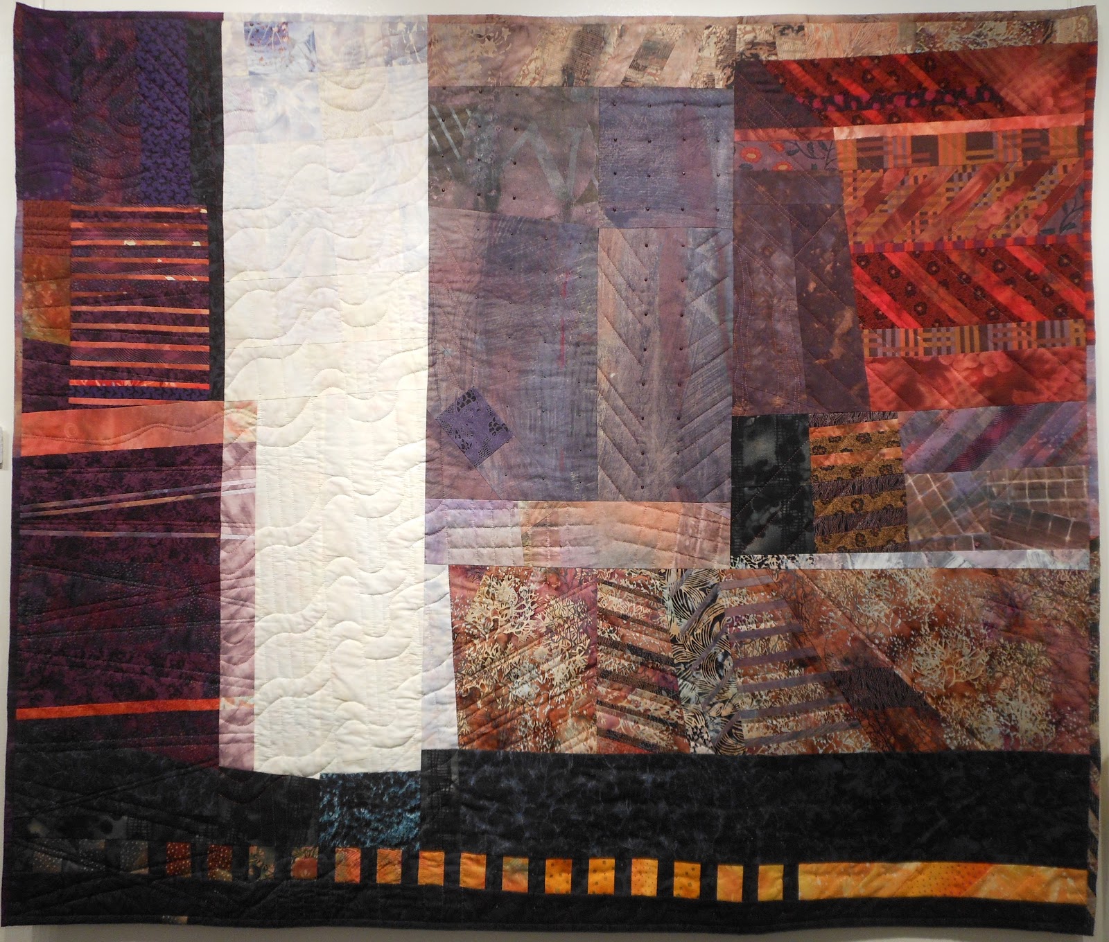
Saturday, January 5, 2013

Bernat Klein


One of the great things about holiday get-togethers with kith and kin is learning more about your family. This week my cousin mentioned a very distant family relationship with Bernat Klein, a top British textile designer, now aged 90. I have done a little on-line research and I am intrigued by what I have discovered.


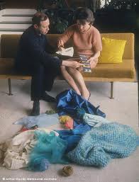

Klein with his wife, Margaret Soper


Klein was born in Yugoslavia to an orthodox Jewish family in the textile trade, and studied in Jerusalem and Leeds. Based in Scotland, he supplied textiles to haute couture designers (Chanel, Cardin, Dior, Balenciaga, Saint Laurent) in the 1960s and 1970s, and later sold his own clothing collections. At one time, he ran a cottage industry of 250 hand-knitters. In 1964, Vogue praised Klein as having "revolutionized traditional English fabrics to win them new recognition abroad." He credits the business acumen of his late wife, Margaret Soper, for much of his success. Eventually his enterprise grew to employ over 600 internationally.


a recent painting


Bernat Klein Studio, near his home in Selkirk

Also a painter, he was appointed CBE in 1973. About 1800 items documenting his career are archived at National Museums Scotland. It is said that his distinctive approach to colour has been hugely influential on both fashion and interior design.  Klein continues to paint every day.


In 1964, Klein had a studio built to house his enterprise, near Selkirk, in southern Scotland. It has won several architectural awards, and has been voted 5th best building in Scotland built in the last 50 years. Its new owner is currently renovating the building.


Bernat Klein at home, aged 90


I have ordered a copy of Klein's book, An Eye for Colour, and look forward to adding it to my collection of books on the subject.

I have always known that my mother's family worked in the textile industry, as did so many in the Leeds region at that time, but this is at a whole other level. Very exciting!


Thursday, December 27, 2012

Sky cloth: hits and misses


Sky fabric for my next Cityscape?


Making my most recent cityscape, Montmartre #1, I began with a beautifully mottled, pale grey hand-dye for the sky, shown at left. Because it wasn't the right shape, I cut it apart and re-stitched it so that it fit. I told myself I could live with two vertical seams in the sky.

I couldn't.


Mid-way through the project, I stopped to dye six different pale greys, finally settling on something called "nickel". It was okay, but it didn't have the beautiful mottling that suggests clouds in the sky.

I had tried ice dyeing this past summer (see my post of September 9) and was struck by the unusual patterning produced with this method. "What if," I wondered, "I used different grey dyes to produce a sky with subtle colours and an interesting, mottled texture?"


It was not a success. I was reminded that grey dyes are often created by mixing together dyes in complementary colours. What looks like a grey dye when dissolved in water is actually made of granules of different dyes: yellow, blue, red, orange, green, etc. If the powdered dye is applied directly to wet cloth, it splits into its various components. So, while the result was vibrant and interesting, even psychedelic, it wasn't the sky I had in mind.


Today I tried some low immersion dyeing, again using pale greys. This time I limited myself to charcoal, nickel, and safari grey, alone and in combination. This technique uses a small amount of liquid, and little agitation of the fabric. The result is more or less mottled, depending on the amount of agitation. Only 1/16 tsp of dye to a half-yard of cotton.

Of course I could paint cloth to look like sky, but I do like the serendipitous textures achieved with low immersion dyeing.

I'm excited about refining my dyeing skills in an on-line class in January with Elizabeth Barton, through Quilt University.com. Liz is a very skilled teacher, and promises to show us how to best use our hand-dyed fabrics, patterned and solid, light and dark, bright and dull, warm and cool. The class is titled Dyeing to Design, and is now fully registered, but will be offered again in April. And I have subscribed to the dyer's list, a forum for dyers, beginners and experts alike. I have a lot to learn.

Sunday, December 23, 2012

Montmartre #1

Beginning with my photo taken in Montmartre this fall,


I made a line drawing, 18" x 24",


and then translated it into hand-dyed cotton and a black line of stitching.


I already have a second drawing done of another Montmartre roofline, and hope to realize it in the same neutral palette soon.

Sunday, December 16, 2012

Colour games

Can you believe these were all painted with the same colours? It's (kinda) true!

Spent a couple of hours this week trying out an exercise in colour mixing from David Hornung's "Colour: A Workshop for Artists and Designers". This is an excellent book, and I have tried a few of the suggested activities, some with my text'art friends.
painted with raw colours from the tube
I began by painting a colour study in flat colours, using gouache paint straight from the tube: deep yellow, light green, sky blue, ultramarine, violet and scarlet. The effect is rather Fauvist. I personally love the Fauves, especially Matisse.
Using the original palette, but adding a bit of burnt sienna
Then I mixed each of these pigments with a small amount of an "admixture", an earth tone of burnt sienna, and reproduced the study using these modified colours. This is called an "altered palette", and it is supposed to produce more unity of colour.
Using the original palette, but adding a bit of yellow ochre 

For my next experiment, I started with the original pigments and added a small amount of another earth tone, yellow ochre. You can see the effect above. Of course, much depends on just how much of the "admixture" is added. Also, although earth tones are the usual choice for the admixture, anything could be used, including black and white. For the exercise, you want to have enough of the original colour that it retains its identity.
Original palette, with neutral grey #4 added

Finally, I added Neutral Grey #4 to each of the original paints, to produce the result above.

For those of us working in cloth, these ideas can be implemented by overdyeing fabric, or simply by choosing colours that are both muted and related. You could even mess around with some paint before choosing your fabrics, matching fabric to the study in paint.


Wednesday, December 12, 2012

El Anatsui and the High Line


Last week we took advantage of some remarkably mild weather to walk the High Line in New York. This is a linear, elevated park built on an old rail line, a couple of storeys above the neighbourhoods of Chelsea and the Meatpacking District. It stretches from 14th to 30th Streets, and offers wonderful views of the bustling city below. It's an oasis of tranquility in the heart of all that urban energy.


The High Line is tended by volunteers, and its gardens are filled with about two hundred plant species. In the garden soil you can see the steel tracks of the former railroad. The paving stones make the High Line easy to walk, and there are frequent and varied clusters of seating for those who wish to take a break. Visitors are intrigued by a number of art installations along the path.


One of the most recent works of art is Broken Bridge II, by my favourite Nigerian sculptor, El Anatsui. It measures 157 feet wide and 37 feet high. Made of pressed tin and mirrors, it forms a wall that reflects the sky and the buildings of the neighbourhood. The rusted metal is a patchwork of overlapping squares and rectangles.


To find out more about the public art on the High Line, click here.

Monday, December 10, 2012

NYC exhibitions

Art Basel Miami Beach coincided with my trip to New York, so the galleries were very quiet. But there was still lots to see.

Pierre Cardin
Pierre Cardin dress, 1968
There were the secondary shows like the exhibit at the Fashion Institute of Technology, exploring the relationship between technological advances and fashion. It spanned quite a range: from split skirts for women cyclists of the late 19th century all the way to LED fabrics for today's "connected" fashionistas.


125 Icons JPG


The Pratt Institute has staged an impressive showcase of 125 products of its faculty and alumni, produced over its 125-year history. Included are the Chrysler Building, the Cuisinart, and the logo of Life magazine.


Self-Portrait: Marion Greenwood, 1954
Self-portrait, Marion Greenwood, 1954


The National Academy Museum had a fascinating show titled "Her Own Style: An Artist's Eye with Judith Shea". Curator and sculptor Shea chose more than thirty portraits of women artists from the museum's collection, to illuminate the place of women in the world of art, and what it has meant over the years to be a female artist.

There was even a display of Lion King costumes in the Theatre District.


Picasso, Woman in White, 1923


But the heavy-hitters were also on display. 

At the Guggenheim, Picasso: Black and White runs until January 23. Though I wasn't able to take photos, the Guggenheim offers an on-line gallery with some 22 works from the show.

Earlier paintings include those from the Blue and Rose Periods, which have surprisingly little colour. Picasso is quoted in the show as saying that colour weakens a painting. Some of his most powerful works, including Guernica, are painted with no colour at all. 

This reminds me of the importance of value in art: even when one uses colour, the darks and lights are critical to how the work is seen. I found it interesting too that some of the paintings on display are in fact charcoal line drawings on a background of cream-coloured oil paint. I was reminded of how lyrical Picasso's drawn lines can be.

Matisse, Laurette Seated on a Pink Armchair, 1916-1917


At the Metropolitan Museum of Art, Matisse: In Search of True Painting runs until March 17. The exhibit focuses on how Matisse would often return to a completed painting and redo it, in the exact same size, changing the composition or the style. He was frustrated that critics thought of his painting as spontaneous, without deliberation. To illuminate his process, he held a show at the Galerie Maeght in Paris, in December 1945, that featured six of his paintings. Accompanying each painting were a dozen or so black and white photos of the work in progress, showing how radical changes were made in the composition from day to day. The photos were as large as the paintings themselves. This show is especially interesting for those who work in series. Images from the show can be found here.


George Bellows, Cliff Dwellers, 1913


George Bellows was a member of the Ashcan School, an American Realist, and a contemporary of Edward Hopper. Seeing his exhibition at the Met was a revelation. "Featuring some one hundred works from Bellows's extensive oeuvre, this landmark loan exhibition is the first contemporary survey of the artist's career in nearly half a century." Bellows died at the age of 42 in 1925, and one can only wonder what he would have accomplished had he not died so young. I enjoyed his gritty cityscapes, depicting tenement life on the Lower East Side. 


Andy Warhol, Self-Portrait, 1967


Lastly, another exhibition at the Met, Regarding Warhol: Sixty Artists, Fifty Years explores the influence of Andy Warhol's work on his contemporaries and on artists of today, making a case for him as the Most Influential Artist of the 20th century. Yes, perhaps even more influential than Picasso. 

His themes of consumerist culture, of celebrity, of sexuality and gender, and of appropriation and his exploration of converging media all foreshadow today's art scene. 

Many works from the show are available here.


Wednesday, December 5, 2012

The artquilt gallery - NYC

Today I visited the City Quilter, a 4000-square-foot emporium of cotton fabrics and quilting supplies, located in Chelsea. They stock an amazing array of cottons, including a special section of New York-themed prints. About a quarter of their space is devoted to the artquilt gallery, which displays the work of Colorado-based artist Judi Blaydon until December 15.
Sub Rosa: Aquifer, 52" x 52", commercial and hand-dyed fabrics, beads, machine-pieced, machine- and hand-quilted
Judy's work shows a masterful understanding of colour. Her lines of hand-quilting add another layer of complexity to her abstract compositions.

Sub Rosa: Plateau, 70" x 53", hand-dyed fabrics, beads, machine-pieced, machine- and hand-quilted
Her compositions are subtle and sophisticated, using a good variety of scale and a rhythmic repetition of shape.
Sub Rosa: Venice II, 54" x 54", custom-dyed and painted fabrics, beads, machine-pieced, hand-quilted, machine satin-stitched 
It is gratifying to see art quilts displayed well, in a brightly-lit gallery, in a neighbourhood known for  its creative energy. One hopes that galleries and exhibits like this will help to promote appreciation of fibre as an art medium.

Sub Rosa: Curtain, 63" x 52", commercial and hand-printed cotton, beads, machine-pieced, hand-quilted, 


Sunday, December 2, 2012

Jerry at the Cottage


This week, my Twelve by the Dozen group unveiled our 12" x 12" fibre pieces on the theme of "Threads". Above is my contribution, a portrait of my father-in-law, based on a sketch made almost forty years ago. The sketch was one of a series done for an undergrad class, and is not unlike the drawings I am making now for my Cityscapes series. So in a sense, I am "picking up the thread" all these years later. Jerry passed away in 1980, but because of the "ties that bind", we can still recognize him and remember him in this portrait, made as he sat in his favourite spot, watching football on TV. Looking a lot like his son Ron, my husband. Another thread.

Wednesday, November 28, 2012

Fibre Arts at Concordia

Born too soon! When I studied for my BFA many years ago, I always tried to submit assignments in fibre whenever possible. This was not always welcomed or understood by some of the teachers. How things have changed!

Last week, four members of our text'art group toured the impressive studio facilities at my alma mater, Concordia, which offers both undergraduate and graduate degrees in "Fibres and Material Practices". We were privileged to be guided by Professor Barbara Layne, whose recent work is in clothing that incorporates wireless and LED technologies and bio-sensing devices.


The university calendar says, "Students are introduced to processes which include silkscreen printing, dyeing, weaving, digital imaging, papermaking, feltmaking, knitting, computer assisted weaving, embellishment, public interventions, sculptural and installation practices. Digital technologies are integrated into the program through digital imaging software and the use of computer assisted textile production systems." Prof. Layne said the courses are so popular that they could easily be filled twice over.

Our group has been lucky enough to visit two other textile schools in Montreal, both associated with the CEGEP de Vieux-Montréal: the CRDITM, which specializes in the design and printing of textiles, and the CTCM, which teaches weaving, knitting, embroidery and computer-assisted design. These programmes are more production-based than the university programs, which include courses in theory, history, and the place of fibre in the contemporary art scene, as well as elective courses in other studio arts (drawing, printmaking, painting, ceramics, etc.)

Do you know what's playing at your local university or college?

Saturday, November 24, 2012

Baby quilt


Suffering with left-brain fatigue from all those cityscapes, I have flung myself into making a baby quilt for my cousin's new grandchild.

It was a joy to work with bright colours, bold prints and wonky circles. I used a technique by Beryl Taylor, which is no doubt completely unsuitable for a baby quilt, as it features lots of raw edges. Perhaps as a wallhanging in the nursery? It has been several years since I have ventured to use a traditional binding, and I cringe to think just how much I have forgotten about making one. Another learning experience.

I have a shocking amount of these brightly-coloured cottons stashed away. No doubt there will be more baby quilts to make in the coming years.


Sunday, November 18, 2012

World of Threads: Art Quilts

Kit Vincent, "Lift"
Art quilts (two or three layers with stitching, say) formed a small part of the work on display at this year's World of Threads Festival.

Of the photos I took, Kit Vincent's works would perhaps qualify as the most obvious representations of this art form. Kit uses hand-dyed cloth and stitch to make abstract, complicated, visually-layered work.

The variation of colour achieved by hand-dyeing adds depth to the imagery. Kit skillfully constructs ghost-like layers of machine stitch, offset from the solid cloth shapes, to create a sense of movement. As the coloured thread moves from a matching background to a contrasting background, transparencies are revealed.

Kit Vincent, "Bel Canto"


Remarkably, Kit's work appears to be pieced in a traditional way, with no raw edges or evidence of fusing.

Four of Kit's beautiful, highly-coloured works were on display at the Queen Elizabeth Park Community and Cultural Centre, as part of the "Variegated Threads" show.


Micaela Fitzsimmons, "The Road Home"


In the same venue, Micaela Fitzsimmons uses traditional piecing techniques, but introduces paint or ink with printed imagery to add a new element.


Judy Martin, "Light of the Moon"


Judy Martin had several works in different shows. This piece on the right has some elements of the traditional quilt, including a grid-like visual structure. Additionally, paint, couching, hand-stitching and buttons are used to add layers of visual interest.

Judy's work often features a large circle motif.


Jennie Wood, "Silent Past, Future Fear"


Jennie Wood introduces raw-edge appliqué in her take on the art quilt. Also, paint, paper, lutradur and image transfer add to the complexity of the piece at left.


Susan Strachan Johnson, "Journey"


Finally, one of my favourite pieces in the whole Festival, the painterly "Journey" by Susan Strachan Johnson, shows an art quilt that has moved well into the realm of mixed media. Saved from being overly-sweet by some darker overtones, this work employs subtle layering, stitch and found objects to make a poignant statement. 


Friday, November 16, 2012

World of Threads: Groupings of Small Pieces

Do you have many small pieces, perhaps made as samples? I saw several works at the World of Threads which may have begun in just this way. I think the way they were grouped for display was very effective.
"Postcards from the Scrap Heap",  Joanne Young


Above is Joanne Young's "Postcards from the Scrap Heap", on view at the Joshua Creek Heritage Art Centre. Each piece in the coherent group was stitched to a strip of burlap, as shown in the detail shot below.


"Postcards from the Scrap Heap", Joanne Young, detail

Dianne Gibson's "Strata" was shown in the wonderful "Pentimento" show, at the O'Connor McLeod Hanna building in Oakville. Each of these cloth squares was wrapped around what appeared to be foam core, then affixed to a square, black ceramic tile. The tiles were mounted on strips in groups of three, and were available for sale as a unit of three, or as a grouping of twelve. Very appealing.

"Strata", Dianne Gibson

Also in the "Pentimento" show, this work by Maggie Vanderweit is composed of nine smaller squares, stitched together to form a cohesive whole. It is made of cotton and foil, and is both hand- and machine-stitched.

"Totem Graffiti", Maggie Vanderweit
Quoting from the show's posted statement:

"Pentimento is a term used to describe how painters change their ideas during the process of making art, often switching the subject matter and painting over the original idea. The layers of underpainting remain but are hidden beneath the surface.

"Connections artists have taken this theme and built up layers of fibres, thread, stitching, paint, dyes and other materials.Then the surfaces have been altered or peeled away to create a visual erosion. The image behind the colors and textures reveals its own story."

The owners of this building are to be applauded for the way they have opened up the hallways of their office building for the exhibition of local art. They have invested in hanging hardware and lighting to allow for a very professional display, with all the work shown to its best advantage. I think this is a fine way to "humanize" a commercial enterprise, and integrate it into the community.