Wednesday, February 8, 2017

Looking at Art

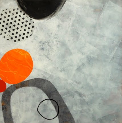
The plan for today's text'art meeting is a visit to the Celebration show at Galérie Beaux-Arts des Amériques, 5432 St.-Laurent in Montreal. This show features thirty paintings, all measuring 20" x 20", prompted by the gallery's tenth anniversary. My entry made it into the show, chosen by three jurors from almost sixty entries.


Photo taken on a quiet day, before the official opening

On a weekday morning, the space should allow for us to look closely at the works.

Here is a guideline that I found on the blog of Margaret Cooter, an English artist acquaintance of mine who posts almost daily about her everyday life, her work, her walks around London, as well as the London gallery and museum scene.  Occasionally she throws in a little poetry.

The next time you visit an art show, you too may find this guideline helpful. I hope it produces a lively discussion at today's outing.


Fingers crossed that today's weather forecast doesn't mean another cancelled excursion!

Sunday, February 5, 2017

"The Painted Word", by Tom Wolfe

The Connoisseur, Norman Rockwell, 1962

"If you have ever stared uncomprehendingly at an abstract painting that admired critics have said you ought to dig, take heart. Tom Wolfe...is on your side. [The Painted Word] may enrage you. It may confirm your darkest suspicions about Modern Art. In any case, it will amuse you."  - The New York Sunday News
"The Painted Word may well be Tom Wolfe's most successful piece of social criticism to date.   - The New York Times
"The Painted Word is a masterpiece. No one in the art world... could fail to recognize its essential truth. I read it four times, each of them with mounting envy for Wolfe's eye, ear, and surgical skill."  -The Washington Post
One of my favourite books of all time is Tom Wolfe's Bonfire of the Vanities (1987) so when this book was recommended to me, it was hard to resist. Published in 1975, it was written just a year after I graduated in Fine Arts. Forty-two years ago. (sigh) It speaks to the state of art at that time, and helps me better understand some of the confusion and conflicts I experienced as a young art graduate.

The focus of The Painted Word is the New York art scene, familiar territory for the author, but his analysis holds for the entire network of North American / European art hubs. Wolfe begins by explaining how the art of the early 1900's was a reaction to "literary art". Think of the iconic paintings of the 19th century, for example, so many of which allow the viewer to read them as a story.


The Raft of the Medusa, Géricault, 1819
(Romanticism)

The Hay Wain, Constable, 1821
(Romanticism)

The Stone Breakers, Gustave Courbet, 1849
(Realist School)

Luncheon of the Boating Party, Renoir, 1881
(Impressionism)

With the beginning of the Modern movement, around 1900, Wolfe explains,
"Literary became a code word for all that seemed hopelessly retrograde about realistic art.... The idea was that half the power of a realistic painting comes not from the artist but from the sentiments the viewer hauls along to it, like so much mental baggage."
What was the opposite of literary painting?
"Why, l'art pour l'art, form for the sake of form, colour for the sake of colour. In Europe before 1914, artists invented Modern styles with fanatic energy – Fauvism, Futurism, Cubism, Expressionism, Orphism, Suprematism, Vorticism – but everybody shared the same premise: henceforth, one doesn't paint 'about anything, my dear aunt,' to borrow a line from a famous Punch cartoon. One just paints. Art should no longer be a mirror held up to man or nature. A painting should compel the viewer to see it for what it is: a certain arrangement of colours and forms on a canvas."
Allow for a decade or two for the culturati to adopt and champion abstraction. Watch how their tastes evolve in an endless search to distinguish themselves from the bourgeoisie. Factor in a decade or so of strongly leftist politics, which resulted in the 1930's era of Social Realism in art, and make allowances for two world wars. Add in the influence of art theorists like Clement Greenberg and Harold Rosenberg and observe the dance between them, the bohemian artists and le monde.


Lavender Mist, Jackson Pollack, 1950

What do you get? Abstract Expressionism. Whereas with the realistic art of earlier eras, it was a case of "seeing is believing", the new experience is one of "believing is seeing". Viewers of art could only hope to understand abstract expressionism by having it explained to them by art theory, the theory of "the integral plane", of "flatness". And few were buying it. Writes Wolfe,
"First you do everything possible to make sure your world is antibourgeois, that it defies bourgeois tastes, that it mystifies the mob, the public, that it outdistances the insensible middle-class multitudes by light years of subtlety and intellect – and then, having succeeded admirably, you ask with a sense of See-what-I-mean? outrage: look, they don't even buy our products!"
So what direction could the art scene possibly take after Abstract Expressionism? Pop Art was the next Big Thing, rejuvenating the New York art scene. The flatness that was so sought after in abstract expressionism came naturally to the flags of Jasper Johns, the comic strips of Roy Lichtenstein, and the silkscreen posters of Andy Warhol. The art theorists agreed that these were not literary, that they were symbols; not representations, but "sign systems".

Flag, Jasper Johns, 1955
(Pop Art)

In the Car, Roy Lichtenstein, 1963
(Pop Art)

Campbell's Soup Cans, Andy Warhol, 1962
(Pop Art)

The culturati quickly cycled through Op Art, Colour Field, Minimalism, and Conceptualism.
"How religiously we've cut away the fat! In the beginning we got rid of nineteenth-century storybook realism. Then we got rid of representational objects. Then we got rid of the third dimension altogether and got really flat (Abstract Expressionism). Then we got rid of airiness, brushstrokes, most of the paint, and the last viruses of drawing and complicated designs (Hard Edge, Colour Field, Washington School).
"Enough? Hardly, said the Minimalists, who began to come into their own about 1965."
Further reductions ensued. Frames? Canvas? The wall? The gallery or museum? The idea of a permanent work of art? Even a visible work of art?
"So it was that in April of 1970 an artist named Lawrence Weiner typed up a work of art that appeared in Arts Magazine – as a work of art – with no visual experience before or after whatsoever, and to wit:
1. The artist may construct the piece
2. The piece may be fabricated
3. The piece need not be built
Each being equal and consistent with the intent of the artist the decision as to condition rests with the receiver upon the occasion of receivership."
And here Tom Wolfe sums up the whole business in his inimitable style:
"And there, at last, it was! No more realism, no more representational objects, no more lines, colours, forms, and contours, no more pigments, no more brushstrokes, no more evocations, no more frames, walls, galleries, museums, no more gnawing at the tortured face of the god Flatness, no more audience required, just a "receiver" that may or may not be a person or may or may not be there at all, no more ego projected, just "the artist", in the third person, who may be anyone or no one at all, for nothing is demanded of him, nothing at all, not even existence, for that got lost in the subjunctive mode – and in that moment of absolutely dispassionate abdication, of insouciant withering away, Art made its final flight, climbed higher and higher in an ever-decreasing tighter-turning spiral until, with one last erg of freedom, one last dendritic synapse, it disappeared up its own fundamental aperture... and came out the other side as Art Theory!... Art Theory pure and simple, words on a page, literature undefiled by vision, flat, flatter, Flattest, a vision invisible, even ineffable, as ineffable as the Angels and the Universal Souls." 

Telephone Booths, Richard Estes, 1968
(Photo-Realism)

In the book's epilogue, Wolfe discusses the return to realism, including Photo-Realism, which became a hot seller in the 70's as a reaction to all that had preceded it. (The art-buying class must have its meat.) Photo-Realism gives me vertigo.


Orange and Yellow, Mark Rothko, 1956
(Colour Field)

As for me, I'm an old-fashioned sort. Colour and form do it for me. Give me a brushy Rothko or the push-and-pull of a Hans Hofmann any day.


Yellow Burst, Hans Hofmann, 1956
(Abstract Expressionism)

Wednesday, February 1, 2017

Chagall: Colour and Music

The Blue Circus

This past weekend was my first visit to the newly-opened exhibition Chagall: Colour and Music at the Montreal Museum of Fine Arts. It will not be my last.

Close to 400 works of art are included: paintings, sketches, prints, costumes, sculpture, stained glass and tapestry cover almost the entire third floor of the Jean-Noël Desmarais pavilion. The range of media is a testament to Chagall's lifelong commitment to his artistic vision.

The theme of the exhibition is how music informed Chagall's work, and music plays in every alternate room of the display. Growing up in a Jewish community in White Russia (now known as Belarus), where violins were found in every household, Chagall frequently included the image of the violin and the fiddler in his work. Even fans of the artist may not realize that he created the costumes and backdrops for three ballets and one opera, Mozart's The Magic Flute

One of the highlights of the show is an enormous projected photo of the ceiling of the Paris Opera House. Visitors are encouraged to sit in beanbag chairs so they can lean back and experience the high-resolution photo. Explains John Pohl of the Montreal Gazette
"The ceiling was photographed in close-up detail by the Google Institute and is shown as a high-resolution projection, in the form of a spotlight moving across the ceiling. The paintings pay homage to composers whose works were produced at the Paris Opera; as each composer enters the spotlight, excerpts from their repertoire are played."
The Triumph of Music

I was a little disappointed to see so few of the very large Chagall paintings, like the impressive, monumental works at the Chagall Museum in Nice. Another quibble is that some of the explanatory text is printed in red ink on red walls, making it all but illegible.

Chagall: Colour and Music is the biggest Canadian exhibition ever devoted to the work of Marc Chagall (1887-1985). Running until June 11, 2017, it is bound to be a popular success. Its only other staging will be in Los Angeles, later this year.

Sunday, January 29, 2017

Nicholas Wilton's on-line video tutorials


A painter working out of Sausalito, California, Nicholas Wilton generously shares his wisdom about art essentials in a free, on-line series of video tutorials. Topics include Design, Value and Colour. When offered 8 months ago, more than 6000 people signed up for the series.

Though Wilton uses examples from his own abstract imagery, the principles apply equally to representational painting, sculpture, and fibre.

Click on this link to subscribe. 

Wednesday, January 25, 2017

More in the Touchstone series


With an opportunity to show some work from my recent series at a local café, I have made ten new acrylic collages. These all measure 10" x 10". Only nine are shown here, because one has already been sold (thanks, Lauma!)

The artist statement that will be posted with these explains that the series is one of "exploration within limitations". I'm having fun with these.


Sunday, January 22, 2017

Celebration, indeed!

Ten

So pleased to have my entry accepted for the upcoming show at Galérie Beaux-Arts des Amériques. The three jurors chose 30 of the 60 works submitted, all on the theme of Celebration, marking the tenth anniversary of the gallery. (And perhaps the 150th anniversary of Canada and the 375th anniversary of Montreal?)

All the works are now available for viewing on-line.

The show will run at the gallery's new, more spacious location, 5432 St.-Laurent Blvd., January 26 - March 11. The opening reception is on Saturday, February 4, from 1 - 5 pm.

Following is a list of participating artists:

ABED, Mouna - BEAUDIN, Anna - BENCOMO, Mario - BERGERON, Luc - CHABOT, Christiane - CHARBONNEAU, Patrice - CÔTÉ, Michel E. - CSASZAR, Andras - DUBREUIL, Heather - DUNLAP, Joseph - DUVAL, Jean-Jacques - HARRIES, Brian - KARANIKA, Helen - LAMBIN, Diane - LEJEUNE, Catherine - MANGIARACINA, Christopher - MEISTER, Jean-Guy - MOFFAT, Normand - MORGAN-BARNES, Nancy - MOUSSEAU, Caroline - MULLIGAN, Lorna - OUELLETTE, Johanne - PARKER HYATT, Lisa - PASSARELLO, Theresa - PETRY, Nancy - ROUTABOULE, Danièle - SATOK, Lauren - TENTI, Bruno - TURNER, Peggy Ann - WALTON, Patrycja

Wednesday, January 18, 2017

In situ: mounted and hung


Pleased to report that most of my recent collages and paintings have found a good home. Above, you can see some of the Touchstone series showcased on a living room wall. I find that presenting these on a black-edged birch cradleboard is very effective. The black edge seems to add something to the work. It's also less expensive than framing, looks contemporary, and is easy to transport.


Others in the series are happily displayed on a bedroom wall, where they benefit from some small spotlights.


And these "colour field" studies add a bright focus to this living room wall. All of the works in the selection above are made with three colours, each from the same palette of six: turquoise, yellow-green, yellow-orange, red, violet and warm grey. Also, each of the pieces is made with only three shapes, all rectilinear. The small spotlights help them be seen to their best advantage.

Another advantage of this kind of mounting is that I can mount a new piece directly on top of an older piece. This helps ease the storage situation a bit.

You can learn more about how to mount your work this way in a video from Jane Davies.


Sunday, January 15, 2017

Abstract & Geometric, by Martha Sielman

So pleased to get my hands on this inspiring new book by Martha Sielman. Since 2004, Sielman has served as the executive director of SAQA (Studio Art Quilt Associates), and now she has drawn on the work of SAQA members to compile a visually stunning volume devoted to art quilts, available from Amazon.


"These engaging works of art represent a range of styles across the abstract art spectrum. Gorgeous art quilts – 300 of them, bursting with color – capture the work of 124 major quilt artists from 18 countries. In-depth interviews with 29 of the artists help us understand their inspirations, their techniques, and their challenges.
"...Participating artists come from Australia, Canada, France, Germany, Israel, Italy, Japan, Latvia, the Netherlands, Northern Ireland, Russia, South Africa, Spain, Sweden, Taiwan, the UK, and across the US."
I enjoyed the range included in this collection, from the complex, layered and intensely-worked (like Deidre Adams' painted pieces) to the clean, direct and spare (Karen Schulz's, for example). Both rank among my favourite artists. And on a personal note, one of the pages is devoted to Spontaneous Combustion, a striking piece by Helena Scheffer, dear friend and fellow member of Text'art.

Spontaneous Combustion, Helena Scheffer


Wednesday, January 11, 2017

Fun and Games with Google's Search by Image

I consider my son to be fairly internet-savvy, so when I discovered that he wasn't familiar with Google's Search by Image feature, it made me think the subject might be worthy of a post.

Let's say you've come across an image of a painting on-line, but it's not attributed to the artist, and you're curious to know more. For instance, here is Perspectives, by Jean-Paul Riopelle.


  • Drag and drop the image onto your desktop. 
  • Open your browser to https://images.google.ca/
  • Drag and drop the image into the search box.
The result will be something like this:


Not only will you find multiple sources for that image, but with any luck you'll find out the name of the artist, the title, size, date and location of the painting, as well as similar paintings, some by the same artist.

This can be useful for visual artists like me, who post images of our work on-line. I can quickly determine whether my image has been pinned on a Pinterest site, or indeed if my work has been appropriated by some greeting card company.

Sometimes the results can be quite hilarious. When I noticed a lot of traffic for a blog post of four recent paintings, I did a Google Search by Image. Here is one of the paintings:

Touchstone series

Google's "best guess" for this image was "Reebok latest shoes". Thoughtfully, a link to the relevant website was included.

A second painting,

Touchstone series

yielded results that included a photo of a swan and of a snowman's face.

It was gratifying when the third of my images was recognized as a "painting", with images of other (random?) paintings offered for comparison.

How ever did we manage before Google?

Sunday, January 8, 2017

Creativity for Life

The beginning of a new year often finds me reaching for a book to inspire my continuing journey in art. Past favourites include Art & Fear, by David Bayles and Ted Orland; Big Magic: Creative Living Beyond Fear, by Elizabeth Gilbert; and The Confident Creative, by Cat Bennett.


This year I decided to re-read Creativity for Life, by Eric Maisel. Its subtitle is "Practical Advice on the Artist's Personality and Career from America's Foremost Creativity Coach".  Maisel, a psychotherapist and teacher, is the author of more than 40 books, including several novels.

What does "creativity for life" mean? In the book's introduction, Maisel makes the helpful distinction between artful living, art-filled living, and art-committed living, categories which are not mutually exclusive.
"First, it means that creativity can permeate one's life, that a person can be creative in the way she handles her job, solves problems around the house, plans menus for dinner parties, or takes in a sunset. She manifests the qualities of a creative person, like imagination, resourcefulness, self-direction, and so on, and shines them like a beacon on whatever she thinks about or tackles.... [She is] 'everyday creative' or engaged in 'artful living.'
"Second, it means that people who love things like art, music, literature, science, and, more broadly, gorgeous, thought-provoking, evocative things, want them in their lives. They want a life full of foreign movies, intellectual puzzles, and natural beauty. They love it that bookstores, museums, and concert halls exist, and they love it that they can fill their living space and their spare time with art.... This is an 'art-filled life' or 'art-filled living'. In this sense, having 'creativity for life' means filling all your days with art and the joy that art brings. 
"Third, it means that a person can spend a lifetime creating in a particular domain, a domain to which she decides to devote herself. She can be creative as a violinist and devote herself to music. She can be creative as a writer and devote herself to writing novels. She can be creative as a research biologist and devote herself to scientific inquiry.... This is an 'art-committed life' or 'identifying as an artist.'"
This third avenue is the focus of the book.

What is creativity? In Maisel's view,
"...People are artistically creative when they love what they are doing, know what they are doing, and actively engage in art-making. The three elements of creativity are thus loving, knowing, and doing; or heart, mind and hands; or, as Zen Buddhist teaching has it, great faith, great question, and great courage."
Maisel goes on to explore the artist's personality, specifically a list of ten traits.
"It seems contradictory to call an artist both shy and conceited, introverted and extroverted, empathic and self-centred, highly-independent and hungry for community – until we realize that all these qualities can be dynamically present in one person."
This realization can help the artist to understand puzzling contradictions in his personality. Maisel cites as examples the musician who wants to perform his music, but is terrified by public performance; the painter who possesses the vain hope of a quiet life, but whose active mind prevents her from feeling relaxed even for a minute; and the author who needs solitude in order to write but also needs a wide and busy social circle. Maisel also deals with the characterization of some artists as being "difficult". He explains that,
"The artist lives in a state of greater dynamic tension than the nonartist and so is likely to demand more, desire more, withdraw further into herself, witness better, laugh harder, and bellyache louder. This may not be easy for anyone to take – the artist included – but it reflects not just one quality like selfishness or narcissism but a whole array of interactive qualities."
Maisel discusses the obstacles to achieving success as an artist, and the difficulties of supporting oneself through one's art.
"It is easy to picture a culture in which art and commerce are not connected and equally easy to picture a culture in which everyone has permission to create, does in fact create, and is supported in their creative efforts. Ours is not that culture. You can live an artful life and an art-filled life without worrying about the connection between art and commerce, but if you intend to live an art-committed life, then the challenges that we've discussed in this chapter are yours to face."
Throughout the book, Maisel peppers his text with quotations from artists of all mediums and many eras. One of these quotes is of particular interest to fibre artists. He cites the American visual artist Elaine Reichek, who said,
"It's political to choose a form that is a craft –  not painting, not sculpture, not in the tradition of high white art." 
My re-reading of Creativity for Life has illuminated my own path. In fact, I have just ordered another of Maisel's most popular books, Coaching the Artist Within.

Wednesday, January 4, 2017

Methods & Materials class, Part 2

In November, I reported about my experience with the first session of Methods & Materials in Acrylic, a class taught by Melanie Matthews at the Montreal Museum of Fine Arts. Melanie is a "Golden Certified Working Artist", so she has lots of expertise with acrylic paints and knows how to make them behave.

Hilda af Klint, Svanen (The Swan) No. 17 , 1914-15

Melanie structured the second session so that each of the six three-hour classes was inspired by the work of a particular artist. By learning about Hilma af Klint (Swedish, 1862 - 1944), we were introduced to the colour wheel, variations of which featured prominently in her work. We began with three primaries and mixed multiple secondary colours. It's remarkable to see how this little-known artist grappled with a hard-edge, "target" style of abstraction more than 100 years ago.

Pat Steir, Waterfall, 1988

The second class was devoted to Pat Steir (American, born 1940), whose use of dripped paint suggests falling water. We used this opportunity to prepare our canvases with three different tinted substrates (light molding paste, coarse molding paste, and acrylic ground for pastel or AGP). Each went on a little differently and produced slightly different effects as a base for the dripping. We tilted the prepared canvas on a supporting board, dribbled on high flow acrylic, and encouraged the paint to flow downwards with a spritz of water.

Viktor Vasarely, Hexa 5, 1988

Stencils were provided for the third class, which allowed us to produce a Victor Vasarely (Hungarian, French, 1906-1997) type of geometric design. We played with the concept of colours advancing and receding, and with the suggestion of form using dark, medium and light values.  We made transparent paints more opaque with the addition of Titanium White. Vasarely is known for his hard-edge paintings, but our time was limited and so we didn't have a chance to use painter's tape and gel medium to create a true hard edge.

Georgio Morandi, Still Life, 1951

Georgio Morandi (Italian, 1890-1964) is known for his still lifes, which use a very limited neutral palette. In the fourth class we learned how to mix complementary colours (for example, Prussian Blue and Burnt Sienna) and tint with lots of white to create a range of interesting neutrals.

Morris Louis, Para I, 1959

For the fifth class, the focus was on Morris Louis (American, 1912 - 1962), who celebrated transparent colours by painting broad swaths of them on raw canvas. We diluted our paints with Acrylic Flow Release OR clear Palmolive dish soap solution OR diluted alcohol, and observed how each affected the dispersal of the paint. The idea here is to reduce the surface tension of the High Flow acrylic paint so that it penetrates the raw canvas, staining it rather than simply lying on the surface.

David Salle, Mr. Lucky, 1998

For the sixth and final class (which I was unable to attend), we looked at how the artist David Salle (American, born 1952) chops up seemingly disparate images from a variety of sources and assembles them in a new way. It was suggested that students select parts of their various assignments and juxtapose them with each other. Stretching canvas on stretcher bars and mounting on panels was also demonstrated.

Though I wasn't particularly satisfied with the canvases I produced, I saw the classes as opportunities to explore the nature of the materials. I've included my exercises below. Melanie is a knowledgeable and energetic teacher with a good strategy for presenting the techniques.

transparent and opaque paints, primary and secondary colours

dripping dilute paint onto three different tinted surfaces

tints and shades to create a shifting sense of volume

mixing subtle neutrals from complementary colours

staining the canvas by adding dispersing agents to paint

And with Golden supplying all the paints, pastes, gels and mediums, we felt free to explore all the possibilities presented.

Sunday, January 1, 2017

Celebration: Ten Years

Each year, Galerie Beaux-Arts des Amériques puts out a limited call for entry on a specific theme, and this year the subject is "Celebration", as the gallery marks its tenth year. Entries focusing on the number 10 are also encouraged.


Ten, acrylic collage on watercolour paper,
mounted on wooden panel, 20 x 20

For the last two years I've happily had my submissions (in fibre) accepted and sold. This year I'm taking a chance by entering an acrylic collage, an extension of my "Touchstone" series.


Ten (detail). Notice the pattern created by repeating the numeral 10.

Entrants are required to mount their work on a 20" x 20" wooden panel. This gives the exhibition a nice consistency when the works are displayed. The gallery not only offers a well-lit, white-walled exhibition space in a trendy downtown neighbourhood, but produces a high-quality printed catalog of the show and features images of all the accepted works on their website.

My artist statement for the work reads:
"Stable/unbalanced,
solid/ephemeral, 
heavy/light,   
dull/bright,
distinct/indefinite: 
ten." 
More information about the show to follow.  Whether or not my piece is juried in. (sigh)