Sunday, November 29, 2015

Inventing Abstraction - Week Two

Mondrian was the focus for Week Two of the Inventing Abstraction class at the MMFA. Our instructor, Jessica Houston, spoke less this week, possibly because she feels her French is not adequate for the francophones in the group. I was sorry about that because I felt an overview of Mondrian's work would have been useful.

We launched immediately into working in pairs. One of us was given a reproduction of a Mondrian painting, concealing it from our partner. We were to describe it in detail so our partner could reproduce it with paint and paper. A great exercise. Here is the image I described to Peter,


and here is what he produced:

Then it was my turn. Here is the image that Peter described to me

 and here is what I produced:


This activity really required you to look at the original in detail and describe it accurately.

Then we were asked to do a quick painted sketch of a plant, using only black and white. Here is the plant


 and my sketch, as always, unfinished.


Then we were asked to distill the shapes a bit more with another sketch. I tried to capture the essential butterfly-like triangles. Again, unfinished.


Finally, we were to try to reduce the image to its essence, in a horizontal and vertical grid. I didn't feel that my subject really lent itself to horizontals and verticals, so I just continued to work with the triangles. Everyone else continued with paint, but I chose to cut up black construction paper and glue-stick shapes into an arrangement. This is probably because I am not a painter: paper collage is similar to working with cloth.


Jessica made some kind comments about how I was able to create a play of positive/negative, and how, like Mondrian, I had created some "live" spots where the eye is tricked into seeing a colour at the empty vortex. I discovered how very difficult it is to create a neutral kind of pattern that appears to be totally random. It would be interesting to reproduce this on a painted background with some minimal flow of colour.

Mondrian is better known for his later work, so it was good to learn about his evolution from expressionism to abstraction.  Our instructor explained that essentially all his early work was based on the form of a tree. He felt that all natural forms could be reduced to a vertical/horizontal structure.

Grey Tree, 1911
Eucalyptus 1912
Composition  No. II: Composition in Line and Colour, 1913
Broadway Boogie-Woogie, 1942-43
Next week: Miró

Wednesday, November 25, 2015

Compare and Contrast

On a recent visit to the current show of the Beaver Hall Group at the Montreal Museum of Fine Art, I was struck by a comment that accompanied one of the paintings. A stark comparison was made between the vision of Canada's iconic Group of Seven and that of their contemporaries in Quebec, all working in the inter-war period.

March Storm, Georgian Bay, A. Y. Jackson
Here is an illuminating excerpt from the text that accompanied the A.Y. Jackson landscape, above. Note that Jackson belonged to both the Toronto-based Group of Seven and the Montreal-based Beaver Hall Group.
"A.Y. Jackson was an important catalyst in the formation of the Beaver Hall Group, and an ardent supporter of the work of many of its artists.... Yet his art is strikingly different from that of most of the Beaver Hall members. His paintings during the first half of the 1920s often present seemingly inhospitable landscapes as exemplars of Canada.... This type of subject did not always appeal to Quebec francophone critics, who were committed to the long and continuous history of Québecois habitation of rural landscapes, an important symbol of the survival of French-Canadian culture and values. When this painting was exhibited in 1921, Pierre Boucier wondered how Jackson, who had recently returned from fighting for 'civilization' in Europe during World War I, could now 'distance himself as much as possible from civilization' by focusing on painting nature at its 'wildest and most hostile'".
The work of the Group of Seven is widely seen as emblematic of Canada, though in fact it is largely Ontario-based. Here are some other examples of their work:
Red Maple, A.Y. Jackson

The Solemn Land, J.E.H. Macdonald

Autumn in Orillia, Franklin Carmichael
The Beaver Hall Group, mostly English Montrealers, distinguished themselves from the Group of Seven by typically choosing as their subject the settled landscape rather than untamed wilderness. Some examples from the current exhibition:
Beaver Hall Square, Anne Savage

After Grand Mass, Berthier-en-Haut, Kathleen Morris

The View from My Studio, University Street, Mabel May
In this, they were consistent with the orientation of French-Quebec painters, whose work in the early years of the 20th century most often focused on small "habitant" villages. The work of Clarence Gagnon is a prime example:

A Québec Village Street, Winter, Clarence Gagnon

Winter Morning in Baie-St-Paul, Clarence Gagnon

This divide between Quebec art and that of the Rest of Canada (or the RoC as we sometimes call it) is a new idea to me. Each of these artists was in fact celebrating an important aspect of our large and diverse country, whether the raw Northern wilderness, the settled, inhabited countryside or the pulsating urban scene. Vive la différence!

Sunday, November 22, 2015

Inventing Abstraction - Week One


Les Demoiselles d'Avignon, Picasso


Well, that was fun!

I have signed up for Jessica Houston's five-week class called "Inventing Abstraction" at the Montreal Museum of Fine Arts. The plan is that we learn about abstraction in a lecture format, go into the galleries to study examples of the work, and then return to the studio to work with some of the ideas discussed.


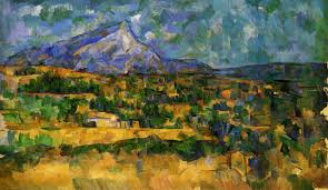
Mont St.-Victoire, Cézanne


Week One was devoted to Cubism, specifically Picasso, Braque and Cézanne. By looking at slides of various paintings, we learned that Cubism was about multiple points of view, a revolutionary concept and a break from the traditional Renaissance "vanishing point" perspective. The phrase used to describe one of Cézanne's landscapes was "flickering moments of perception".


Still Life with Clarinet, Braque


We noted the radical introduction of non-traditional materials like newsprint and oilcloth to the canvas, the way brushstrokes were used to flatten the picture plane, and how art's role of representation was challenged. Rather than having it all laid out, we saw that the viewer was required to ask, "What do I see?", bringing more of themselves to the experience.


Then it was time for a trip to the museum's permanent galleries, where we had 15 minutes to observe and sketch. I made three sketches, including this one of Picasso's "Head of a Musketeer".


When we returned to the studio, the instructor asked us to do a blind contour drawing of an ordinary four-legged stool, which she placed on our table top. The idea is to draw something without ever looking at your paper or lifting your pencil. Your eyes are never to leave your subject.

I can do a better job of contour drawing when I take more time, but for some reason I rushed through this.  Perhaps it's more interesting this way.


Then we were told to do a regular pencil sketch of the stool. After a minute or two, the instructor flipped the stool onto its side. Another minute, and it was upended. A minute later, a second stool was added. And so it continued. We were then instructed to go over some of the lines with dark charcoal.  At one point, we made free-hand cut-outs of the stool from newspaper, no pencils allowed.


Finally, we were given free rein to develop our work in our own direction.  I was quite pleased with the way this looked before the addition of the black paint.  It had an intriguing confusion of transparency created by continuing drawn lines over the newsprint, when the newsprint was clearly on top of the drawn stools. There was a delicacy to it that was lost with the application of the black paint.


Next week: Mondrian

Wednesday, November 18, 2015

Taxonomy of Art Quilts - Jane Dunnewold


At this year's International Quilt Festival, held annually in Houston, the eminent textile artist and teacher Jane Dunnewold spoke on the subject of "A Taxonomy of Art Quilts". Her lecture is available through YouTube, above. 

In the process of classifying art quilts into categories, Dunnewold surveys the broad range of current work in the field. She also raises some interesting issues about the predominance of women in this medium. What are the implications of this "sociopolitical reality"? Are we content to work in a "ghetto" or do we wish to participate in a broader art context? Simply by characterizing our work as "mixed media" rather than "art quilt", do we enhance the likelihood of having our work viewed in a more serious way? 

The taxonomy devised by Dunnewold is available in pdf form here

Sunday, November 15, 2015

Les Mémoires d'Hudson @ Hudson Medi-Centre

Since the Hudson Medi-Centre opened more than four years ago, one of its waiting room walls has been used as a showcase for local art.

Today a new display is installed: four of the pieces created to celebrate Hudson's 150th anniversary will be shown there for the next two months.


In the spring of this year, Hudson artist Daniel Gautier organized 14 local artists, assigning each of them an aspect of Hudson's history to portray in a 40" x 30" vertical format. The resulting collection was named "Les Mémoires d'Hudson". Banners with images of the paintings have been hung throughout the town, and now the Medi-Centre is delighted to showcase four of the works for the benefit of those passing through.

Gisèle Lapalme - The Empress
"The Empress" was one of several steamships that were once the lifeblood of the local community. Here it is shown docked in Hudson, around 1800. It carried 800 passengers in luxurious accommodations, as well as mail, merchandise and livestock.

Susan Snelgrove - The Hudson Yacht Club
The town of Hudson has long been a country retreat for Montrealers, with many local homes originally built as summer residences. One of the attractions was the Hudson Yacht Club, shown here as it appeared around 1900, and still very active today.

Mona Turner - Tribute to Hudson's War Veterans
When the storms of war blew across Europe, Hudsonites answered the call. Twenty-five soldiers lost their lives in WWI and another twenty-five in WWII. The Canada Geese represent those who were lost.

Heather Dubreuil - Greenwood: Layers in Time
One of the oldest houses in Quebec, Greenwood now serves as a heritage museum and as the home of Hudson's literary festival, Storyfest. Greenwood’s history, built on layers of time, is a patchwork of stories, documents and artifacts.

These four works may be seen at the Hudson Medi-Centre, 465 Main Road, during regular clinic hours, until January 17, 2016.


Wednesday, November 11, 2015

Christmas cards 2015


A sneak peek at this year's edition of my handmade fabric postcards, ninth in a series. Before I adopted the postcard format, I made folded cards with fabric shapes fused directly to the paper.

I was stuck for an idea, but rummaging through my collection of traditional printed fabrics sparked this design. I fussy-cut the flowers from a Moda print bought many years ago, and fused them to a cream-coloured print background. Though I had tossed many of my traditional-design stencils, the wreath survived, and it provided an arc of leaves, stitched with heavy black thread.

The red hot-fix crystals add a little needed sparkle.

I enjoy making do with what I have on hand, rather than having to run out and buy new supplies for this annual project. I make about two dozen of these little gems, and subject them to the tender mercies of the postal system, unwrapped. A seasonal act of faith.

Sunday, November 8, 2015

Syncopated Rhythm

Syncopated Rhythm
This summer (July 22 actually) I wrote a post about a Call for Entry that interests me, quoted below:
"For the group exhibition Poésie muette / Poetry Unspoken, artists are invited to create a work inspired by a piece of literature. Text in all its iterations - a passage from a novel, a poem, a quotation, an extract from a journal article, or simply a word - is to be translated into images that are both creative and expressive. The participants are asked to explore the visual possibilities suggested by the text in the most creative way possible. This is not about imitating literature by being limited to simple narration but, instead, to interpret the text in the proper language of the visual arts. The words should be transposed and appropriated by the artist in order to express what the text suggests to him/her - its rhythm, its tone, and even its physicality (for example: the texture and quality of the paper, the colour of the ink, the shape of the letters or paragraphs)."

How do I "package" this new Cityscape so that it not only meets the requirements of the Call for Entry, but has a little unexpected friction between the image and the quote that accompanies it?  I haven't quite nailed it, but I have a few weeks before the deadline to think this through.

Here is the quote I propose as my inspiration, from Italo Calvino's "Invisible Cities":
"[The city's] secret lies in the way your gaze runs over patterns following one another as in a musical score where not one can be altered or displaced".
The placement of the windows on the buildings' facades reminds me of notes on a musical score, and the small window panes suggest a rhythm to me. The antennae are like the sharps and flats, and the sets of parallel lines are the chords of the music. Or, from the same book,
"The city, however, does not tell its past, but contains it like the lines of a hand, written in the corners of the streets, the gratings of the windows, the banisters of the steps."
Thoughts?

Of course, as with all calls for entry, there is no guarantee the work will be accepted. So much depends on reading the minds of those who set the parameters, the appeal of the other entries, and the concerns of hanging a cohesive yet varied show.

YES!!! Delighted to report that the piece has been accepted into the exhibition. For more information, please refer to my post of January 20, 2016.


Wednesday, November 4, 2015

400 posts!

Please celebrate with me this 400th post to my blog, which I started in March 2012. Since the beginning, I have tried to post regularly, twice a week, mostly covering art exhibitions at home and away, and my own work in cloth and other media.

Views to this blog are closing in on the 100,000 mark, and it's satisfying to think that both friends and strangers find something of worth here.

What is the value for me? I hesitated to get into this "blogging thing", because I thought it would take time away from my own production. Instead, I have found that by being disciplined about posting, I have sustained my engagement with art, not only my own but also with the work of others. My blogging has become a form of journal-keeping for me.

And please remember, comments are always welcome!

Sunday, November 1, 2015

Major new museum opens in LA


Thank you to Colleen for sharing this 3-minute video, showcasing a new museum of modern art in Los Angeles. Funded entirely by billionaire art collector Eli Broad and his wife, The Broad opened in late September and is free to the public.