I have signed up for an online class with the Winslow Art Center. The class is called "Paint Fast, Loose and Bold in Acrylics and Oils", and will be given on-line by instructor Patti Mollica, for four consecutive Wednesdays.
I never took a painting class while pursuing my BFA. For one thing, paint was expensive! Another factor was that the style of painting being championed in my program did not appeal to me. "Les Plasticiens" painted in a style described as "rigorously hard-edged and abstract" and they held sway over the painting department at the university.
 |
| an exhibition of "les Plasticiens" |
I've dabbled a bit in watercolour and explored abstract imagery in acrylic, but this will be my first experience with figurative painting in acrylic, and I thought I should do a little warm-up before the start of class.
I began with some travel photos and a still life, trying to match the colours in the photos. I found an app called Rapid Resizer that helped me to enlarge the image to the desired size. The app converts a photo into a line drawing and, using some antique carbon paper from the days when I had a portable typewriter, I was able to get the basic shapes and perspective in place.
 |
| sketch #1 |
 |
| sketch #2 |
I set up some still life tableaus and worked from those photos as well.
sketch #3
At this point, I realized that I wanted to do more than just reproduce photos. I wanted "the hand of the artist" to be evident in the sketches. More energy, more pizazz.
I thought back to my cityscapes in cloth, and how I had transformed my photo images by imposing my own colour scheme on them.
 |
| sketch #4 |
Then I noticed a Vlaminck post card that was pinned to my studio wall.
 |
| Le Restaurant de la Machine a Bougival, 1905 |
The bold palette appealed to me.
 |
| sketch #5 |
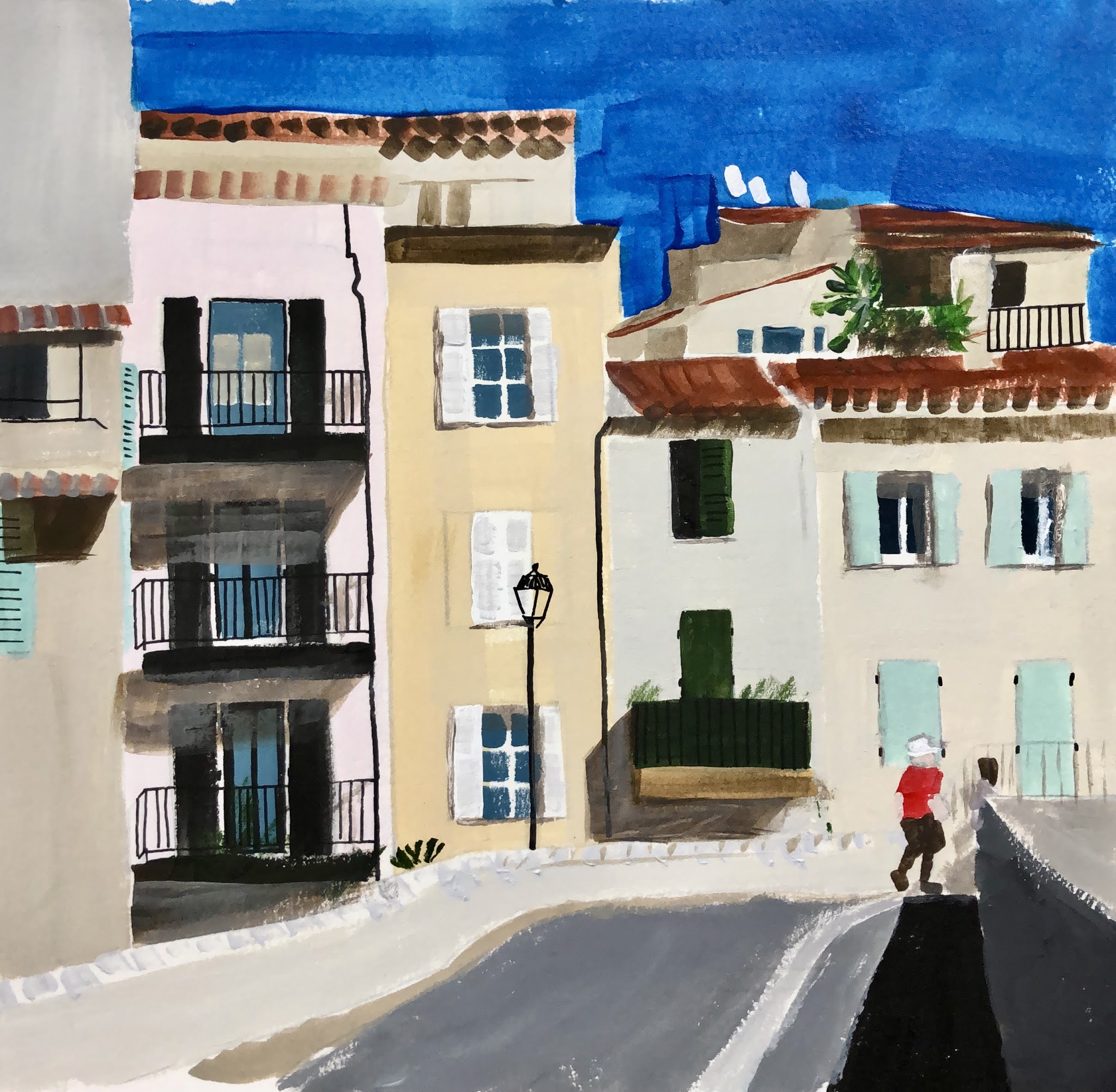
On further reflection, I decided that the success of Vlaminck's palette depended on many small areas of colour, rather than large blocks of colour. I've noticed the same phenomenon with patchwork quilts. I chose to work from a photo that had more small shapes.
 |
| sketch #6 |
I looked more closely at the Vlaminck street scene, and saw that his brushstrokes added to the vigour of the image. The brushstrokes were not visible on the buildings in the far distance, but became larger moving towards the foreground. I made an attempt to introduce some texture to the foreground of the scene.
Another Vlaminck postcard suggested a still life subject, using a similar palette.
 |
| Vase bleu avec fleurs, 1906 |
I set up a still life of flowers in a vase, and painted the subject.
 |
| sketch #7 |
How to proceed? Would it have been better to paint the background first? Perhaps I will learn some of these basic skills in my upcoming class.
To complete the exercise, I took my cue from the Vlaminck and painted in a similar background.
 |
| sketch #8 |
Clearly I have a lot to learn, and I may decide that figurative work is not for me. But at least I am somewhat warmed up for the first class.


No comments:
Post a Comment