Wednesday, March 17, 2021

Fibre Art Exhibition at the Smithsonian

The Smithsonian Museum of American Art has organized Subversive, Skilled, Sublime: FibertArt by Women, originally scheduled for April 22 - August 28, 2022. At this time the museum is closed, and opening dates are to be announced.

The website reads, in part:

"The thirty-four selected artworks piece together an alternative history of American art. Accessible and familiar, fiber handicrafts have long provided a source of inspiration for women. Their ingenuity with cloth, threads, and yarn was dismissed by many art critics as menial labor. The artists in this exhibition took up fiber to complicate this historic marginalization and also revolutionize its import to contemporary art. They drew on personal experiences, particularly their vantage points as women, and intergenerational skills to transform humble threads into resonant and intricate artworks."

Visitors to their website can see the thirty-four works selected for the show. Artists include Sheila Hicks and Judith Scott, whose work I have profiled here in the past.

Tuesday, March 9, 2021

Painting class, progress report #2

Having completed three sessions, I am learning a lot in Patti Mollica's class, "How to Paint Fast, Loose & Bold". I also ordered her book, and have found it to be instructive. 

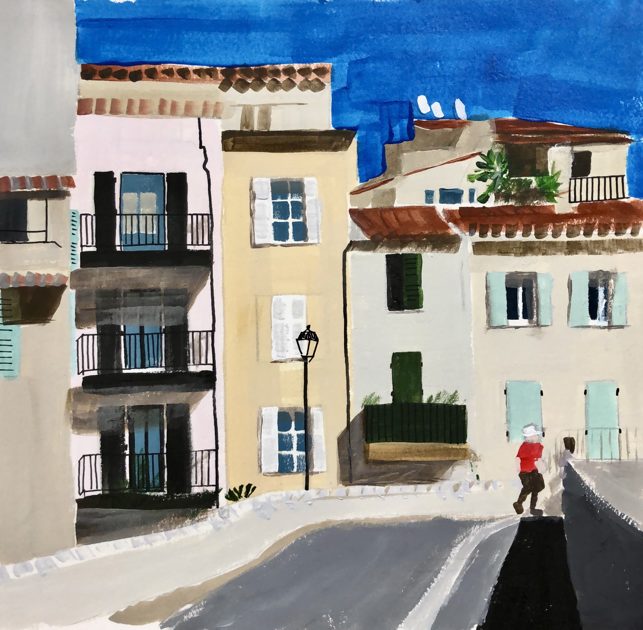
One of the aspects of Mollica's paintings that appeals to me is that she imposes her own colour scheme on her subject, creating a mood with colour rather than faithfully reproducing reality. I often did this with my Cityscapes in cloth, so this approach interests me. 

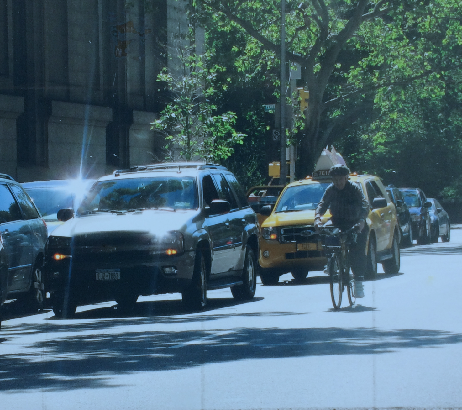
Here's the photo I started with. The instructor has given us ten photos to work with for the four classes. This limitation allows for easier comparison between the varying efforts of the participants.


 Here's how I cropped it into a 9 x 12 format, eliminating distractions that I felt were best removed.


Here's the value study. I used four values for this sketch, and three would have been easier. I eliminated the sun flares on the car to put the focus on the cyclist.


And here is my effort, using what I think might be called a triadic colour scheme (red-blue-yellow). I began this in the third class and finished it up a few days later. The idea is to work faithfully from the value sketch. If changes seem called for, they should be tried out first on the value sketch. (You may notice, if you squint, that I wasn't totally faithful to my value sketch.)

We were to pay attention to our brush strokes, and use them with freedom, introducing subtle variety in colour. Some of the students opted for a robust "mosaic" look, for a still life, for example. I felt an approach like that would undermine the focal point (the cyclist). But perhaps I could have been bolder with the brushstrokes.


More adventures await....

Sunday, February 28, 2021

Painting class, progress report #1

Patti Mollica, the author of "How to Paint Fast, Loose and Bold", offers an on-line class of the same name through the Winslow Art Centre. We are now half-way through the four classes, and I thought I would post an update here.

I am a real newbie when it comes to figurative acrylic painting, so I'm finding there's a lot to absorb.

Mollica's style is all about exuberant colour and energetic brushstrokes, but the basis of her approach to composition is quite technical. Whether she begins with a photo or from life, she translates her image into a value study, reducing the subject to three or four values of dark, medium and light. She transfers her value study to her support, using charcoal, and then mixes and applies paint, always keeping in mind the value of the chosen colours. Being able to rely on this structure allows her to be more expressive with colour and  application of paint.


Above is one of ten photos Mollica provided for our first efforts.


I cropped the image a bit and converted the colours of the photo into a value study, using black, white, and a neutral gray. At this point, the artist has the option of deviating from the original, to make a successful design. For one thing, it's important to have some imbalance. It would be rather boring to have equal amounts of the three values: one should dominate. Even more important is to have enough information to allow the viewer to decipher the subject. Above, the cylindrical nature of the solids are conveyed by means of highlights, credible shading and shadows, and small details that reinforce the perception of solid shapes. 

Another consideration is to establish a focal point, and use a dramatic contrast of value to establish that. Where is the eye drawn? (Often it's to a figure.) Can that focal point be strengthened by directional lines in the composition?

This value study is then transferred to a substrate, using charcoal to indicate areas of light, middle and dark values. Paint is then applied on top of the charcoal drawing.


Above is my first effort, 12" x 9". I decided the image needed to be cropped more closely, and used a 10" x 10" format for my second effort, below. 


I also applied green paint to the panel as a first coat. This "underpainting" peeks through and makes the painting more interesting, especially if its colour is the complement of the subject. 

I think the shadows need to be softened in the image above. Perhaps the instructor will offer some other advice, as she provides support on the class message board and during class time as well.

Here's another still life subject that I worked with:


Notice that in my value study I've transposed some of the values. The highlights are important details, giving information about the shapes of the solids as they are struck by the light.


I used an underpainting of turquoise for this one, though it's not as evident as I would like. Again, I think the shadows should have softer outlines.


When choosing our colours, it's important to be conscious of their values. If I need a dark, it's important that what I mix reads as a dark, to reinforce the composition. So by putting a dab of the paint on our "value checker", we can get a better sense of whether it suits our needs or not.

Mollica is an advocate of using as big a brush as we can handle, to allow for expressive brushstrokes. So far I'm being too careful with mine. Her palette often becomes tainted with colours transferred in the process of applying paint. This is all to the good, according to the instructor. Again, I'm not working loosely enough to accommodate this approach, but it's something I will try to put to use in my next assignments.

Below is a value study of a third photo provided by the instructor. Perhaps something more challenging for my next efforts?


Wednesday, February 17, 2021

Dabbling in figurative imagery

I have signed up for an online class with the Winslow Art Center. The class is called "Paint Fast, Loose and Bold in Acrylics and Oils", and will be given on-line by instructor Patti Mollica, for four consecutive Wednesdays. 

I never took a painting class while pursuing my BFA. For one thing, paint was expensive! Another factor was that the style of painting being championed in my program did not appeal to me. "Les Plasticiens" painted in a style described as "rigorously hard-edged and abstract" and they held sway over the painting department at the university.


an exhibition of "les Plasticiens"

I've dabbled a bit in watercolour and explored abstract imagery in acrylic, but this will be my first experience with figurative painting in acrylic, and I thought I should do a little warm-up before the start of class.

I began with some travel photos and a still life, trying to match the colours in the photos. I found an app called Rapid Resizer that helped me to enlarge the image to the desired size. The app converts a photo into a line drawing and, using some antique carbon paper from the days when I had a portable typewriter, I was able to get the basic shapes and perspective in place.

sketch #1

sketch #2

I set up some still life tableaus and worked from those photos as well.

sketch #3

At this point, I realized that I wanted to do more than just reproduce photos. I wanted "the hand of the artist" to be evident in the sketches. More energy, more pizazz.

I thought back to my cityscapes in cloth, and how I had transformed my photo images by imposing my own colour scheme on them.

sketch #4

Then I noticed a Vlaminck post card that was pinned to my studio wall.

Le Restaurant de la Machine a Bougival, 1905

The bold palette appealed to me.

sketch #5

On further reflection, I decided that the success of Vlaminck's palette depended on many small areas of colour, rather than large blocks of colour. I've noticed the same phenomenon with patchwork quilts. I chose to work from a photo that had more small shapes.

sketch #6

I looked more closely at the Vlaminck street scene, and saw that his brushstrokes added to the vigour of the image. The brushstrokes were not visible on the buildings in the far distance, but became larger moving towards the foreground. I made an attempt to introduce some texture to the foreground of the scene.

Another Vlaminck postcard suggested a still life subject, using a similar palette.

Vase bleu avec fleurs, 1906

I set up a still life of flowers in a vase, and painted the subject.

sketch #7

How to proceed? Would it have been better to paint the background first? Perhaps I will learn some of these basic skills in my upcoming class. 

To complete the exercise, I took my cue from the Vlaminck and painted in a similar background.

sketch #8

Clearly I have a lot to learn, and I may decide that figurative work is not for me. But at least I am somewhat warmed up for the first class.

Wednesday, February 3, 2021

A Close Read of a Cubist Masterpiece


The New York Times publishes an occasional series of "close reads" of iconic works of art. Most recently, "Still Life with Table", by Juan Gris, was chosen as a subject for exploration.

If asked to name the most revolutionary new artistic medium in 20th-century art, would you choose Cinema? Video? Installation? Writer Jason Farago suggests it might well be Collage. Readers learn about the impact of collage as a medium, and what the use of glued newspaper had to say about the explosive influence of journalism on French café society.

What is real and what is false? Wood-grained paper purports to represent a wooden surface. And the content of these same newspapers: true or false?

Farago refers us to the impact of African sculpture, with its shattering portrayal of three-dimensional space, so different from the classic perspective of European traditionalists. The painted landscapes of Cezanne are cited as an earlier challenge to the accepted view of reality.

The fascinating analysis, with its many supporting illustrations and close-up views, is well worth a look.


Sunday, January 31, 2021

What's Happening at the Louvre?


Never since World War II has the Louvre been closed for such a long time, but during the pandemic, the Louvre is still a hive of activity. With no visitors permitted, the museum is undergoing a major "refresh". I read about it in the New York Times. Lots of great photos help to give a sense of what's going on.

Wednesday, January 27, 2021

"The Golden Thread: How Fabric Changed History", by Kassia St. Clair


I last wrote about Kassia St. Clair when I reviewed her book, "The Secret Lives of Colour", in June of 2019. The book, her first, was a really good read. About 70 colours were profiled by St. Clair, each one with its own history. Readers learned how colours are experienced differently in different cultures, how precious dyes came to signify elite status, and how the toxicity of some dyes drove innovation in dye manufacture.

I was reminded of St. Clair when my friend Lauma shared with me a link for a video from Karen Brown, featuring a 38-minute interview with Kassia St. Clair, discussing "The Secret Lives of Colour" as well as her most recent book. 

"The Golden Thread: How Fabric Changed History", weaves the fascinating story of how textiles have driven human development in areas like technology, trade and even space exploration. The book has been well-received, having been chosen as a Sunday Times Book of the Year, and nominated for the Somerset Maugham Award.

A recent review of "The Golden Thread" is available from The Washington Post.  

Sunday, January 24, 2021

Visions Art Museum's virtual exhibition

Visions Art Museum, in San Diego, California, is a non-profit organization with a focus on fibre art. It stages twenty exhibitions annually, and though it is now closed to visitors, four of its shows are currently available on-line.

Octopus and Crab (detail), Beth Blenkinship

Beth Blankenship's solo exhibition, "Connecting Threads", showcases her longtime fascination with marine life. Using thread and beads, she has made a series of vessels celebrating the diversity of aquatic plants and animals.

Meltdown #1 (detail), Sandra Meech

Canadian artist Sandra Meech has a longstanding interest in the people and landscape of the polar regions.  "Polar Expressions" is a masterful display of her use of painted cloth and stitch to create contemporary quilts.

Break Up, Maria Shell

"Shifting Tides: Convergence in Cloth" is a group show, staged by members of Studio Art Quilt Associates. Its 46 varied works focus "on the current state of the Pacific Ocean ecosystem, its marvellous natural diversity, and the human activities that both sustain and threaten oceanic life".

The Wave, Carol Simpson

Finally, small works by local artists, "The Seaside Quilt Group", are on display in the show "The San Diego Seaside".

Fans of contemporary art quilts will have much to explore in this virtual collection.

Wednesday, January 13, 2021

Knitting the Pandemic

Thank you, Lynda, for passing along this item from CBC News. Each stitch on Sarah McLean's epic project represents 100 COVID-19 cases. It takes her hours a day to keep up. 

While I have not attempted anything as ambitious as McLean's project, I have found some solace in knitting during these difficult days. At this point I am using wool scraps to make slippers for the local women's shelter. It steadies me to have something to do with my hands while watching too much television.

Sunday, January 10, 2021

"We Are the Story": quilt exhibition in Minneapolis

I'll Fly Away,
Susan Brubaker Knapp

An article in The New York Times reviews "We Are the Story", one of a series of quilt exhibitions at seven sites throughout Minneapolis and St. Paul, presented by the Textile Center and the national Women of Color Quilters Network. The first exhibition, "Gone but Never Forgotten:Remembering Those Lost to Police Brutality, is available online, and other shows run through the spring.

Writing on the Wall,
Deborah Fell

Wednesday, January 6, 2021

Architecture and Knitting Machines


I subscribe to a blog by painter James Gurney, where I recently learned about an innovative approach to building that relies on knitted textiles to support concrete construction. This method is being explored as a new way to build affordable housing, with a smaller environmental footprint.

The video below features architect Mariana Popescu, explaining how knitting machines can create the "bones" of concrete structures.


Sunday, January 3, 2021

Excellence in Fibers VI

Repair (detail), Kevan Lunney, 2016
Aluminum base, neon glass tubes, industrial wool felt,
white electric cord; back fully enclosed with
removable aluminum plate, knitted construction

This virtual show is presented by the New Bedford Art Museum, in Massachusetts. It showcases fifty-two outstanding works, juried from over 1100 submissions, in the categories of 

  • Installation
  • Sculptural
  • Vessels
  • Wall and Floor, and
  • Wearables.
The exhibition presents a truly astonishing diversity of material, technique, and subject.