Sunday, March 28, 2021

Des Horizons d'Attente @ MAC Montréal

The Musée d'Art Contemporaine is currently staging a show of its recent acquisitions. Des Horizons d'Attente features the work of 21 Montreal-based artists. There are no traditional paintings in the collection. Instead, visitors are treated to some novel uses of materials like cloth, paper, wood and plastic. There is a particular emphasis on aboriginal issues and imagery.

Facade de recueillement, 2016-2017
[Contemplation Facade]
Myriam Dion
Japanese paper cut with X-acto knife, graphite

Facade de recueillement, 2016-2017
[Contemplation Facade]
Myriam Dion
Japanese paper cut with X-acto knife, graphite

"Myriam Dion pushes the fragility of paper to its limits by means of an infinitely meticulous precision knife (X-acto).... The delicate, slow, calm and solitary process required to produce this lace-like work represents the materialization of the artist's musing on the Syrian conflict and the migrant crisis rocking the planet. The installation Facade de recueillement takes up the architectural motifs of the façade of the Great Mosque of Aleppo, which was destroyed by the bombing...."

Essai d'aplanissement entre les mondes, 1999-2020
[Levelling Trial Between the Worlds]
Pierre Bourgault
Installation: shore mud on wood and ink-jet print on paper

Essai d'aplanissement entre les mondes, (detail) 1999-2020 
[Levelling Trial Between the Worlds]
Pierre Bourgault
Installation: shore mud on wood and ink-jet print on paper


water song [Kinosipi] 2019
Hannah Claus
Installation, digital print on Jetview© film,
thread, PVA glue, acrylic

water song [Kinosipi] 2019 (detail)
Hannah Claus
Installation, digital print on Jetview© film,
thread, PVA glue, acrylic

"water song [Kinosipi] is based on the sound spectrum of a song by Atikamekw singer and storyteller Karine Wasiana Echaquan."

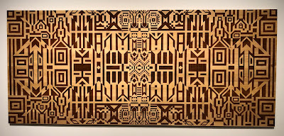
Lot #X - Front de la rivière Désert, 2018
[Lot #X - Desert River Front]
Caroline Monnet
Pyrography on wood

"Using pyrography, a network of geometric motifs inspired by Indigenous graphic traditions is outlined on this large wooden support made of white cedar..., a tree native to Canada and considered sacred by First Nations. The mention of the term 'Lot # X' in the title, the horizontal cuts and the arrow symbols in the composition suggest the lots of land laid out following the forced uprooting of Indigenous communities over the centuries. Like a metaphorical map with a modern pictorial look, this work gives material form, through wood burning, to the confiscation of Indigenous lands and the scars it has left on Indigenous peoples".

The exhibition continues until September 19, 2021.

Wednesday, March 24, 2021

Painting class, progress report #3

Our fourth and final session concentrated on brushstrokes. We were encouraged to develop dexterity with big brushes, loaded with lots of paint. Big, juicy brushstrokes create a sense of energy. Beginning painters are often too timid with their brushstrokes, making many fussy adjustments that make the final painting look overworked, rather than fresh.

Patti Mollica, teacher for the Winslow Art Center's "Paint Fast, Loose and Bold in Acrylic and Oil", demonstrated by using a 2" brush on a 6" x 6" canvas. Very impressive brush-handling!

We were given a pdf with several awkward shapes (above), and tried to fill them in, without lifting the brush from the paper. In other words, with a single brushstroke.

To follow up, we tried to fill in awkward shapes in this line drawing of a rose. Again, single brushstrokes only. One approach I tried to put into practice was the under-mixing of colour on the palette, giving a kind of variegated quality to a single colour.

I see some value problems in this, but it was just an exercise,
and I'm not planning to rework it.

Our final in-class assignment was to create a value study of a photo, and then to paint over the value study using as few strokes as possible. We were challenged to make the image using no more than 15 separate brushstrokes.

the subject

my value study

I quickly realized that my brush needed to be fully-loaded with paint, and moved up to a 1" brush. It was also clear that I would have to put some thought into the sequence of strokes (dark over medium-value? medium-value over dark?) 

Maybe 20 strokes to cover 12"x9" panel

One non-essential stroke is the highlight down the side of the bottle. Also, I could have done with a single highlight on the bottle, rather than two. Five strokes were needed for the background alone. 

As instructed, I created the value study in charcoal directly on the panel, then painted over it. But the charcoal lifted from the surface and mixed in with the goopy paint, darkening it. Should I have applied fixative to the charcoal? Or used graphite instead of charcoal?

More importantly, was this just an exercise to teach the importance of loading the brush, making big, unfussy gestures, and planning a strategy? Or is this actually how we're supposed to paint?

Alas, these questions will not be answered, as the class has ended. Your comments welcomed.

Sunday, March 21, 2021

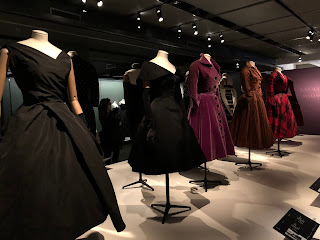
Christian Dior @ the McCord

Until May 2, Montreal's McCord Museum will host a tribute to Christian Dior. Fans of fashion and of the textile arts will find much of interest. 

silks and velvets in abundance

We learn about the appetite for high fashion after World War II. Dior is quoted as saying that, after wartime austerity, "women wanted to feel like women again". He achieved a sense of opulence with his extravagant use of fine fabrics. Wartime skirts and suits were cut so as to use a minimal amount of cloth; post-war, Dior embraced pleats to achieve a lavish amount of fabric.


We trace the process of couture, from an original idea to a mock-up in muslin, to realization in the hands of needleworkers.

beads, sequins, and threads

Impressive samples of embroidery and beading are on display.

Videos give visitors a taste of the in-house fashion show. Tall, thin, wasp-waisted, the models seem like creatures from an entirely different world. I had not realized that wearing many of these structured dresses required a "dresser" to fasten all the hooks and eyes.

One wonders about the parallels between post-war fashion and post-pandemic fashion. Will we be ready to give up our "athleisure wear" and sneakers for something more structured, more formal? It will be interesting to see how the fashion industry tries to create an appetite for something new and different.


The number of visitors to the museum is controlled with time-specific tickets. Phone the McCord or go to their website. Admission to non-members is free on the first Sunday of the month.

Wednesday, March 17, 2021

Fibre Art Exhibition at the Smithsonian

The Smithsonian Museum of American Art has organized Subversive, Skilled, Sublime: FibertArt by Women, originally scheduled for April 22 - August 28, 2022. At this time the museum is closed, and opening dates are to be announced.

The website reads, in part:

"The thirty-four selected artworks piece together an alternative history of American art. Accessible and familiar, fiber handicrafts have long provided a source of inspiration for women. Their ingenuity with cloth, threads, and yarn was dismissed by many art critics as menial labor. The artists in this exhibition took up fiber to complicate this historic marginalization and also revolutionize its import to contemporary art. They drew on personal experiences, particularly their vantage points as women, and intergenerational skills to transform humble threads into resonant and intricate artworks."

Visitors to their website can see the thirty-four works selected for the show. Artists include Sheila Hicks and Judith Scott, whose work I have profiled here in the past.

Tuesday, March 9, 2021

Painting class, progress report #2

Having completed three sessions, I am learning a lot in Patti Mollica's class, "How to Paint Fast, Loose & Bold". I also ordered her book, and have found it to be instructive. 

One of the aspects of Mollica's paintings that appeals to me is that she imposes her own colour scheme on her subject, creating a mood with colour rather than faithfully reproducing reality. I often did this with my Cityscapes in cloth, so this approach interests me. 

Here's the photo I started with. The instructor has given us ten photos to work with for the four classes. This limitation allows for easier comparison between the varying efforts of the participants.


 Here's how I cropped it into a 9 x 12 format, eliminating distractions that I felt were best removed.


Here's the value study. I used four values for this sketch, and three would have been easier. I eliminated the sun flares on the car to put the focus on the cyclist.


And here is my effort, using what I think might be called a triadic colour scheme (red-blue-yellow). I began this in the third class and finished it up a few days later. The idea is to work faithfully from the value sketch. If changes seem called for, they should be tried out first on the value sketch. (You may notice, if you squint, that I wasn't totally faithful to my value sketch.)

We were to pay attention to our brush strokes, and use them with freedom, introducing subtle variety in colour. Some of the students opted for a robust "mosaic" look, for a still life, for example. I felt an approach like that would undermine the focal point (the cyclist). But perhaps I could have been bolder with the brushstrokes.


More adventures await....